We are a London-based practice working with artists, businesses, and cultural institutions doing graphic design, typography, and art direction. We've recently worked with Tate, Camden Art Centre, Charles Dickens Museum, Estorick Collection, Lisson Gallery, London Centre for Book Arts, Nuart Festival, Royal College of Art, Central Saint Martins, Science Practice, and Unto.
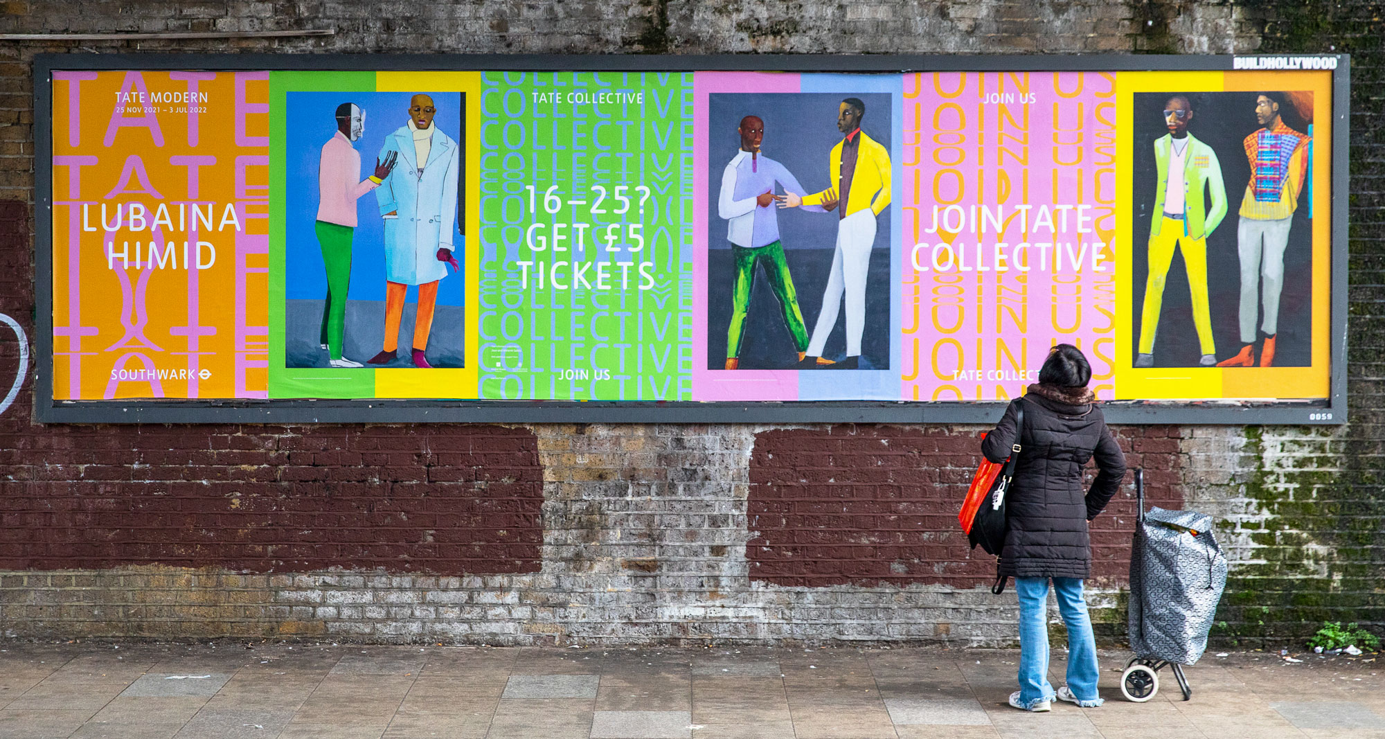
These days, around London, you might see our colourful Tate Collective campaign 🎨 for the 🟠 Lubaina Himid 🟢 exhibition currently on at Tate Modern 🌀 with the Tate design studio.
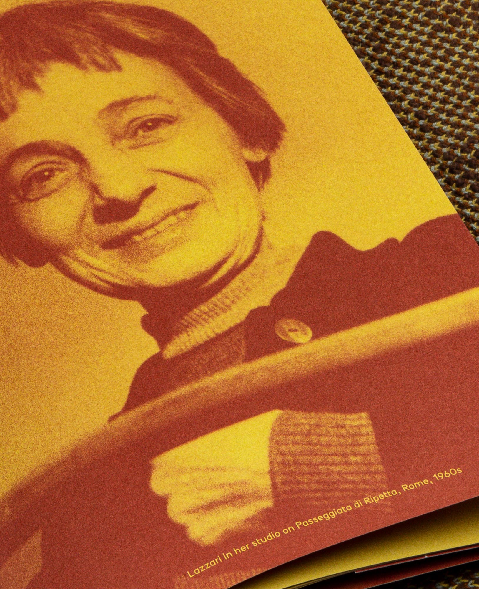
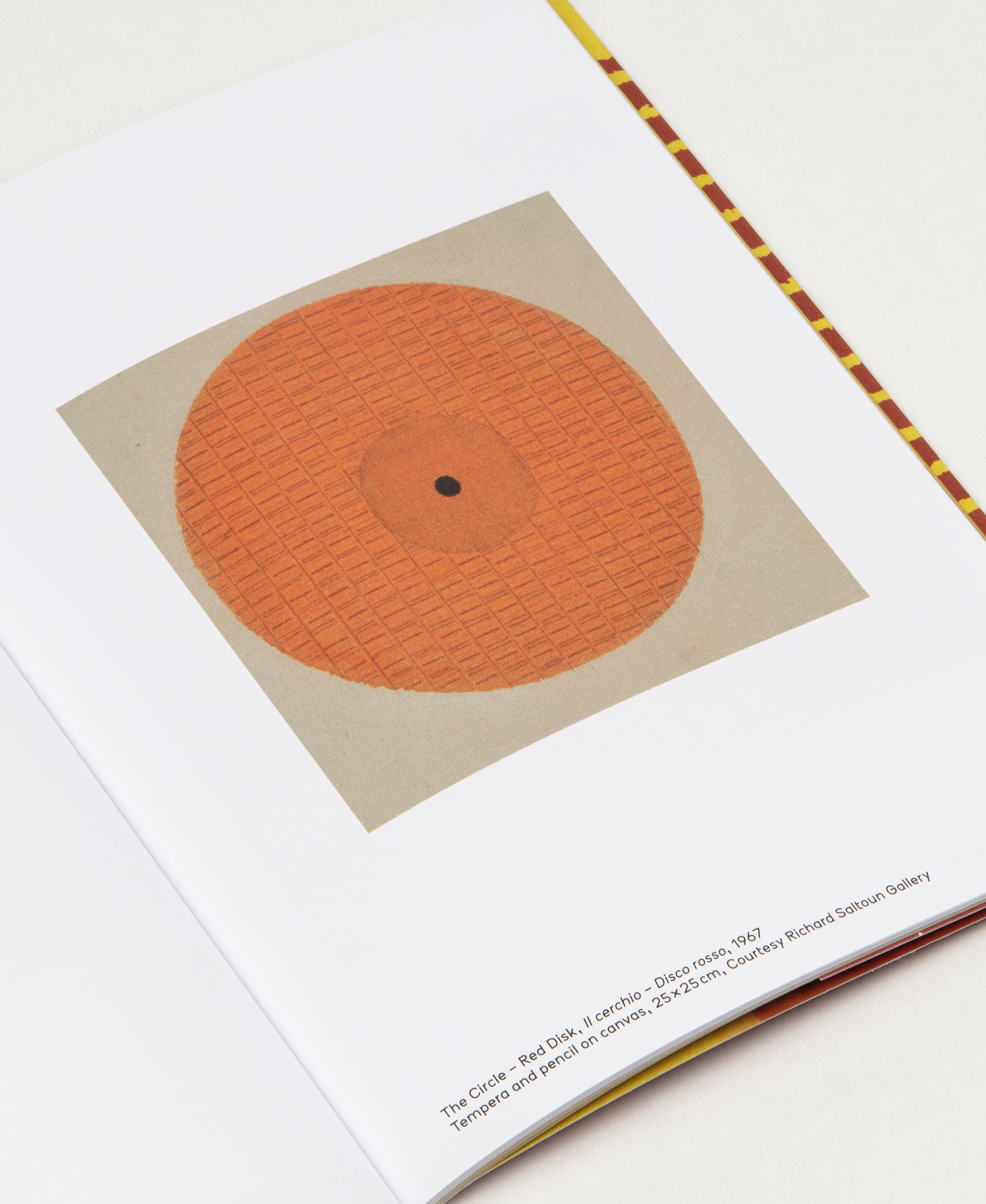
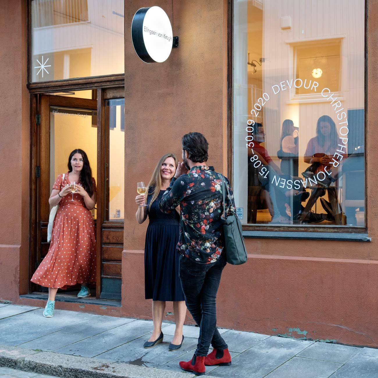
Bice Lazzari was an artist from Venice who made a significant contribution to twentieth-century Italian art, yet has remained largely unknown outside her native country. The cover graphic was made by overprinting her painting “Acrylic n.5” twice in two colours at 180° rotation, generating a new abstract composition. [more]
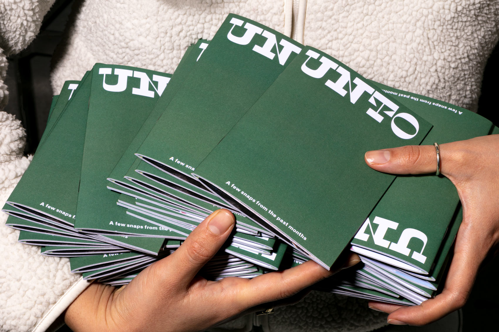
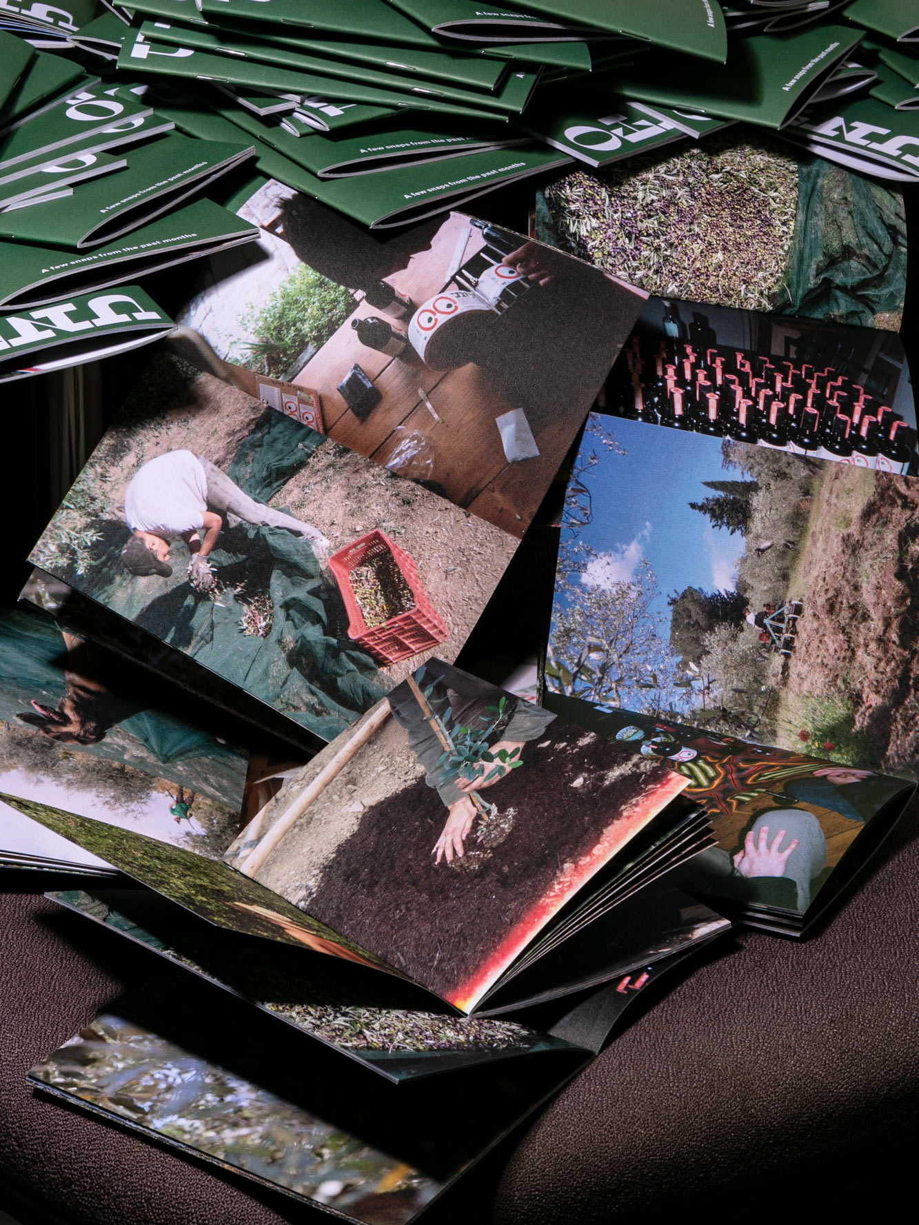
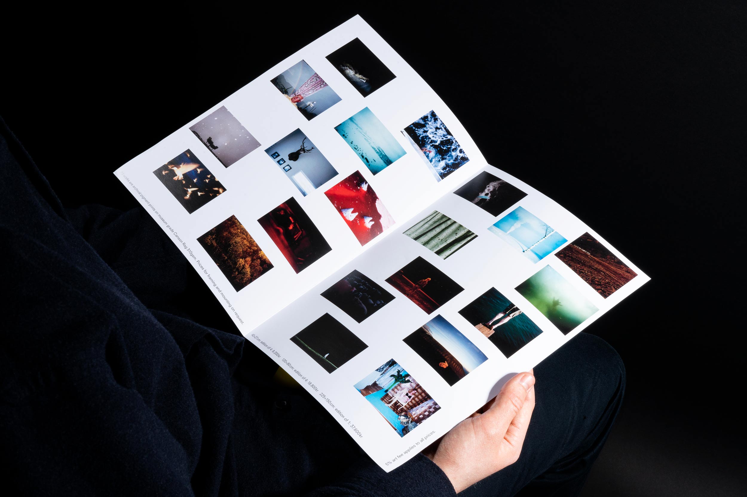
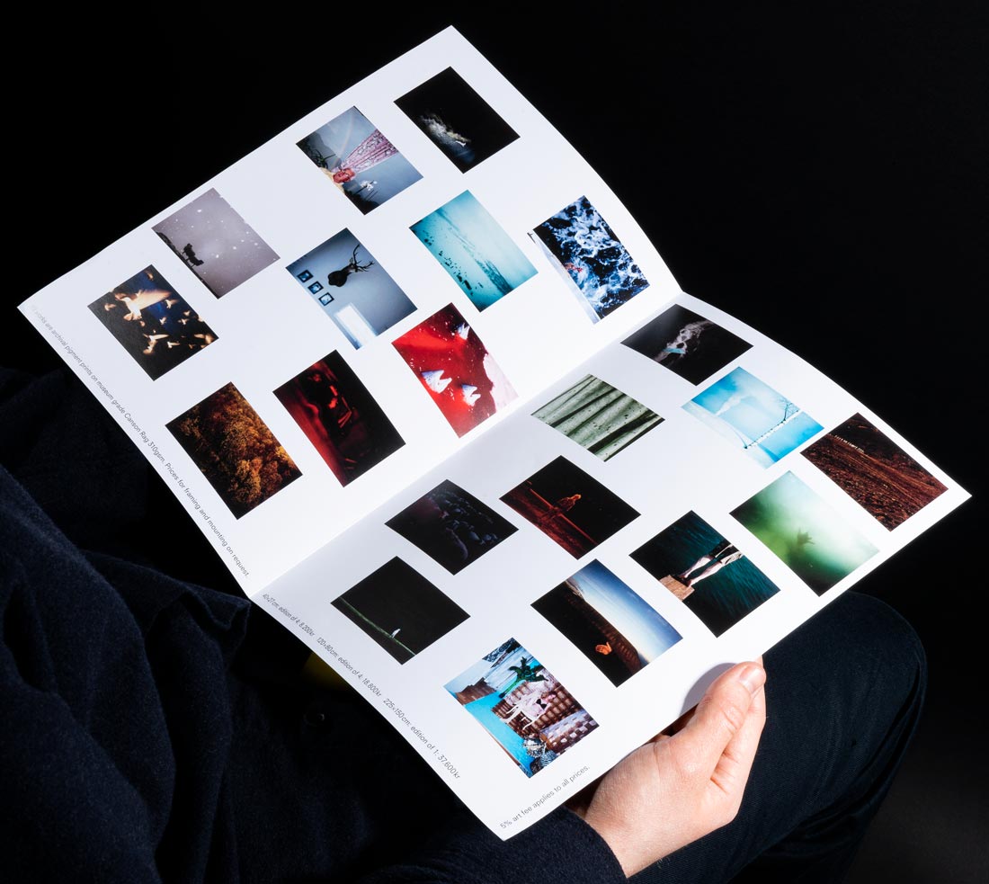
🫒🫒In order to generate image content 🏞 for UNTO we kitted out the Unto harvesting crew with a bag💰of disposable cameras 🎞 and told them to shoot whatever 🔫 – which they excelled at 👏This is the first photo zine📗in a future series📚giving an insight into the production of the first batch of 🫒olive oil🛢 and farm life in Tuscany generally 🚜 Included with every online order!🌐🛒 [more]
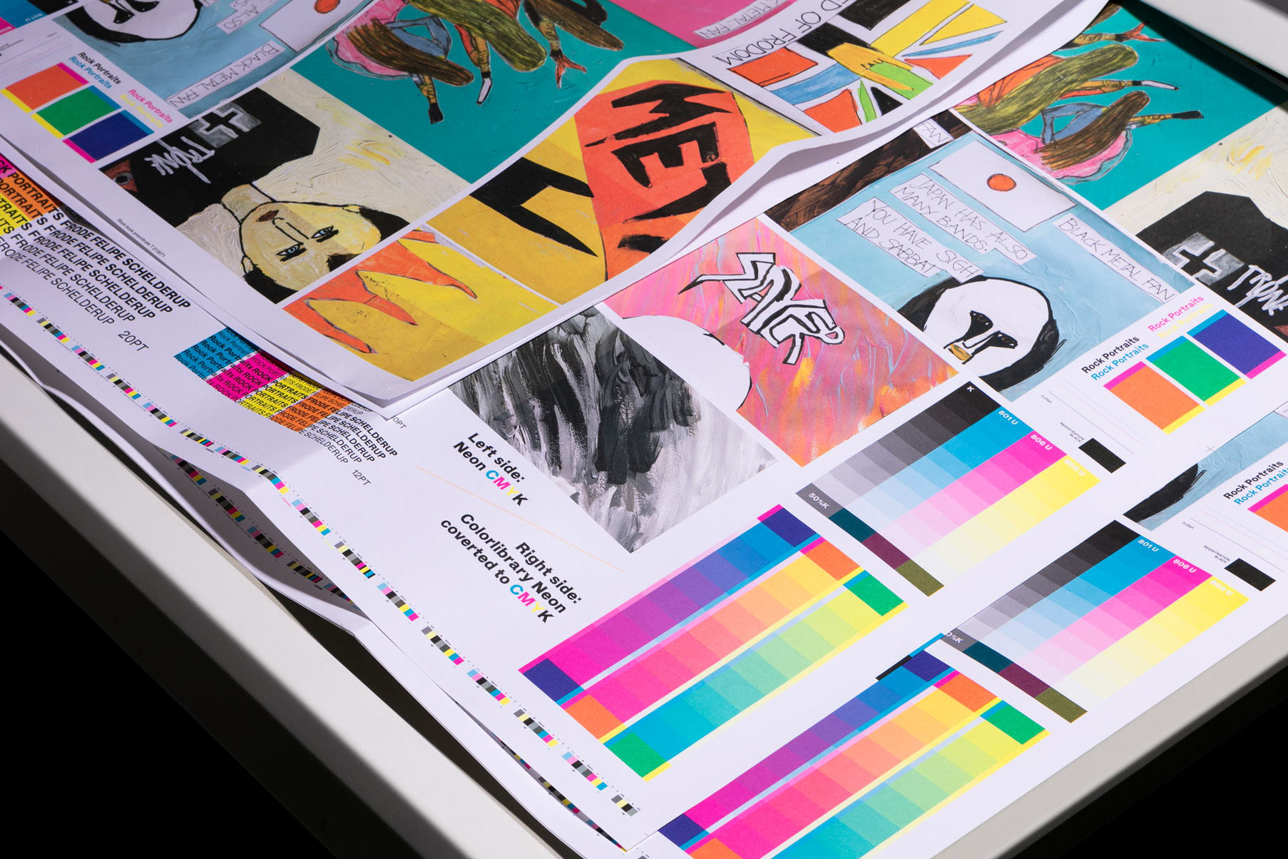
👀secret work in progress👀🤘proofing some neon images 🕯 for upcoming artist book with Sæter Jørgensen Contemporary ✝️ 🤘for artist Frode Felipe Schelderup 🔥⛪️🔥
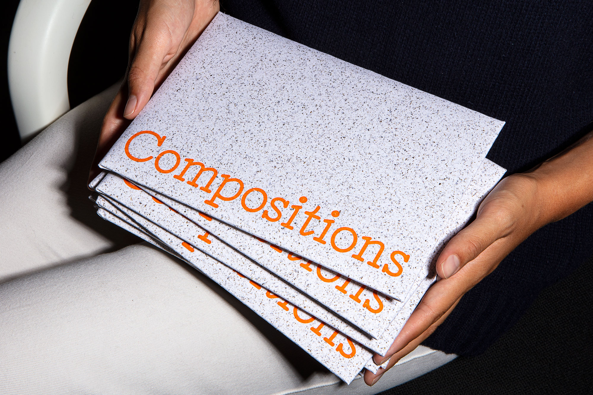
COMPOSITIONS 🤹 Central Saint Martins commissioned us to design a welcome pack 👋 mailed out 💌 to the 2021 cohort in anticipation of their arrival. The envelopes, made from NOTPLA Seaweed Paper 🍙 (world first‼️), contains an 👉 information/inspiration booklet 👉 a card with prompts inspired by Brian Eno’s Oblique Strategies 👉 and a sketchbook. 📦 edition of 4,000 📦 all produced locally by small, independent businesses 🏭 [more]
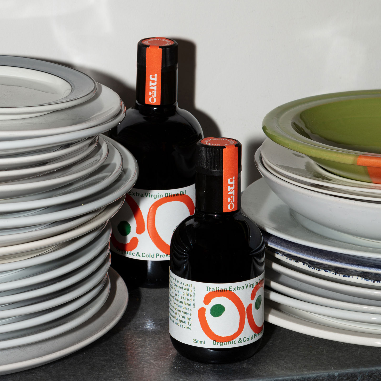
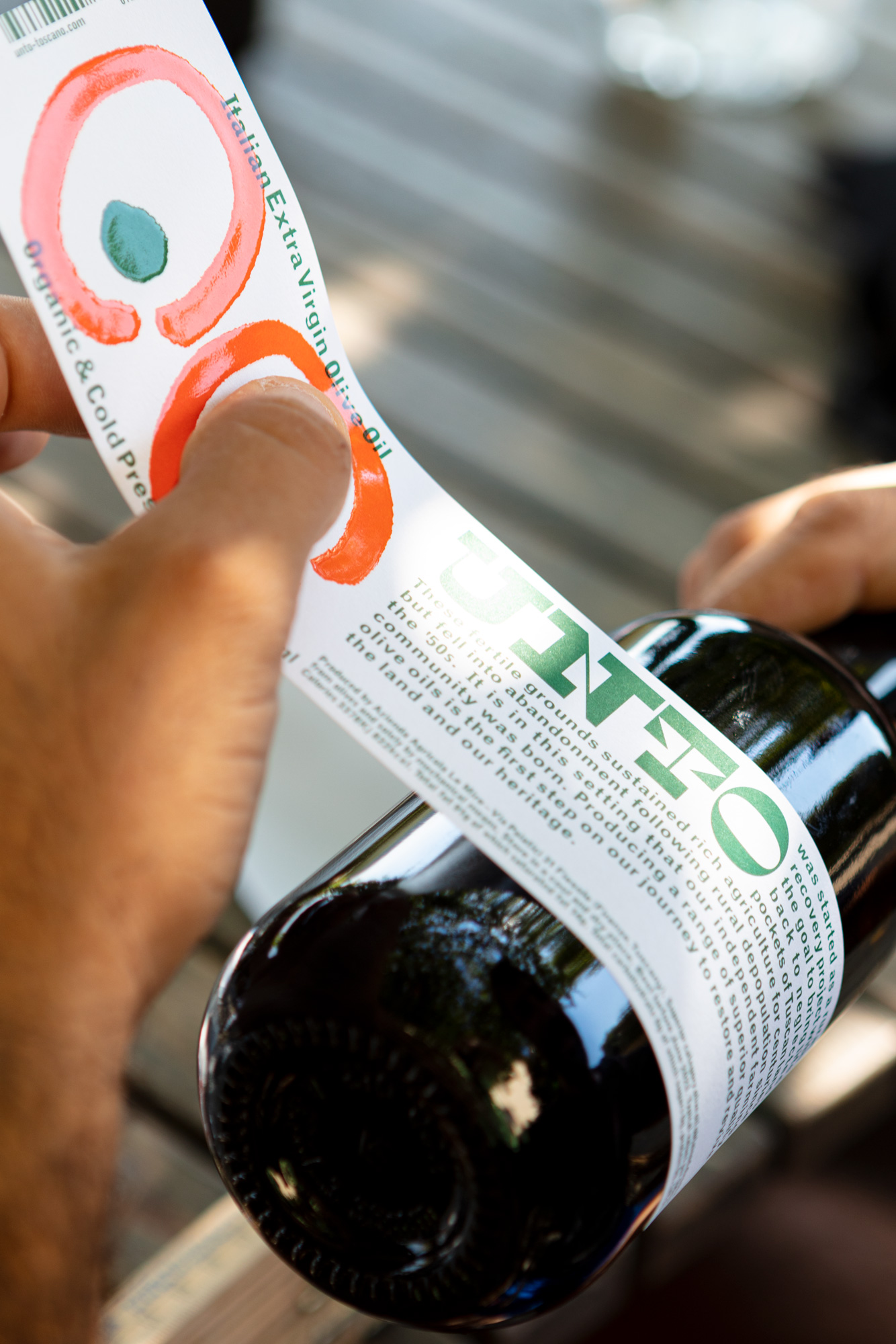
🫒 UNTO 🫒 The labels for the first batch of this delicious olive oil are printed on greaseproof paper in Pantone 021 🍊& 349 🥬 with a succulent layer of silkscreened translucent ink over the top and hand applied by the Unto crew 🧑🌾👨🎨👨🔧👩🔬🧑🍳 The bottles are hitting deli shelves 🛒 mailboxes 📦 and bruschettas 🍅🥖 all over London and the world as we speak 🫒🌏 [more]
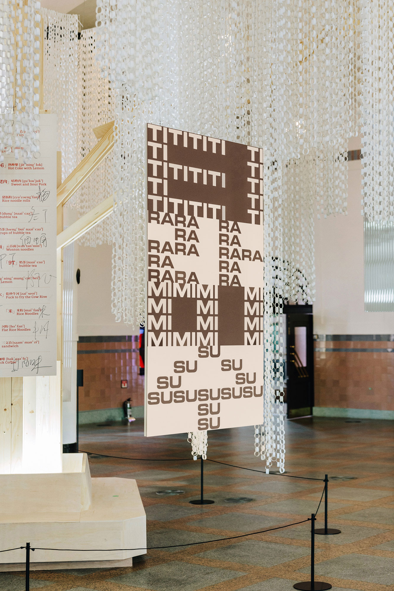
티라미수 🤎🤍 TIRAMISU: Our 2m tall 📐dual language 🧐 luck-bringing 🤞performative sound poem 👯♂️ and bujeok for Typojanchi in Seoul, which represents a series of separate but connected meanings and events connecting our personality, history, experience, and æsthetic to tiramisu 🤎🤍 [more]
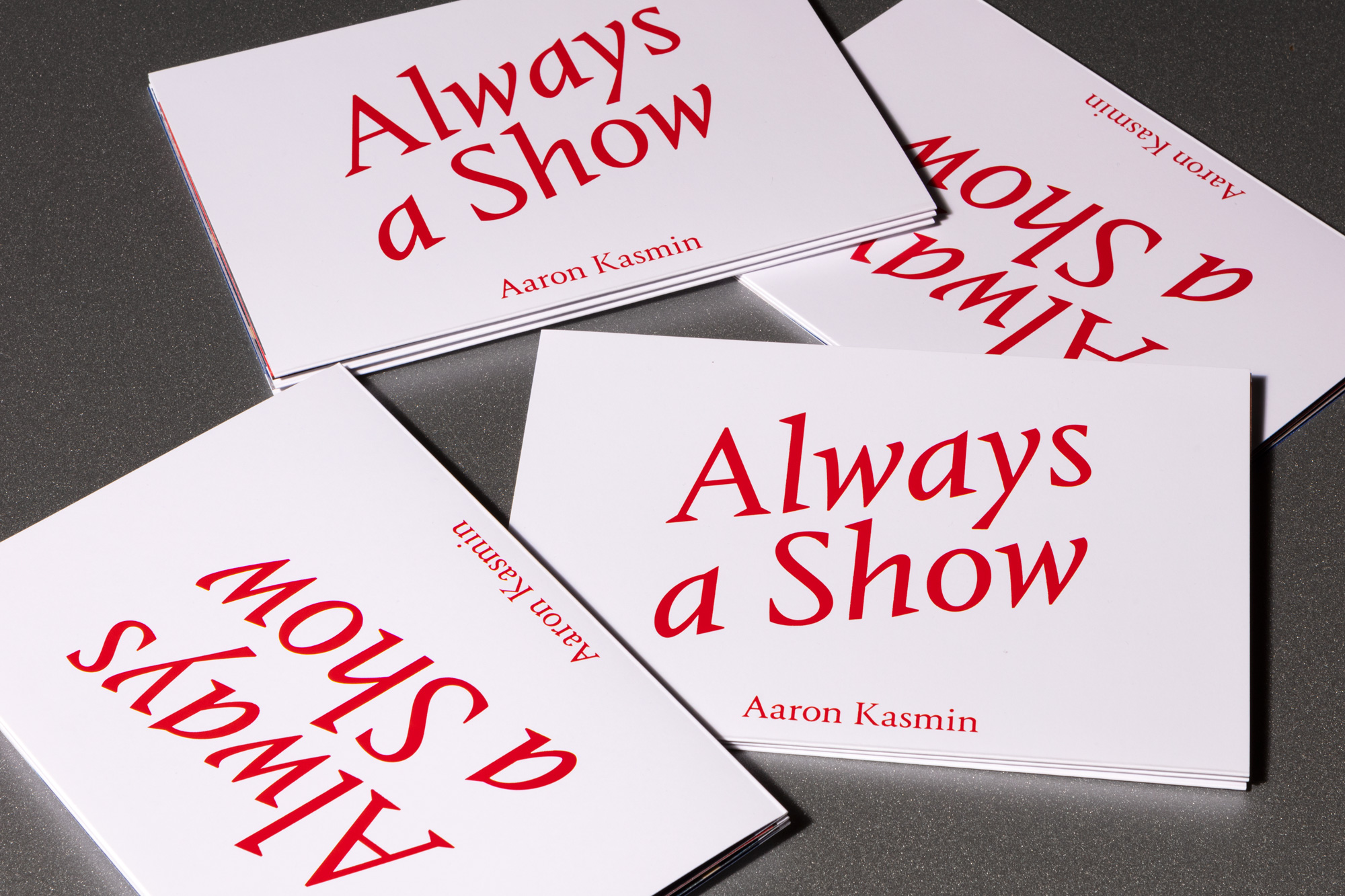
📩 Invite/booklet 🍸 concertina for Aaron Kasmin’s show at Sims Reed Gallery, London.
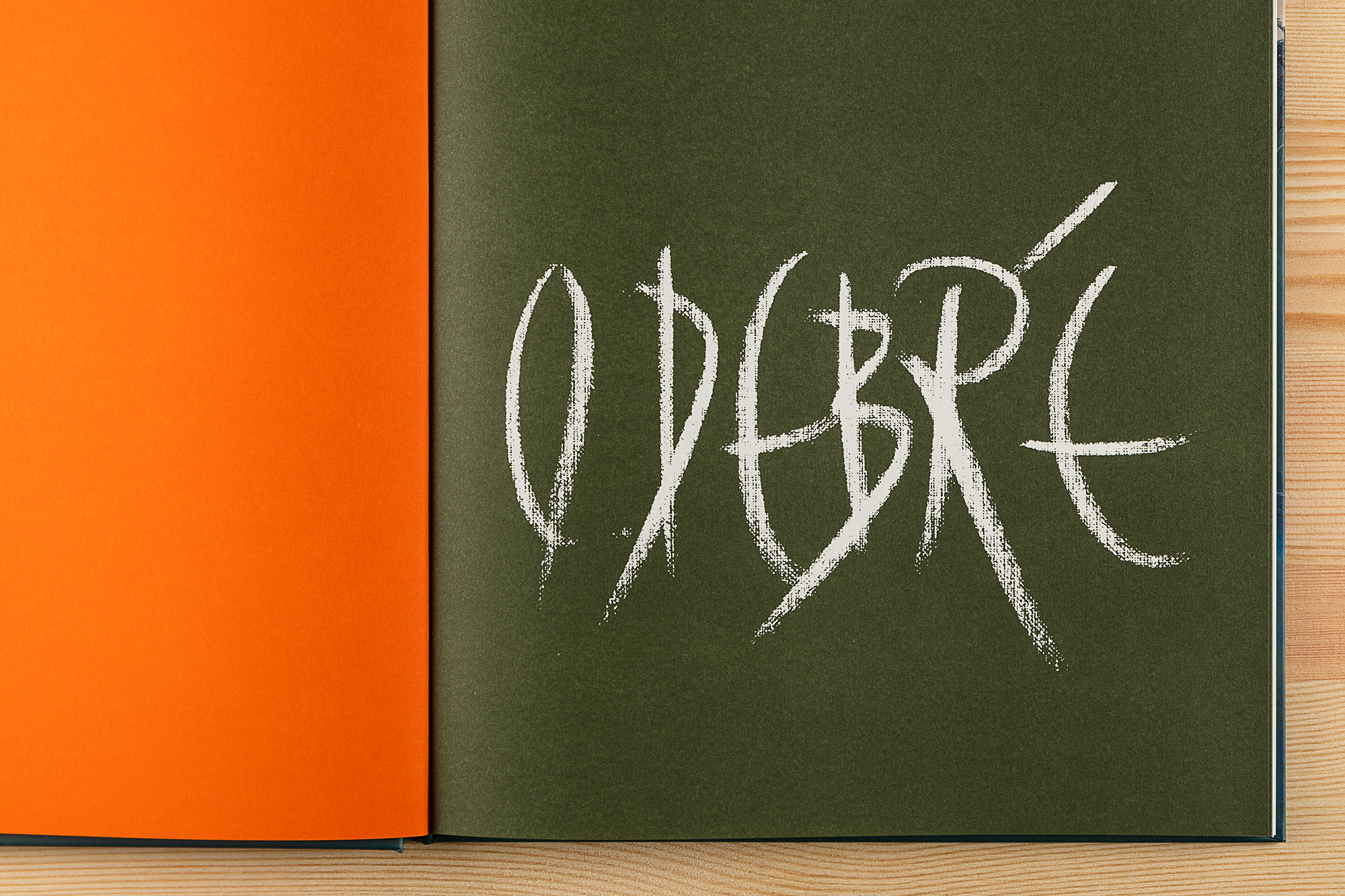
New catalog for ‘Olivier Debré: Fervent Abstraction’at Estorick Collection 📙 The catalog fames the first major show of the artist’s work in the UK in 44 years, bringing together some 30 oils and works on paper, including 16 of Debré’s large-scale paintings 👨🎨
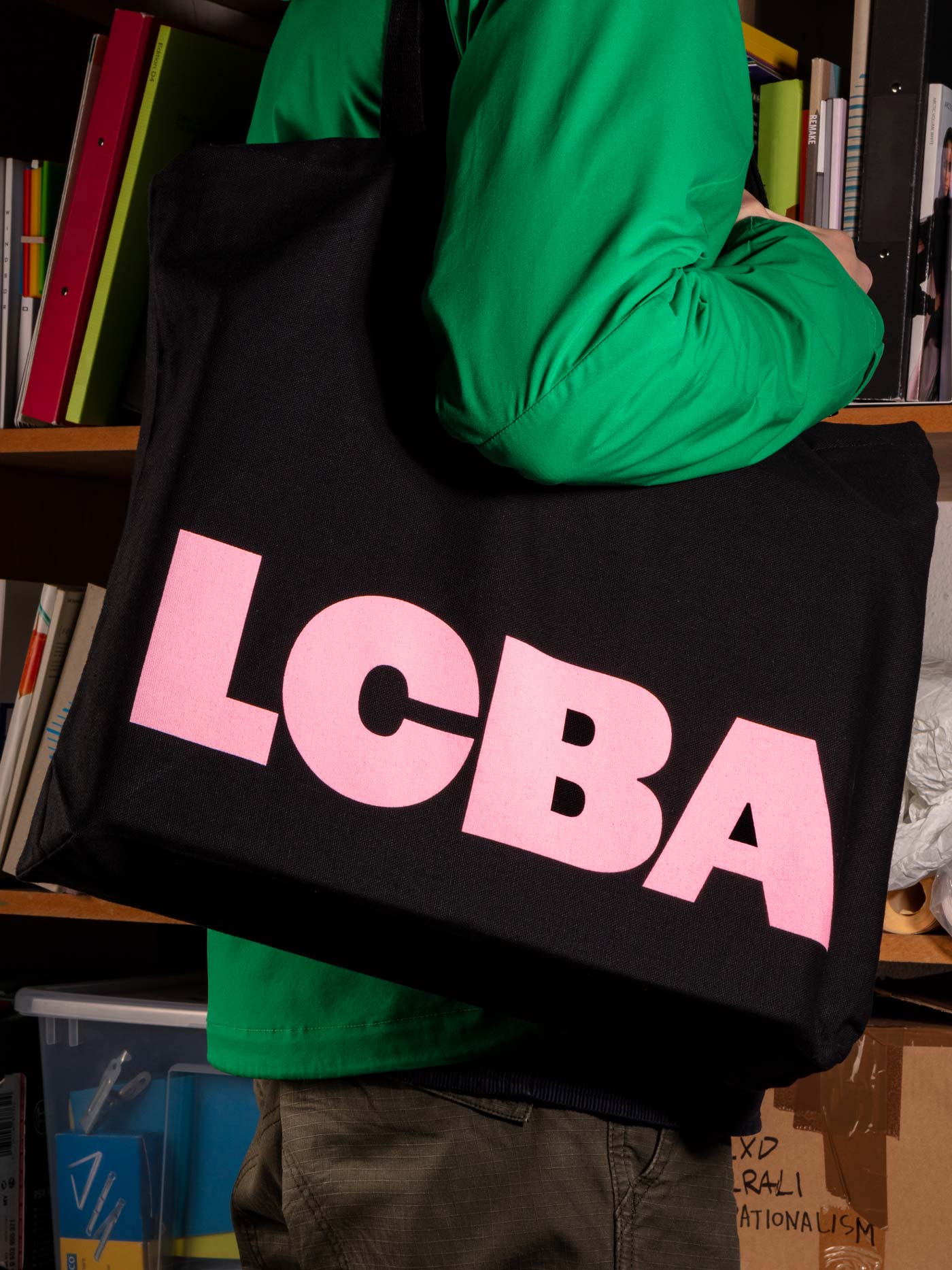
Our identity for the London Centre for Book Arts has been developing over the course of a year, a dialogic process which ensures a seamless integration of identity elements and applications with the needs of LCBA. This collaborative approach allows us to shape how the designs are taken up and used in real time, with Bergini initially overseeing everything from naming and brand strategy to materials and printing, giving the LCBA a more tailored and future proof identity.
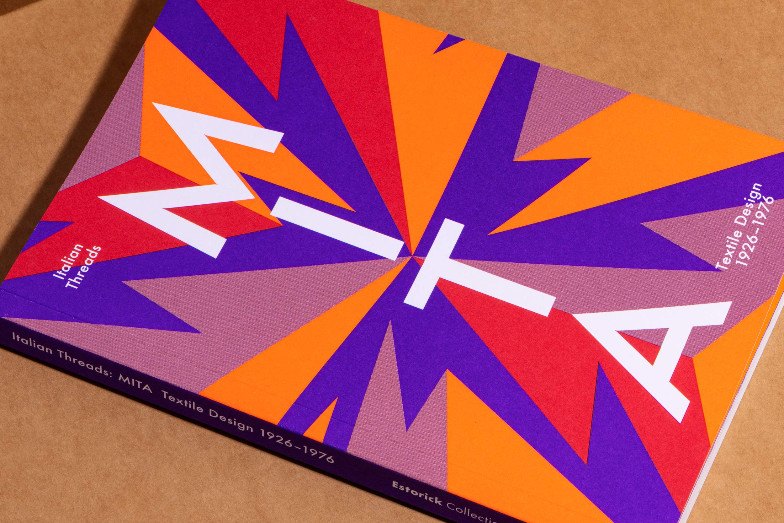
Catalog for Estorick Collection: MITA (1926–1976) was a celebrated Italian textile firm which earned its reputation by collaborating with some of Italy's most talented artists and designers – Gio Ponti, Fortunato Depero, Arturo Martini, Emanuele Luzzati, Arnaldo Pomodoro, Giò Pomodoro, and Ettore Sottsass Jr. among them.
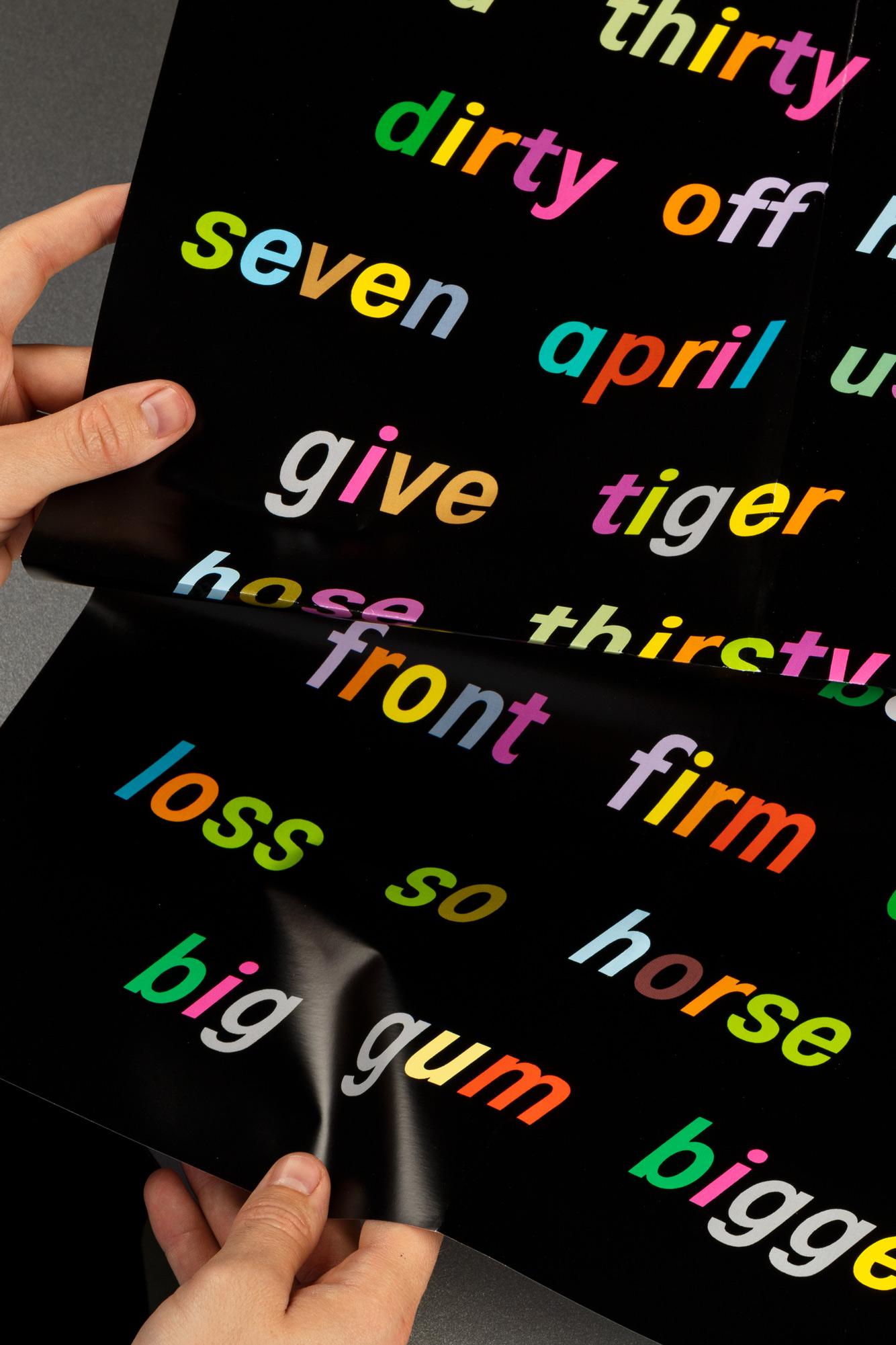
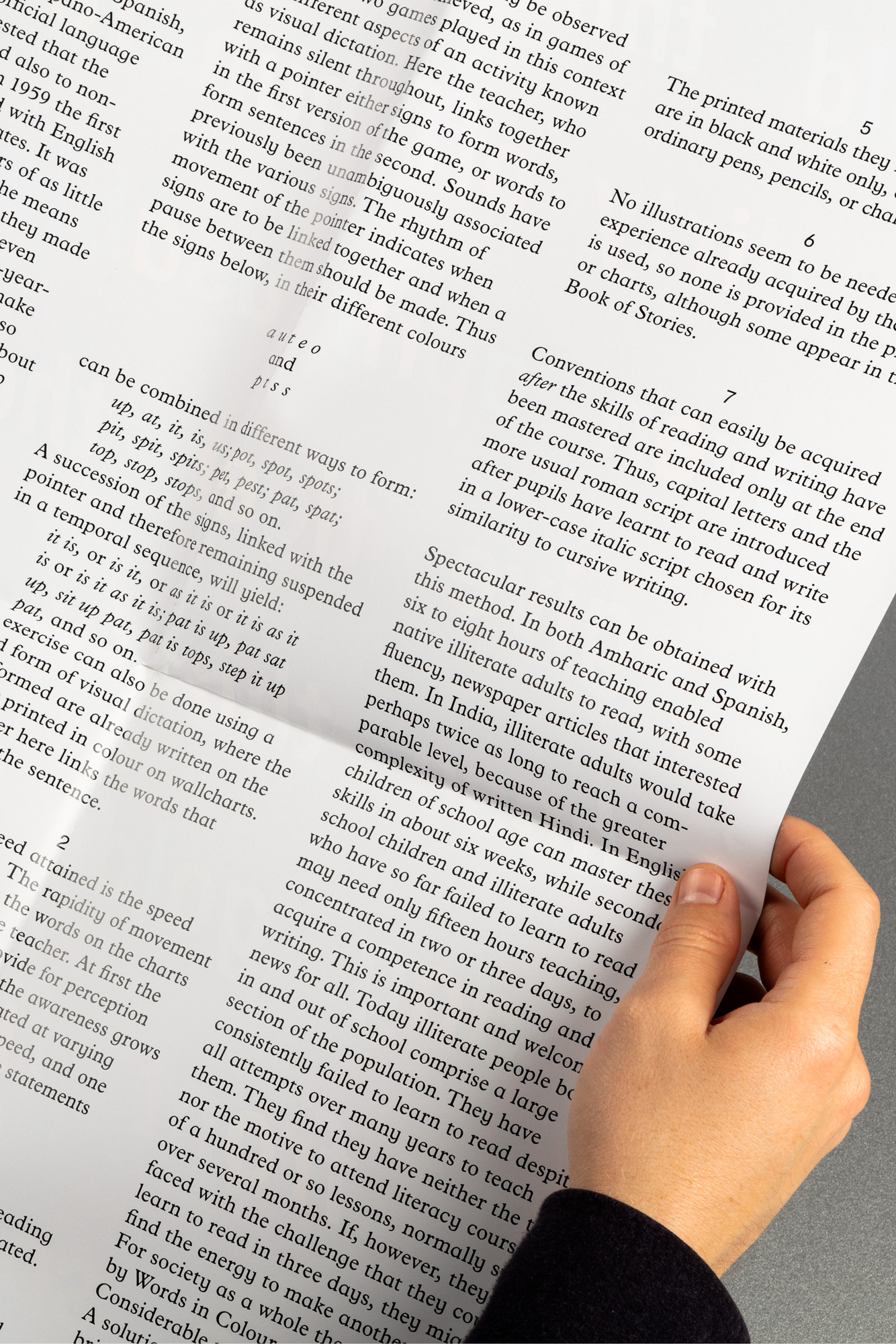
Output 002: Words in Colour is a 1:1 reproduction of Wallchart No.9 by C. Gattegno, published in Penrose Annual 58, 1965 as an illustration to an article outlining new ways of teaching illiterate people to read. The article itself is printed on the back. Words in Colour is the second in a new series of Outputs from Studio Bergini. [Buy]
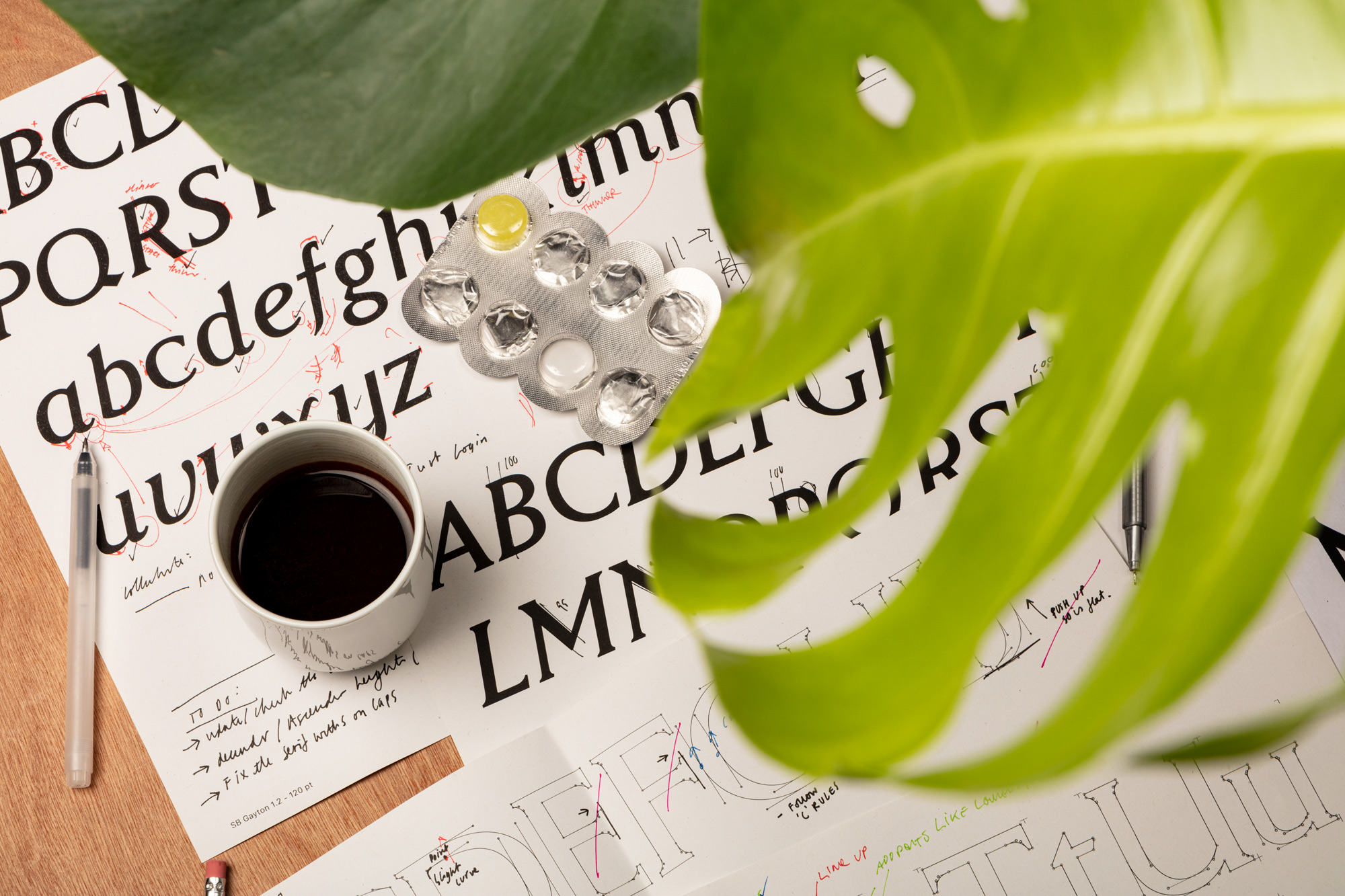
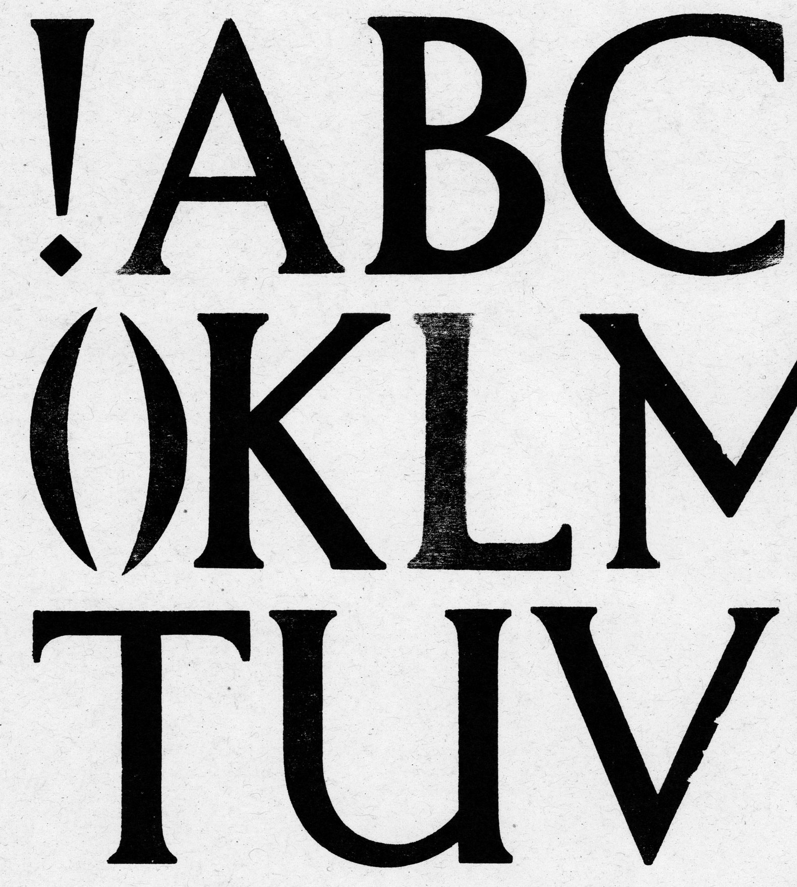
Typeface revival in progress. SB Gayton is drawing from Frank Gayton's ‘Gayton’ typeface for Frederick Ullmer and H.W. Caslon, based on his own commercial poster lettering.
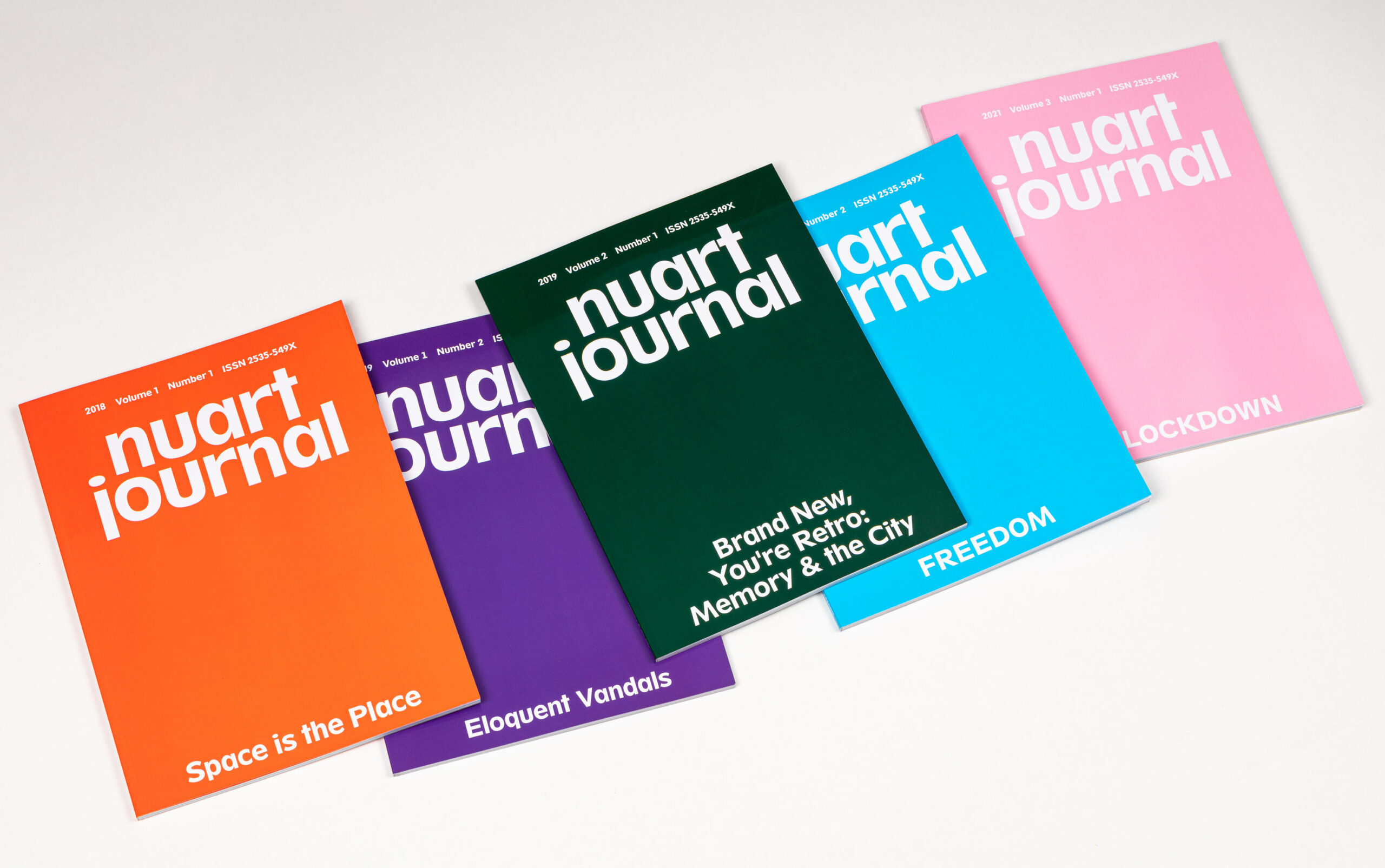
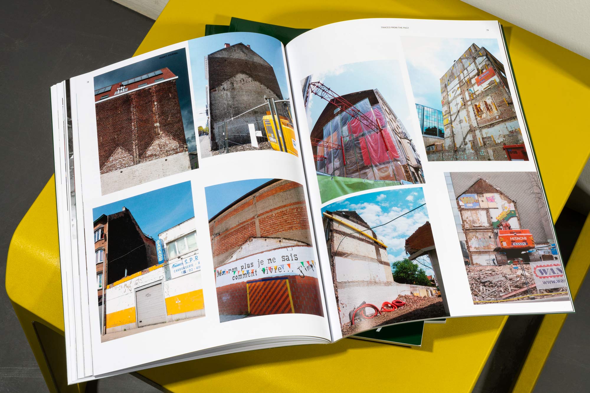
Nuart Journal is a biannual publication currently in its 5th issue. With a focus on Street art, activism, and art in the public sphere, it's published by Nuart and recognised as the leading academic journal in its field. Issue 6 coming soon!
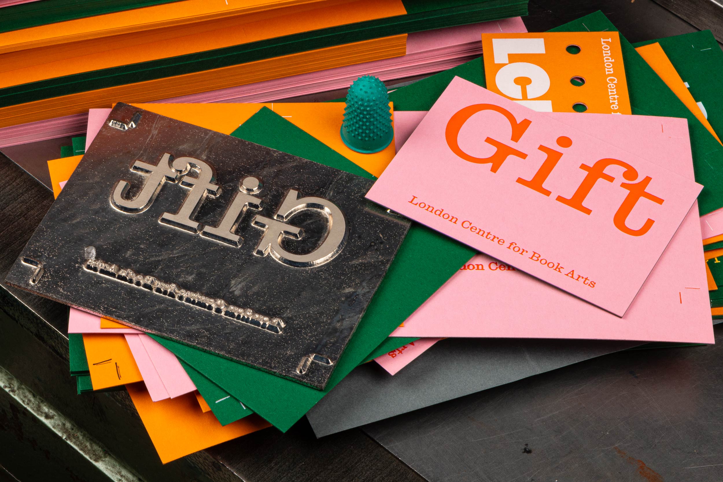
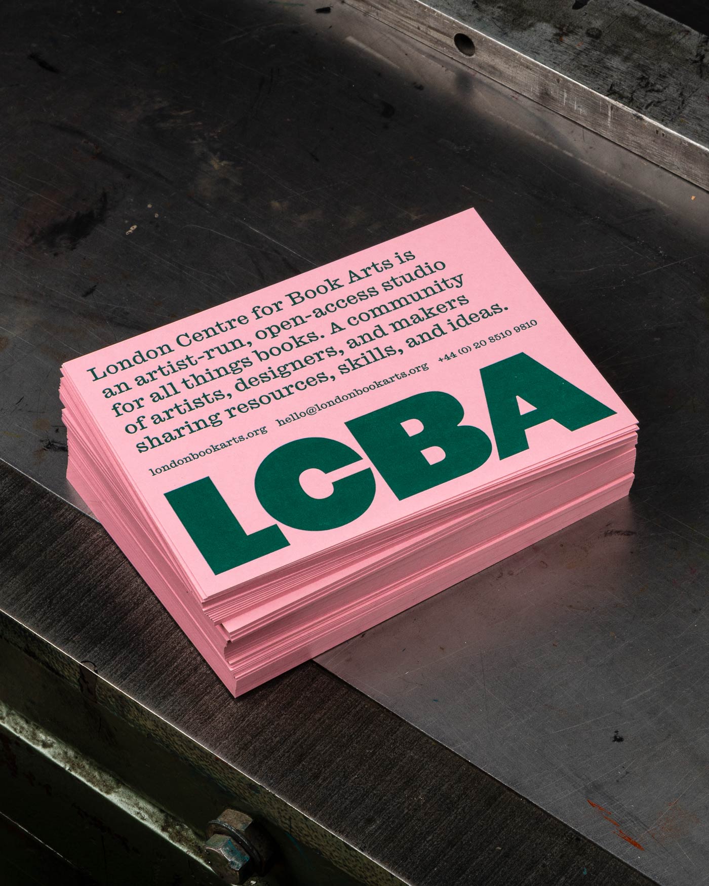
A key part of our brand strategy for London Centre for Book Arts was to have all advertising material and ephemera produced in-house using high-end printing techniques – a way to show off the amazing facilities available in the workshop. Gift cards as seen during production.
[WIP] Our typeface SB Spartan, originally developed for Nuart Festival, is expanding into a full font family. The typeface is based on Spartan Classified, a Futura knock-off from 1939 by Mergenthaler Linotype and American Type Founders, designed for classified newspaper ads.
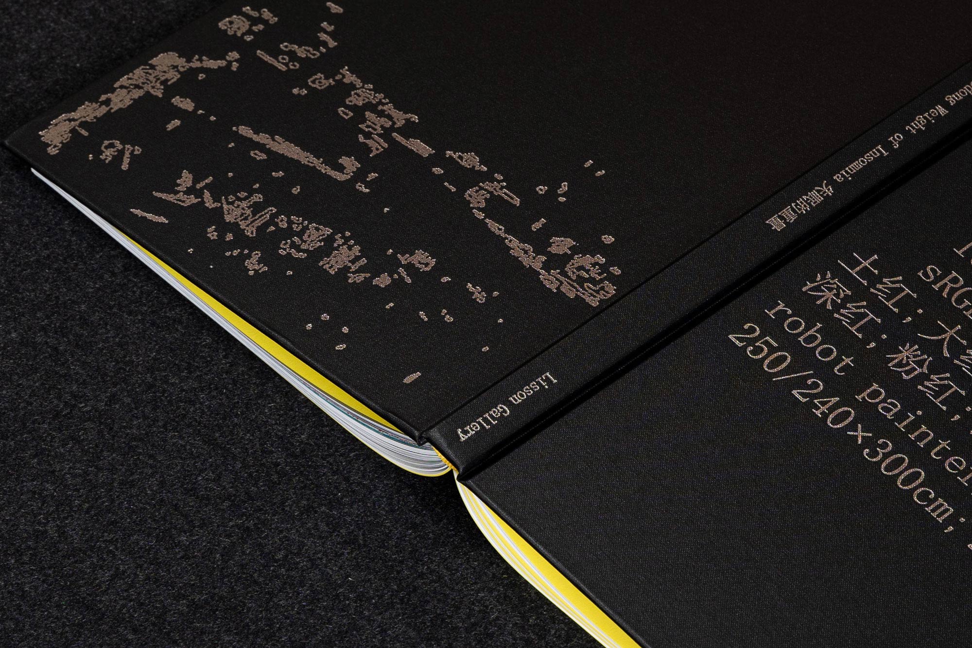
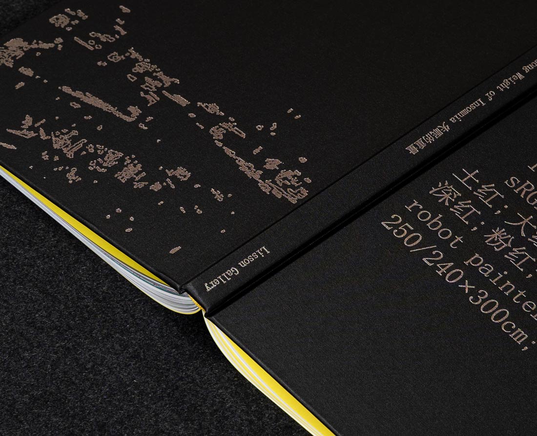
Catalogue for Liu Xiaodong's exhibition ‘Weight of Insomnia’ at Lisson Gallery (London), a book which aims to reflect the slow, relentless, observing work of a painting surveillance machine. The bilingual book is typeset in 12pt SimSun (ZHONGYI Electronics Co.), a standard Chinese-first mono serif typeface. Silver ink is used extensively throughout this book, a reference to the glow of the screen and the metallic machine, suspending the book in a constant flux between light and dark. Process images were printed in 5 colours using a CMYK+Silver profile.
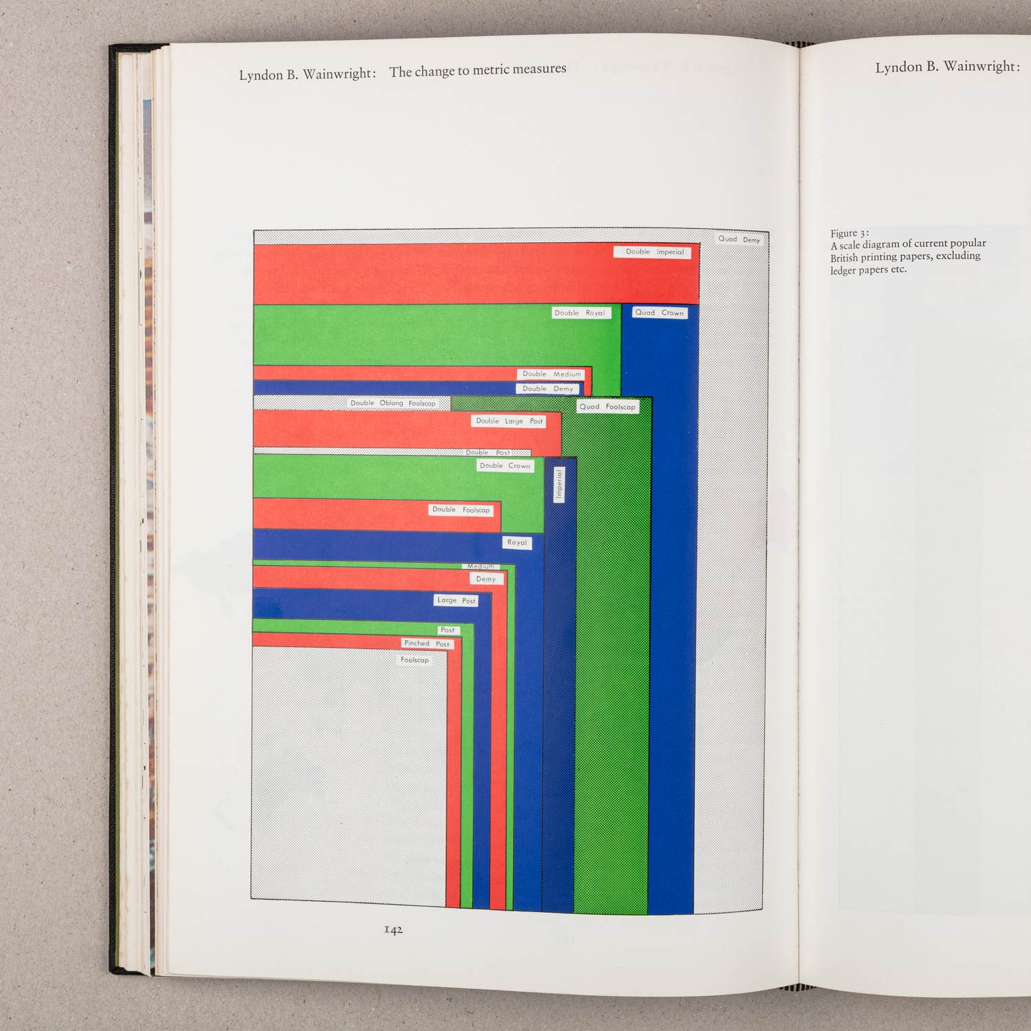
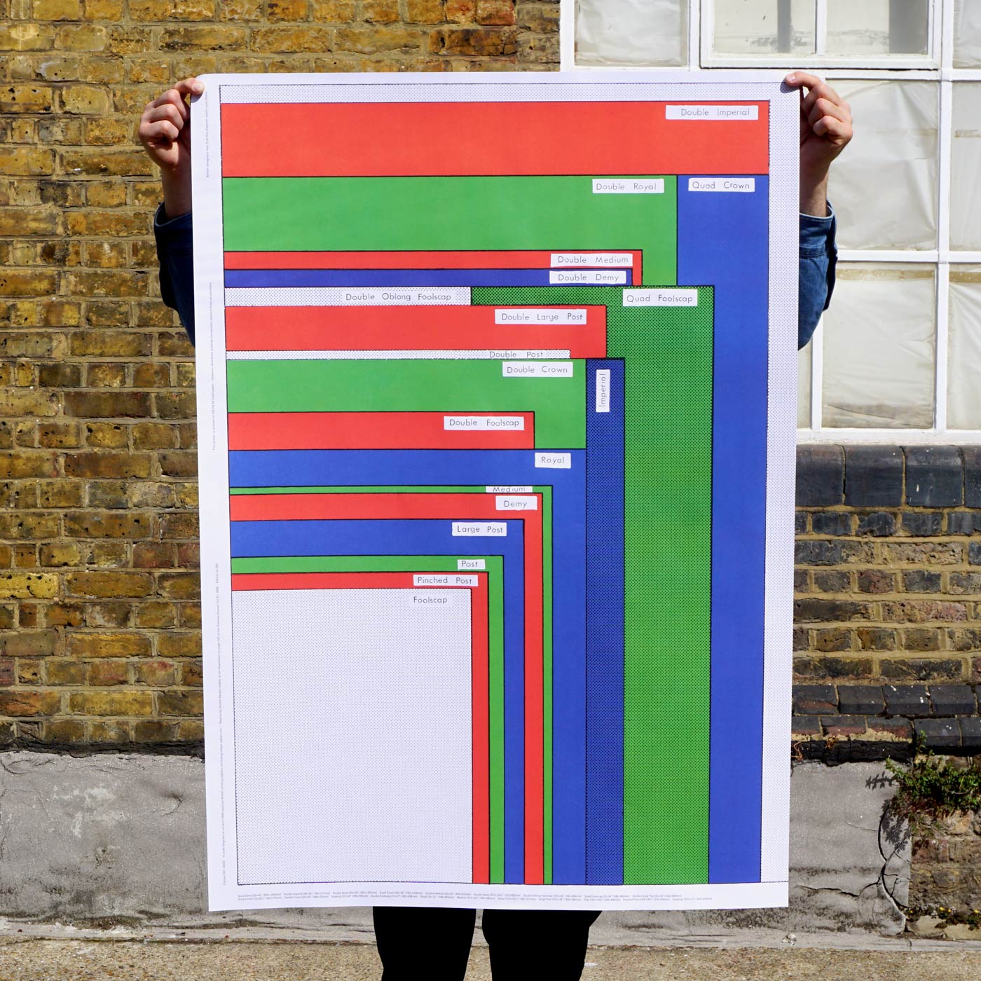
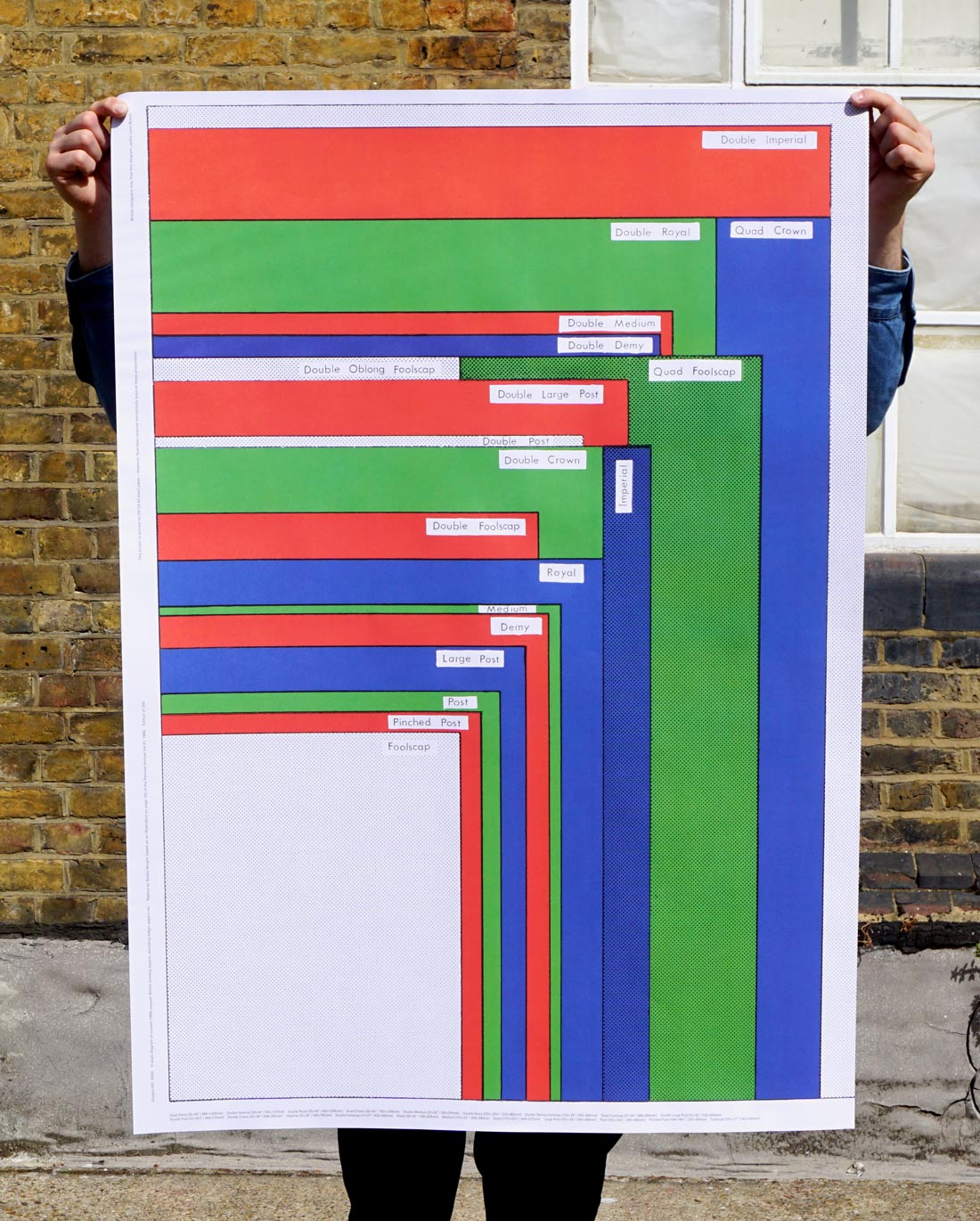
Output 001: Imperial Wallchart is the first in a new series of Outputs from Studio Bergini. The wall chart is a true reproduction of a diagram printed in Penrose Annual 1968 (enlarged to full size from an original scale of 1:5·4) and details some of the most popular paper sizes in Britain prior to switching to the Metric system. This poster is a fundraising edition for London Centre for Book Arts – in whose library the chart was initially discovered – and is available from their shop [BUY]

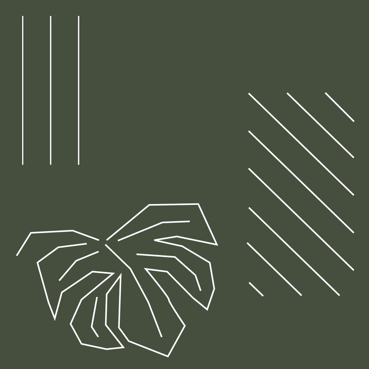
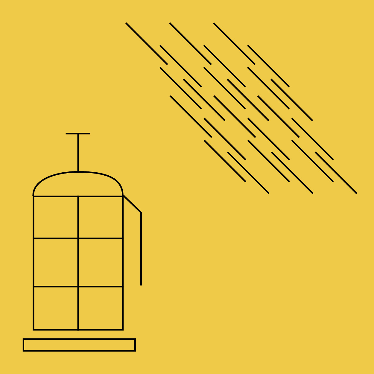

Set of illustrations for a Japanese-inspired café (kissa 喫茶) in Norway, which unfortunately fell through.
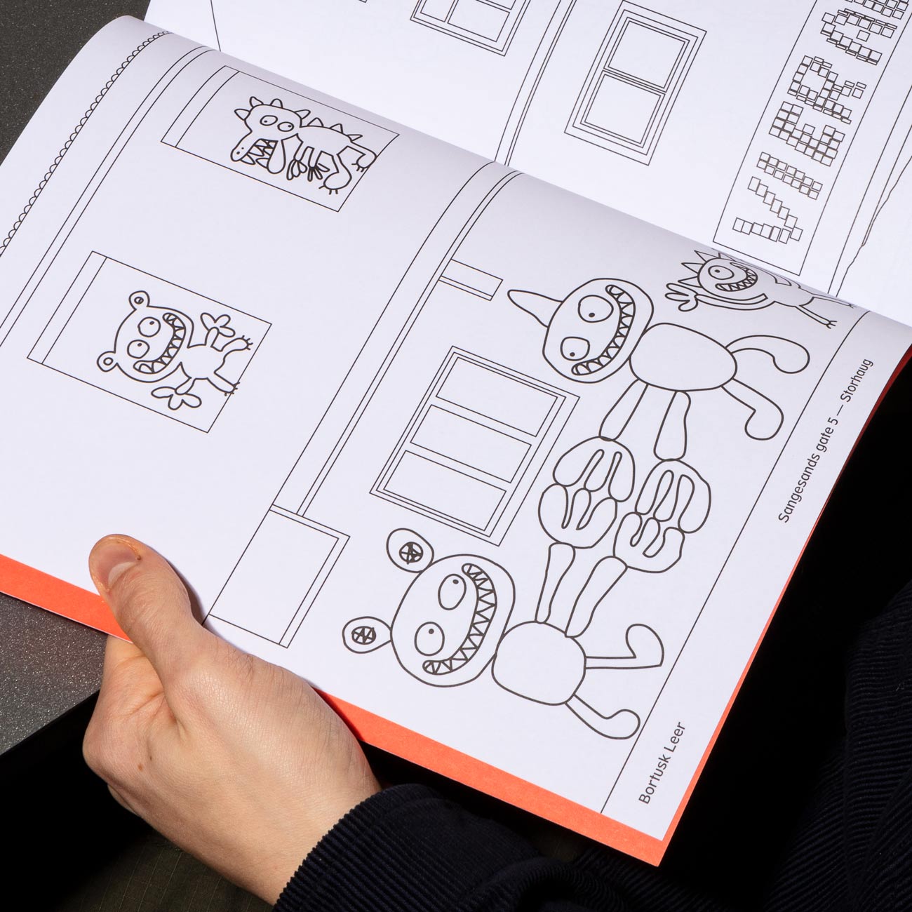
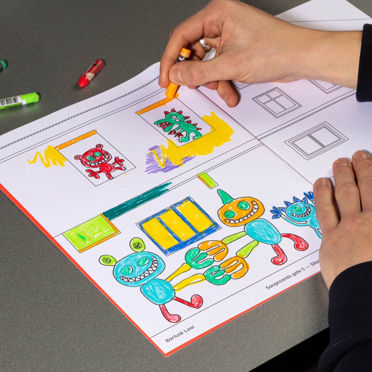
The Nuart Colouring Book is a part of Nuart's Lockdown Edition. The book features traced street art works taken from Stavanger East, aiming to give kids and families in lockdown some indoor and outdoor activities, and giving them a tool for exploring art in their own neighbourhood. All proceeds from sales cover printing costs for giving away books to local organisations for disadvantaged youths.
We are a London-based practice working with businesses, and cultural institutions doing graphic design, typography, and art direction. We've recently worked with Tate, Camden Art Centre, Charles Dickens Museum, Estorick Collection, Lisson Gallery, London Centre for Book Arts, Nuart Festival, Royal College of Art, Central Saint Martins, and Science Practice.
These days, around London, you might see our colourful Tate Collective campaign 🎨 for the 🟠 Lubaina Himid 🟢 exhibition currently on at Tate Modern 🌀 with the Tate design studio.
Bice Lazzari was an artist from Venice who made a significant contribution to twentieth-century Italian art, yet has remained largely unknown outside her native country. The cover graphic was made by overprinting her painting “Acrylic n.5” twice in two colours at 180° rotation, generating a new abstract composition. [more]
🫒🫒In order to generate image content 🏞 for UNTO we kitted out the Unto harvesting crew with a bag💰of disposable cameras 🎞 and told them to shoot whatever 🔫 – which they excelled at 👏This is the first photo zine📗in a future series📚giving an insight into the production of the first batch of 🫒olive oil🛢 and farm life in Tuscany generally 🚜 Included with every online order!🌐🛒 [more]
👀secret work in progress👀🤘proofing some neon images 🕯 for upcoming artist book with Sæter Jørgensen Contemporary ✝️ 🤘for artist Frode Felipe Schelderup 🔥⛪️🔥
COMPOSITIONS 🤹 Central Saint Martins commissioned us to design a welcome pack 👋 mailed out 💌 to the 2021 cohort in anticipation of their arrival. The envelopes, made from NOTPLA Seaweed Paper 🍙 (world first‼️), contains an 👉 information/inspiration booklet 👉 a card with prompts inspired by Brian Eno’s Oblique Strategies 👉 and a sketchbook. 📦 edition of 4,000 📦 all produced locally by small, independent businesses 🏭 [more]
티라미수 🤎🤍 TIRAMISU: Our 2m tall 📐dual language 🧐 luck-bringing 🤞performative sound poem 👯♂️ and bujeok for Typojanchi in Seoul, which represents a series of separate but connected meanings and events connecting our personality, history, experience, and æsthetic to tiramisu 🤎🤍
🫒 UNTO 🫒 The labels for the first batch of this delicious olive oil are printed on greaseproof paper in Pantone 021 🍊& 349 🥬 with a succulent layer of silkscreened translucent ink over the top and hand applied by the Unto crew 🧑🌾👨🎨👨🔧👩🔬🧑🍳 The bottles are hitting deli shelves 🛒 mailboxes 📦 and bruschettas 🍅🥖 all over London and the world as we speak 🫒🌏 [more]
📩 Invite/booklet 🍸 concertina for Aaron Kasmin’s show at Sims Reed Gallery, London.
New catalog for ‘Olivier Debré: Fervent Abstraction’at Estorick Collection 📙 The catalog fames the first major show of the artist’s work in the UK in 44 years, bringing together some 30 oils and works on paper, including 16 of Debré’s large-scale paintings 👨🎨
Our identity for the London Centre for Book Arts has been developing over the course of a year, a dialogic process which ensures a seamless integration of identity elements and applications with the needs of LCBA. This collaborative approach allows us to shape how the designs are taken up and used in real time, with Bergini initially overseeing everything from naming and brand strategy to materials and printing, giving the LCBA a more tailored and future proof identity.
Catalog for Estorick Collection: MITA (1926–1976) was a celebrated Italian textile firm which earned its reputation by collaborating with some of Italy's most talented artists and designers – Gio Ponti, Fortunato Depero, Arturo Martini, Emanuele Luzzati, Arnaldo Pomodoro, Giò Pomodoro, and Ettore Sottsass Jr. among them.
Output 002: Words in Colour is a 1:1 reproduction of Wallchart No.9 by C. Gattegno, published in Penrose Annual 58, 1965 as an illustration to an article outlining new ways of teaching illiterate people to read. The article itself is printed on the back. Words in Colour is the second in a new series of Outputs from Studio Bergini. [Buy]
Typeface revival in progress. SB Gayton is drawing from Frank Gayton's ‘Gayton’ typeface for Frederick Ullmer and H.W. Caslon, based on his own commercial poster lettering.
Identity for the Camden Art Centre's ‘The New Radical’, an online series of conversations between Arts of the Working Class and contributing writers for Verso Books, discussing what the new radical means today. Speakers: Maya Goodfellow, Aaron Bastani, John Merrick, Alina Kolar...
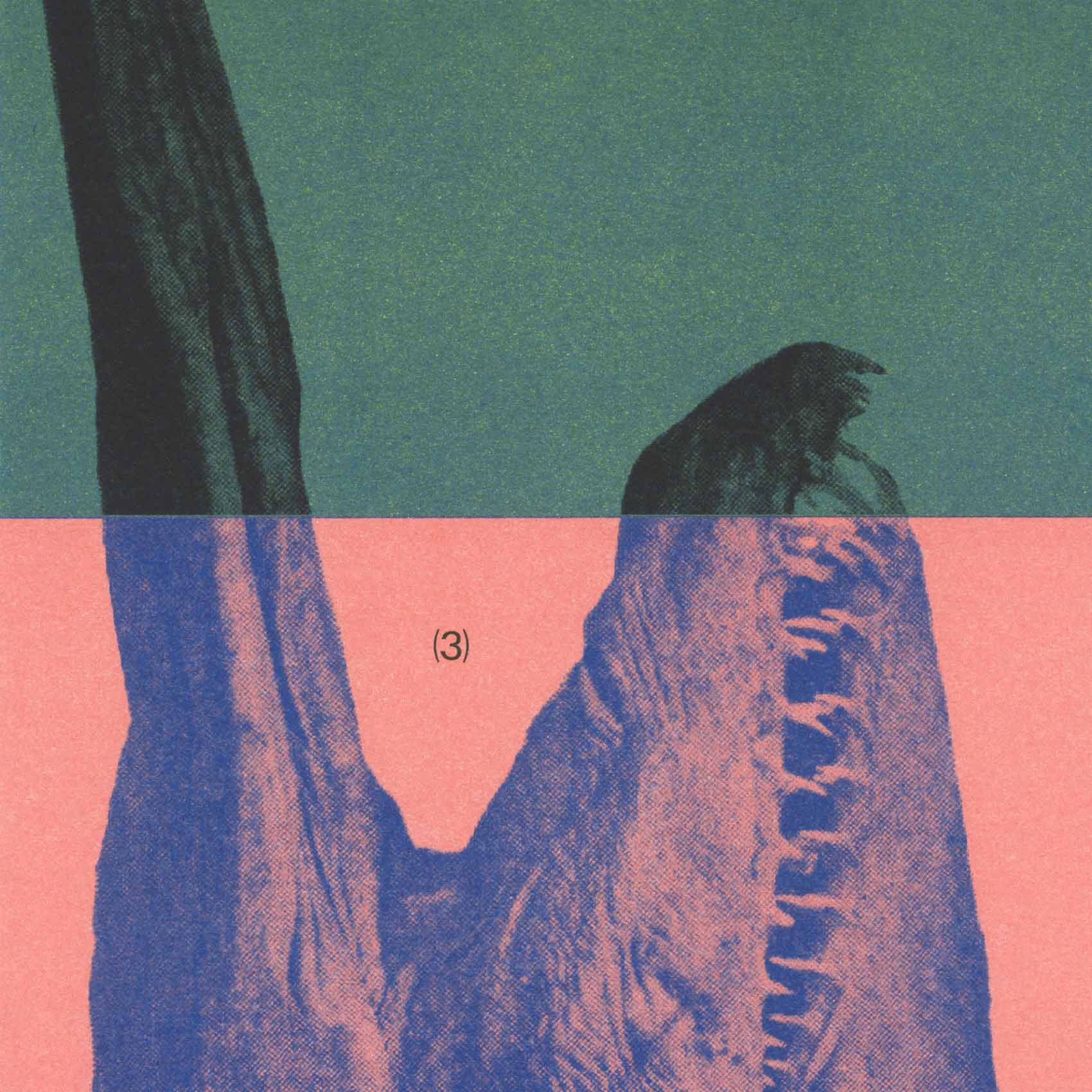
Nuart Journal is a biannual publication currently in its 5th issue. With a focus on Street art, activism, and art in the public sphere, it's published by Nuart and recognised as the leading academic journal in its field. Issue 6 coming soon!
A key part of our brand strategy for London Centre for Book Arts was to have all advertising material and ephemera produced in-house using high-end printing techniques – a way to show off the amazing facilities available in the workshop. Gift cards as seen during production. [more]
[WIP] Our typeface SB Spartan, originally developed for Nuart Festival, is expanding into a full font family. The typeface is based on Spartan Classified, a Futura knock-off from 1939 by Mergenthaler Linotype and American Type Founders, designed for classified newspaper ads.

Set of illustrations for a Japanese-inspired café (kissa 喫茶) in Norway, which unfortunately fell through.
The Nuart Colouring Book is a part of Nuart's Lockdown Edition. The book features traced street art works taken from Stavanger East, aiming to give kids and families in lockdown some indoor and outdoor activities, and giving them a tool for exploring art in their own neighbourhood. All proceeds from sales cover print costs for giving away books to local organisations for disadvantaged youths.