Liu Xiaodong: Weight of Insomnia, exhibition catalogue, Lisson Gallery, 2019
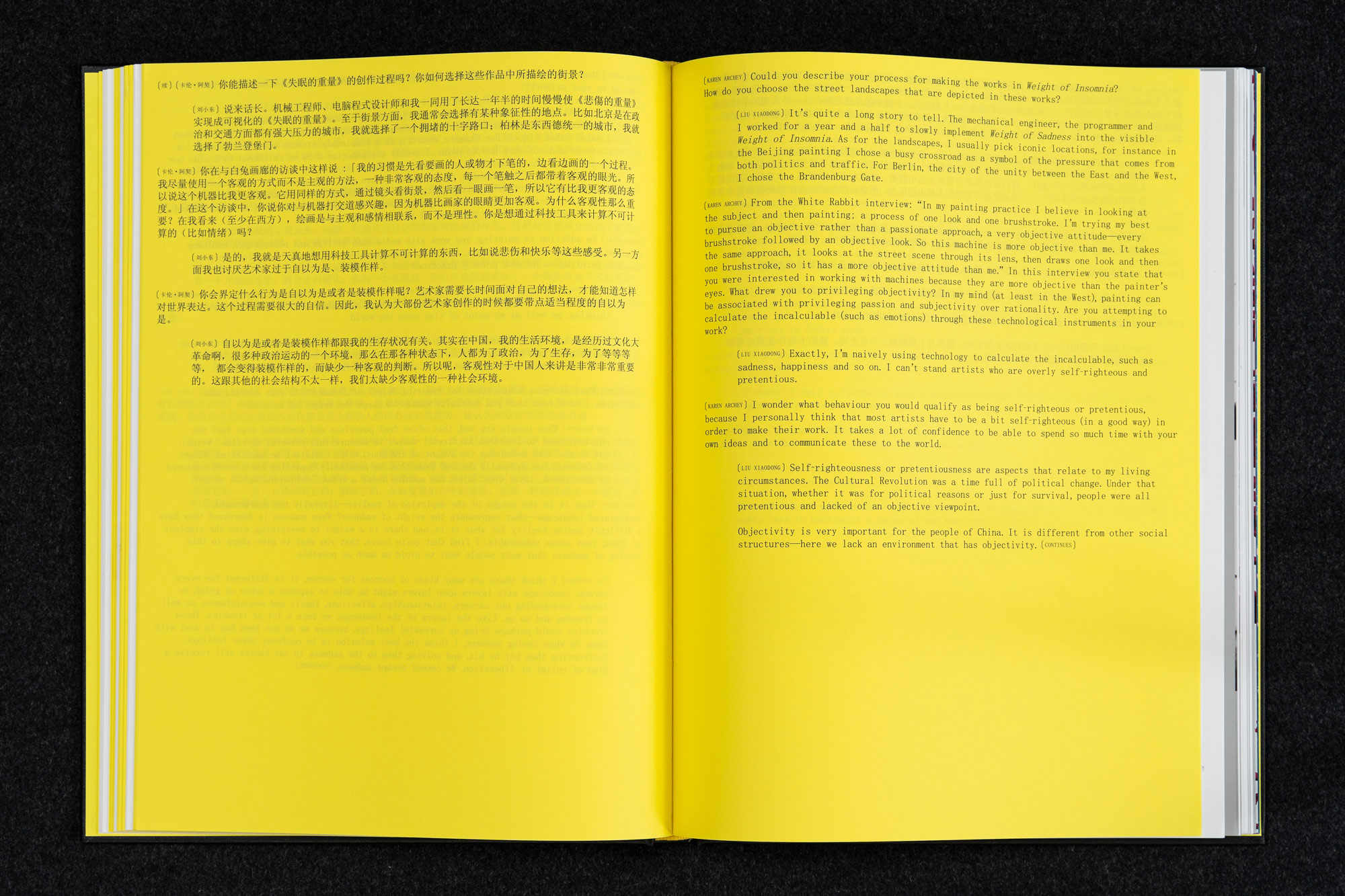
‘Liu Xiaodong: Weight of Insomnia’ is a catalog designed for Lisson Gallery London, which aims to reflect the slow, relentless, observing work of a painting surveillance machine.
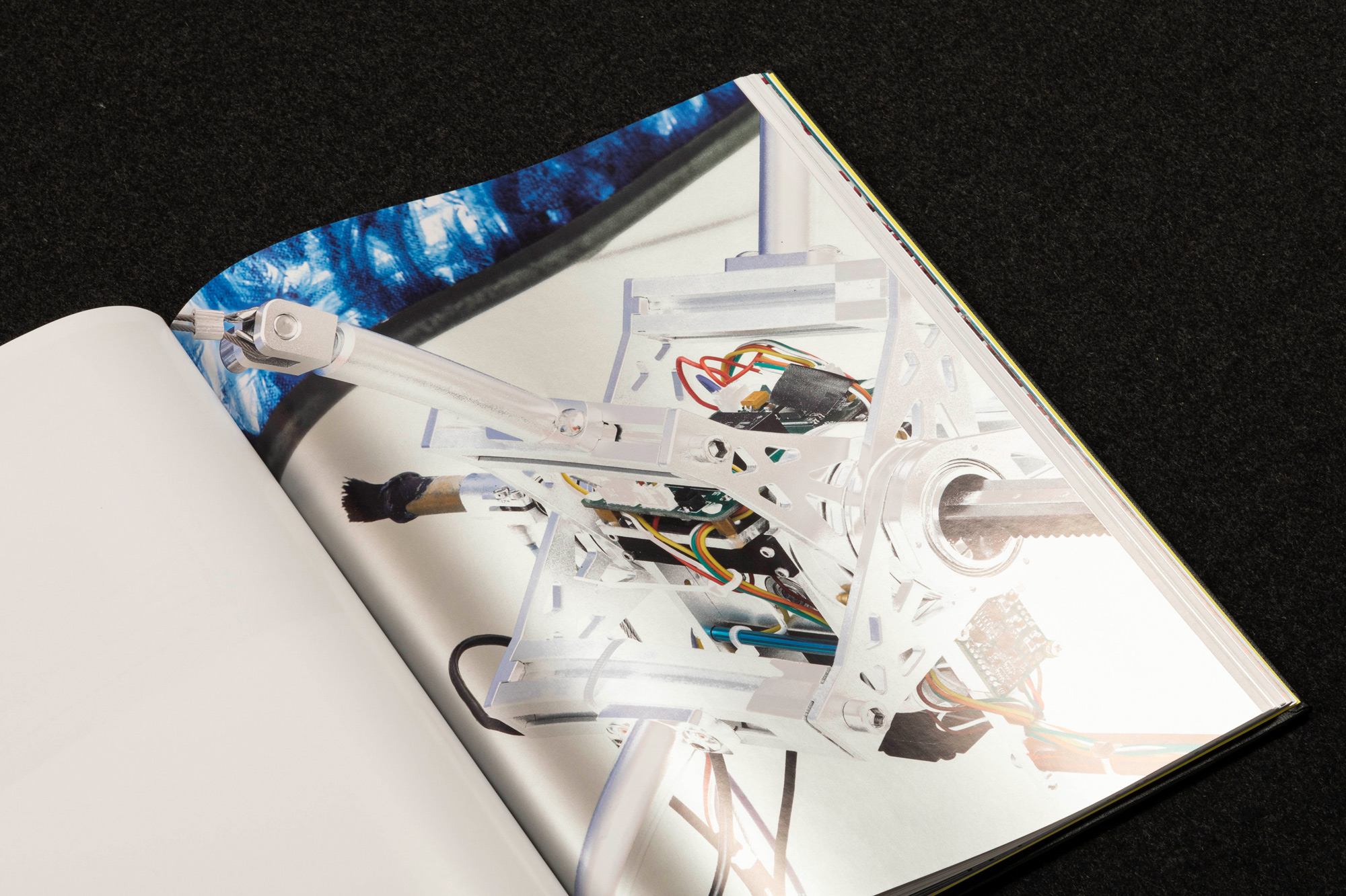
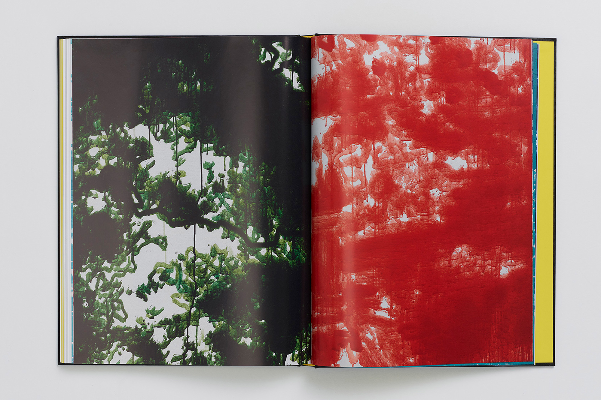
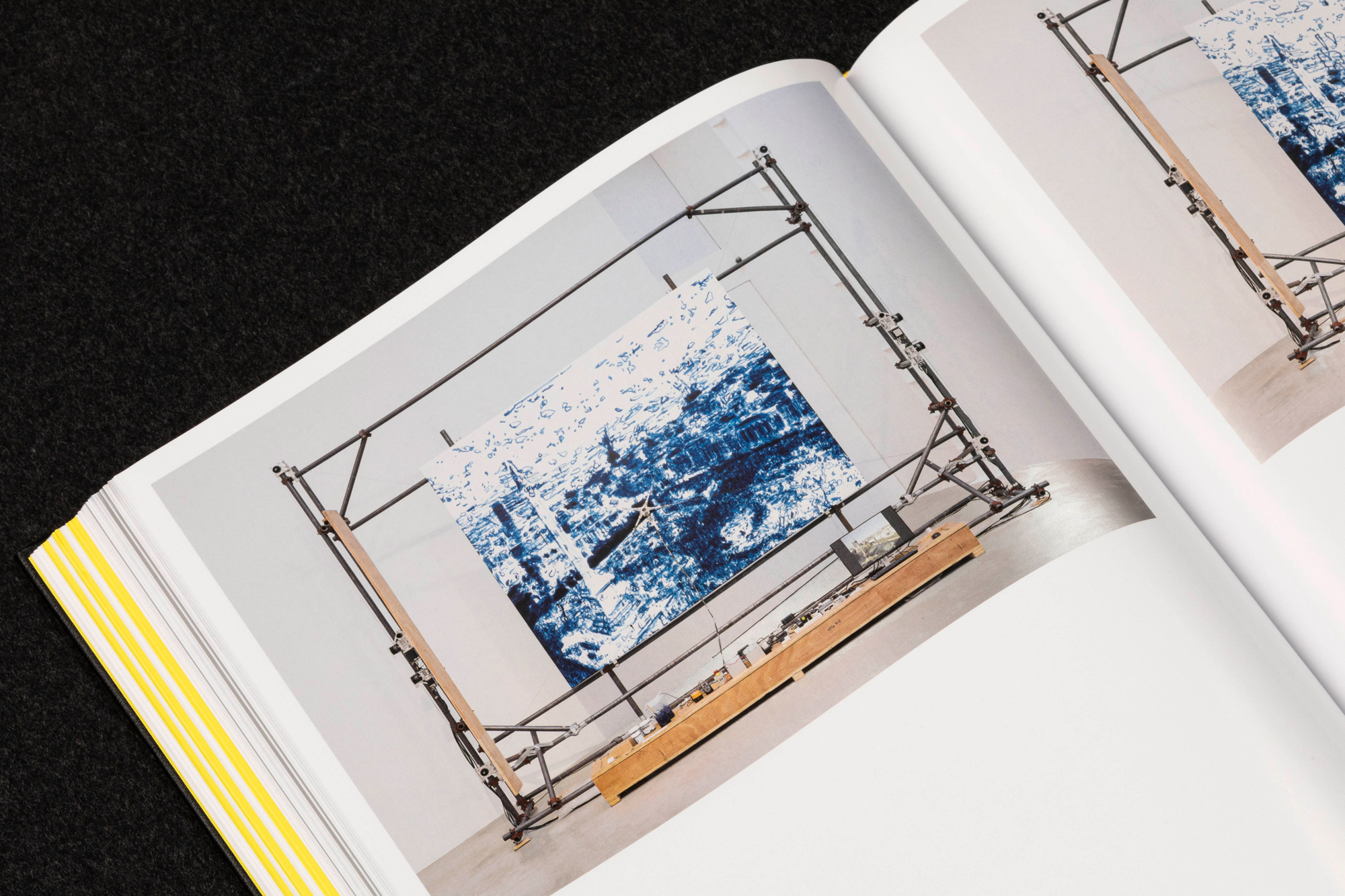
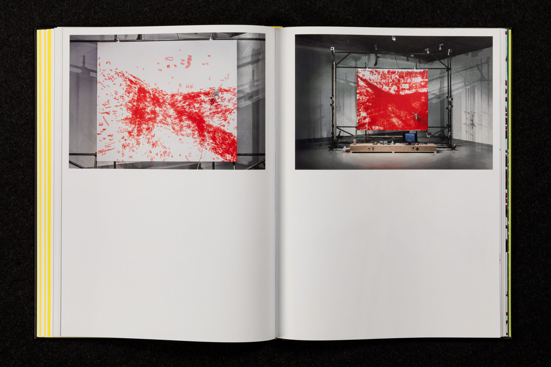
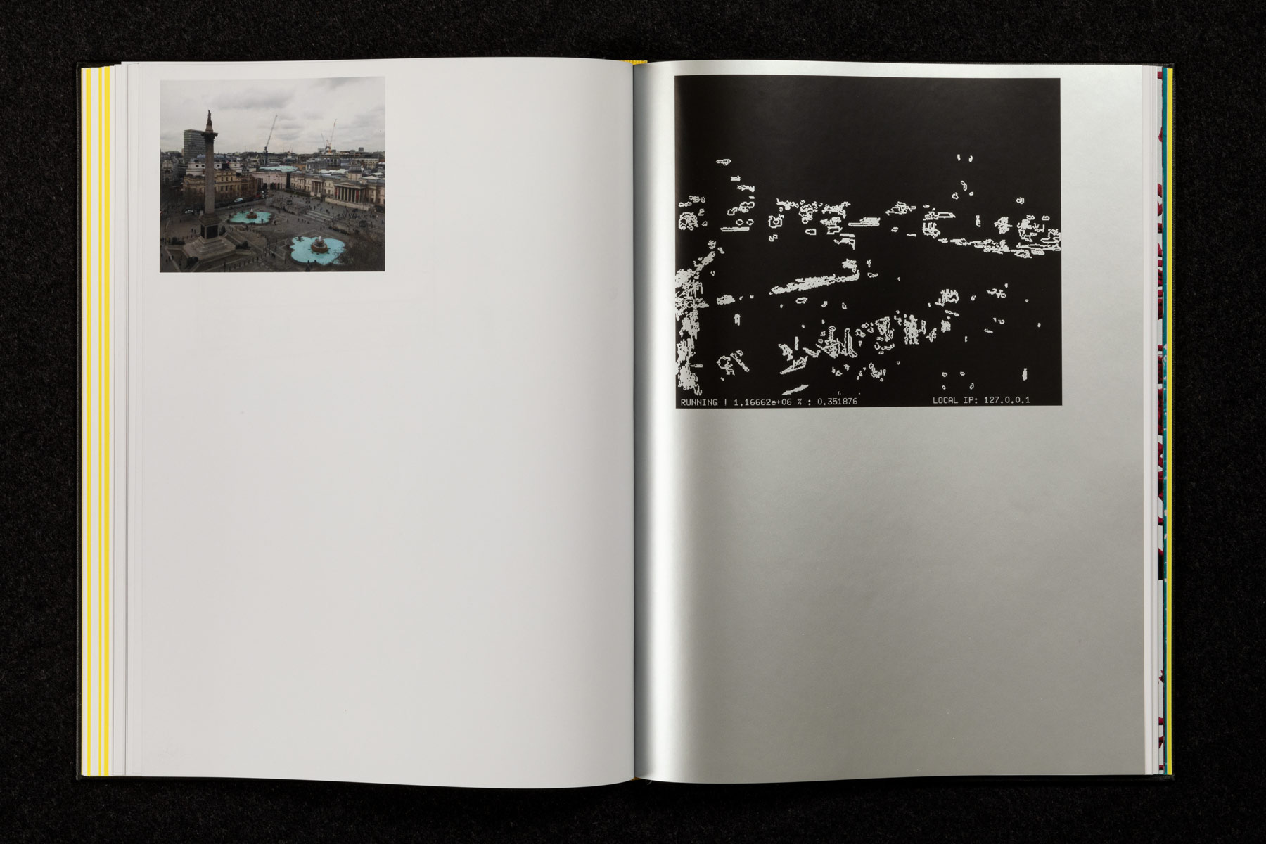
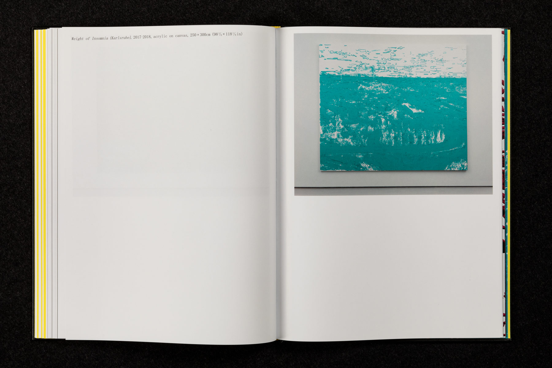
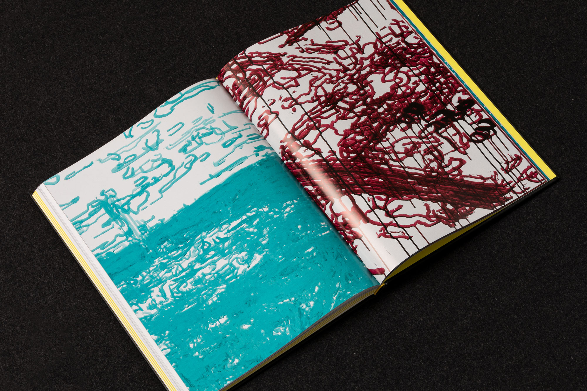
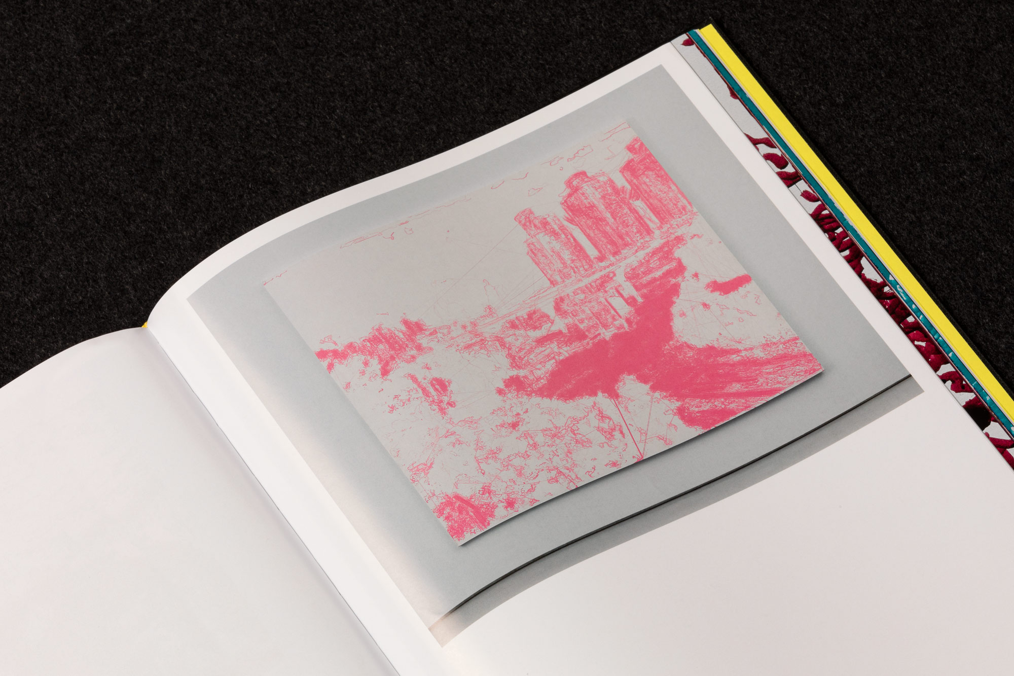
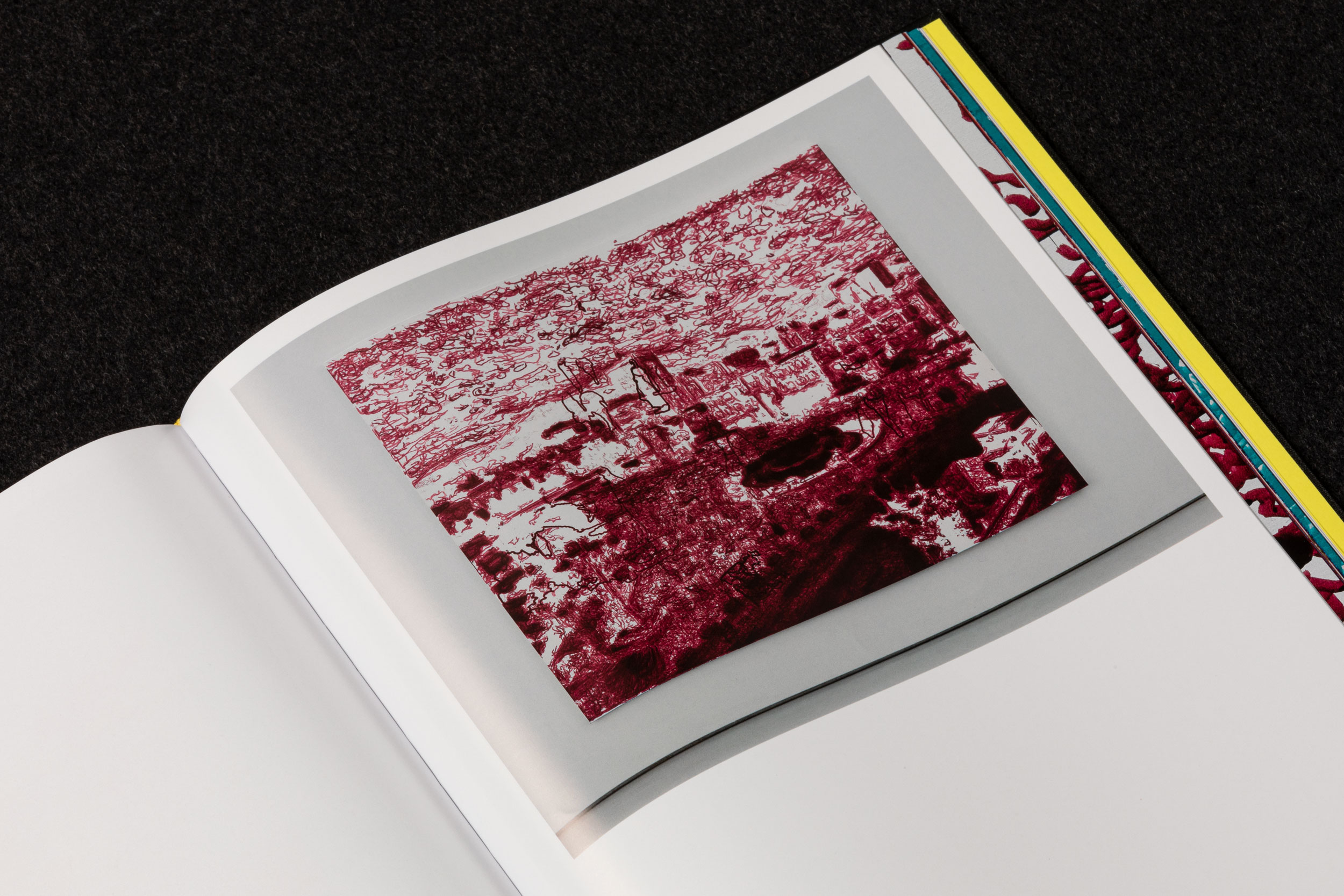
The book details the process of Liu Xiaodong's technologically radical project ‘Weight of Insomnia’, started in 2015, where large painting machines connected to live streaming cameras in public places around the world painted scenes of urban landscapes, each robot painting continuously for 3 months, day and night, slowly rendering a monochrome image.
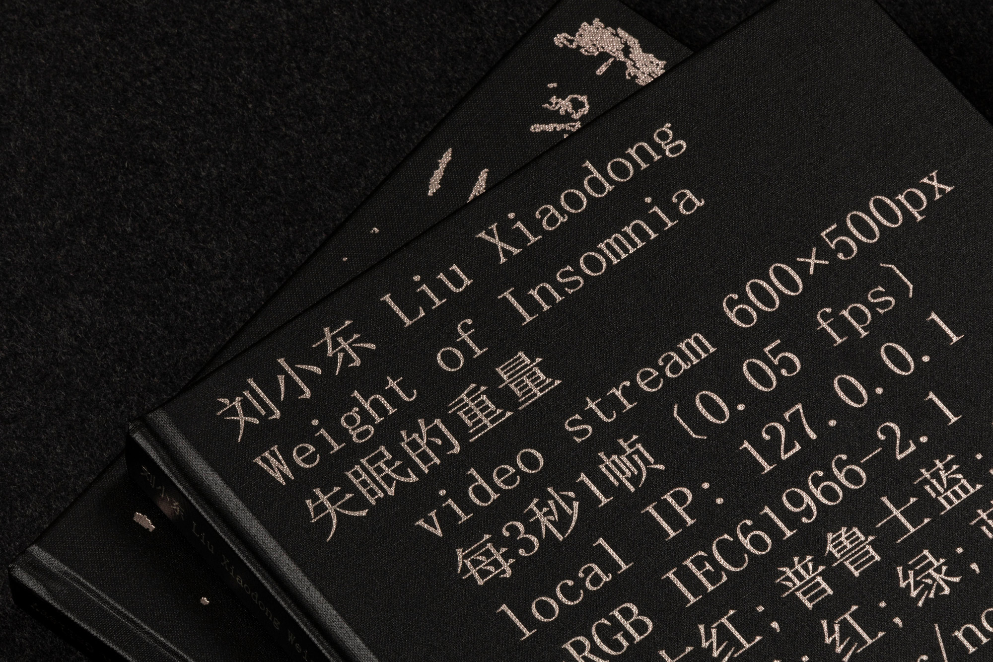
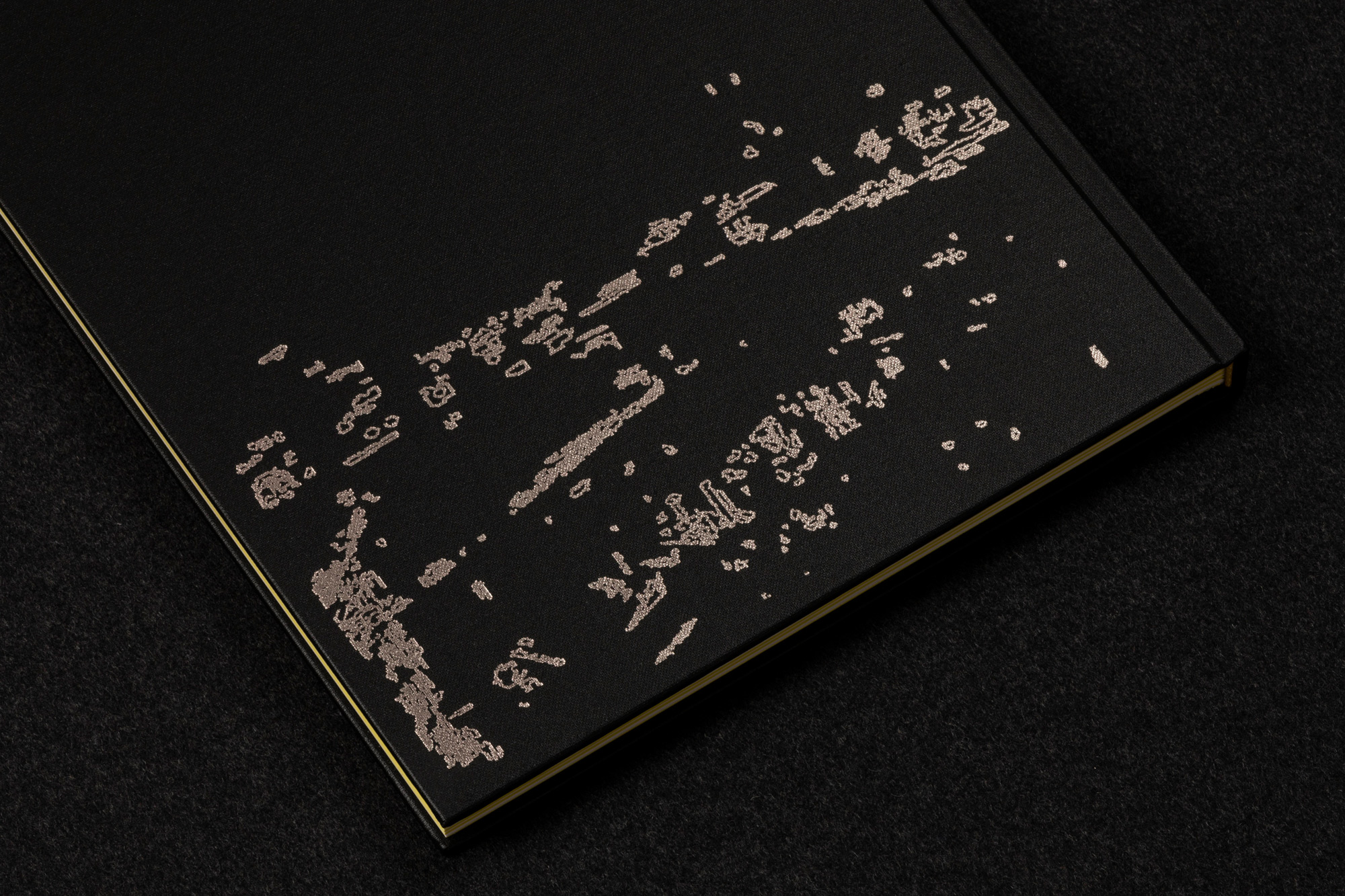
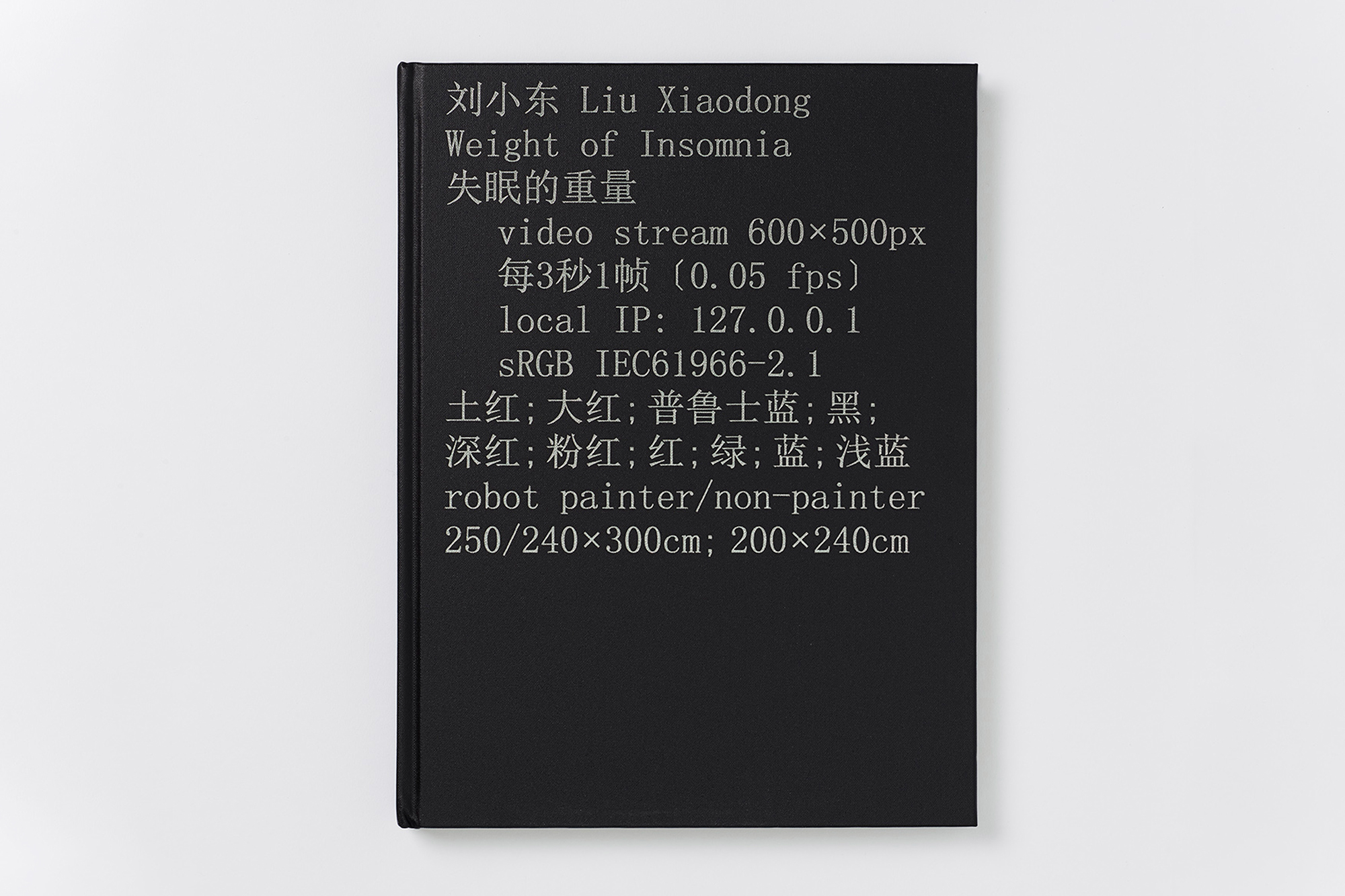
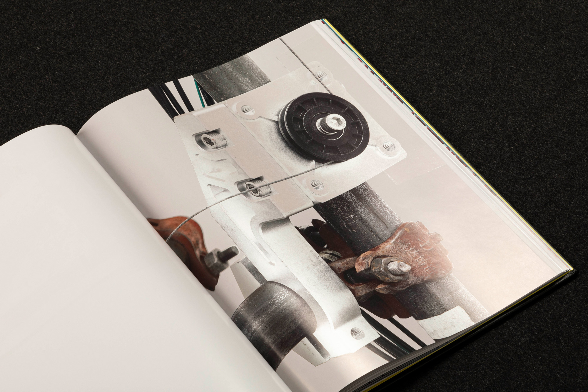
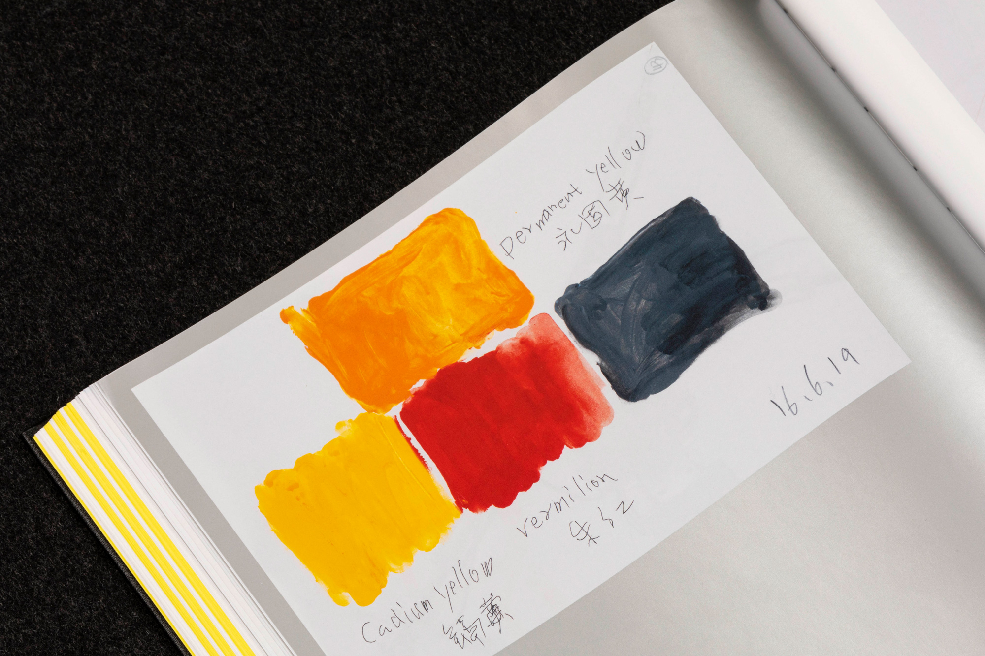
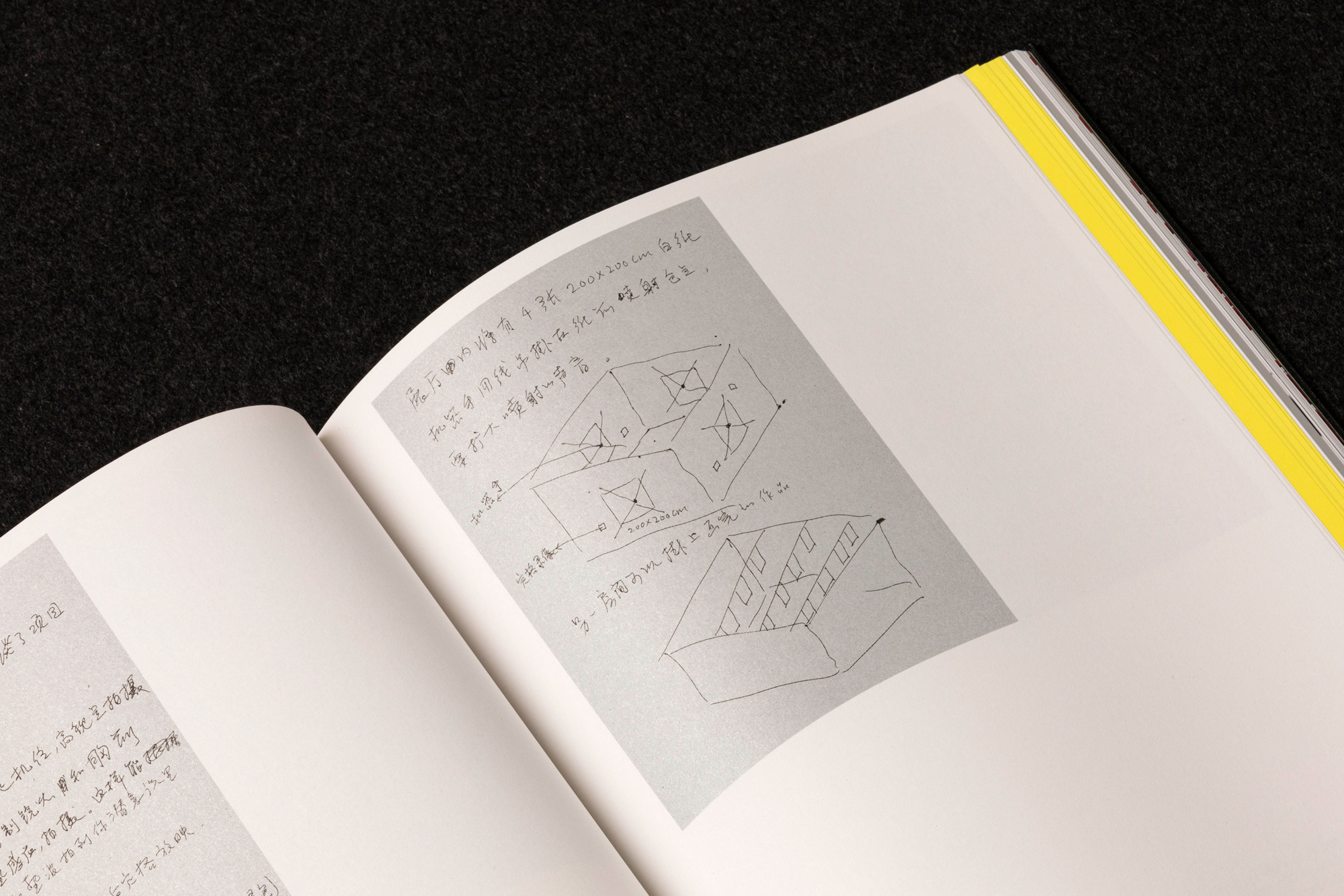
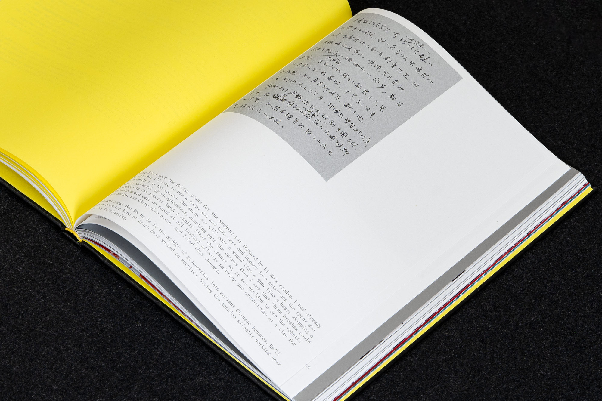
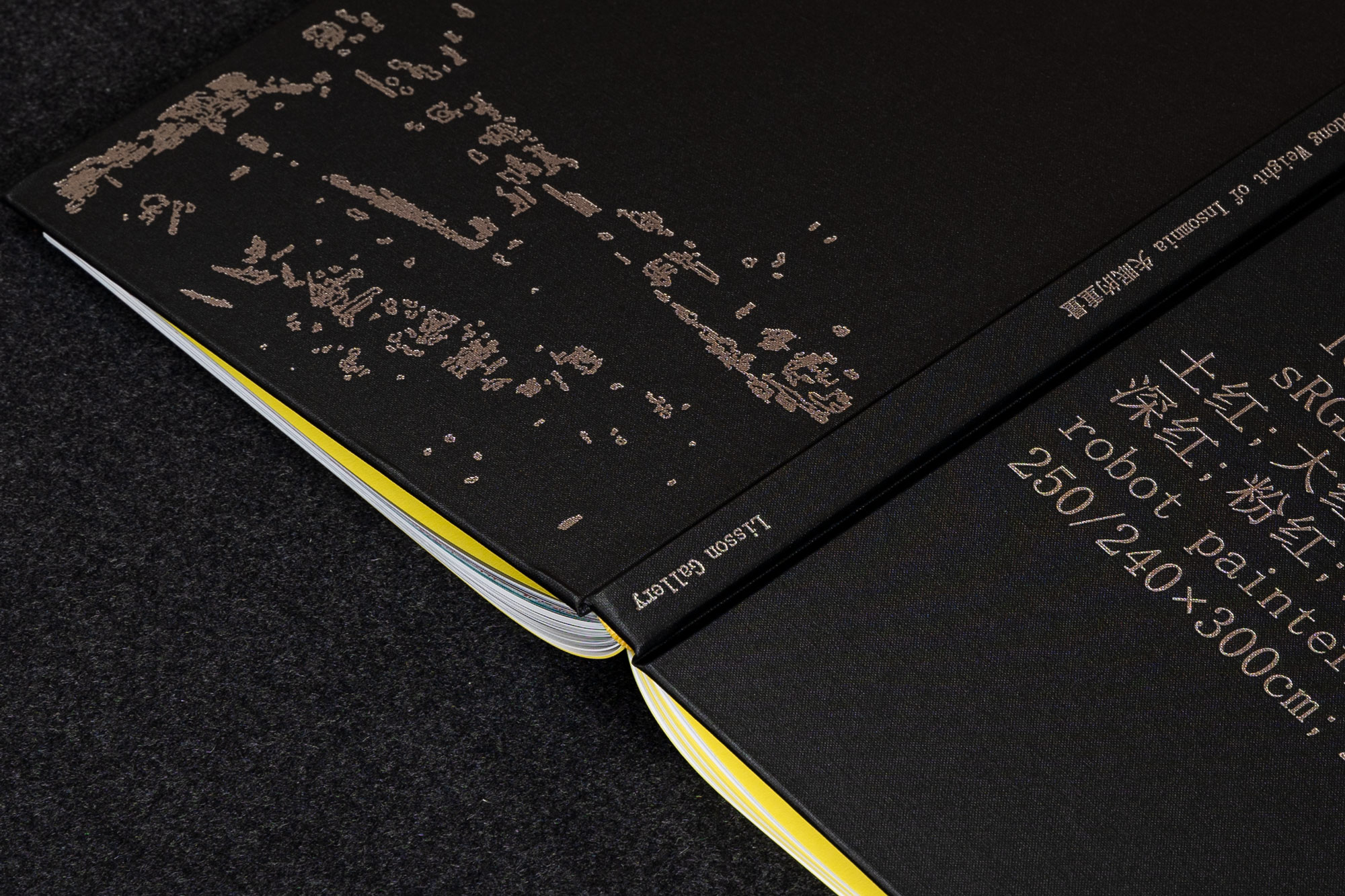
The bilingual book is typeset entirely in 12pt SimSun (ZHONGYI Electronics Co.), a standard Chinese-first mono serif typeface lending a digital and sometimes sinister quality to the pages. Silver ink is used extensively throughout this book, a reference to the glow of the screen and the metallic machine, suspending the book in a constant flux between light and dark. Process photos, directed and commissioned by us, were printed in 5 colours using a Colorlibrary CMYK+Silver profile.
240×320mm, hardback, 184pp
Available to buy: Cornerhouse Publications
Liu Xiaodong: Weight of Insomnia, exhibition catalogue, Lisson Gallery, 2019
‘Liu Xiaodong: Weight of Insomnia’ is a catalog designed for Lisson Gallery London, which aims to reflect the slow, relentless, observing work of a painting surveillance machine.
The book details the process of Liu Xiaodong's technologically radical project ‘Weight of Insomnia’, started in 2015, where large painting machines connected to live streaming cameras in public places around the world painted scenes of urban landscapes, each robot painting continuously for 3 months, day and night, slowly rendering a monochrome image.
The bilingual book is typeset entirely in 12pt SimSun (ZHONGYI Electronics Co.), a standard Chinese-first mono serif typeface lending a digital and sometimes sinister quality to the pages. Silver ink is used extensively throughout this book, a reference to the glow of the screen and the metallic machine, suspending the book in a constant flux between light and dark. Process photos, directed and commissioned by us, were printed in 5 colours using a Colorlibrary CMYK+Silver profile.
240×320mm, hardback, 184pp
Available to buy: Cornerhouse Publications