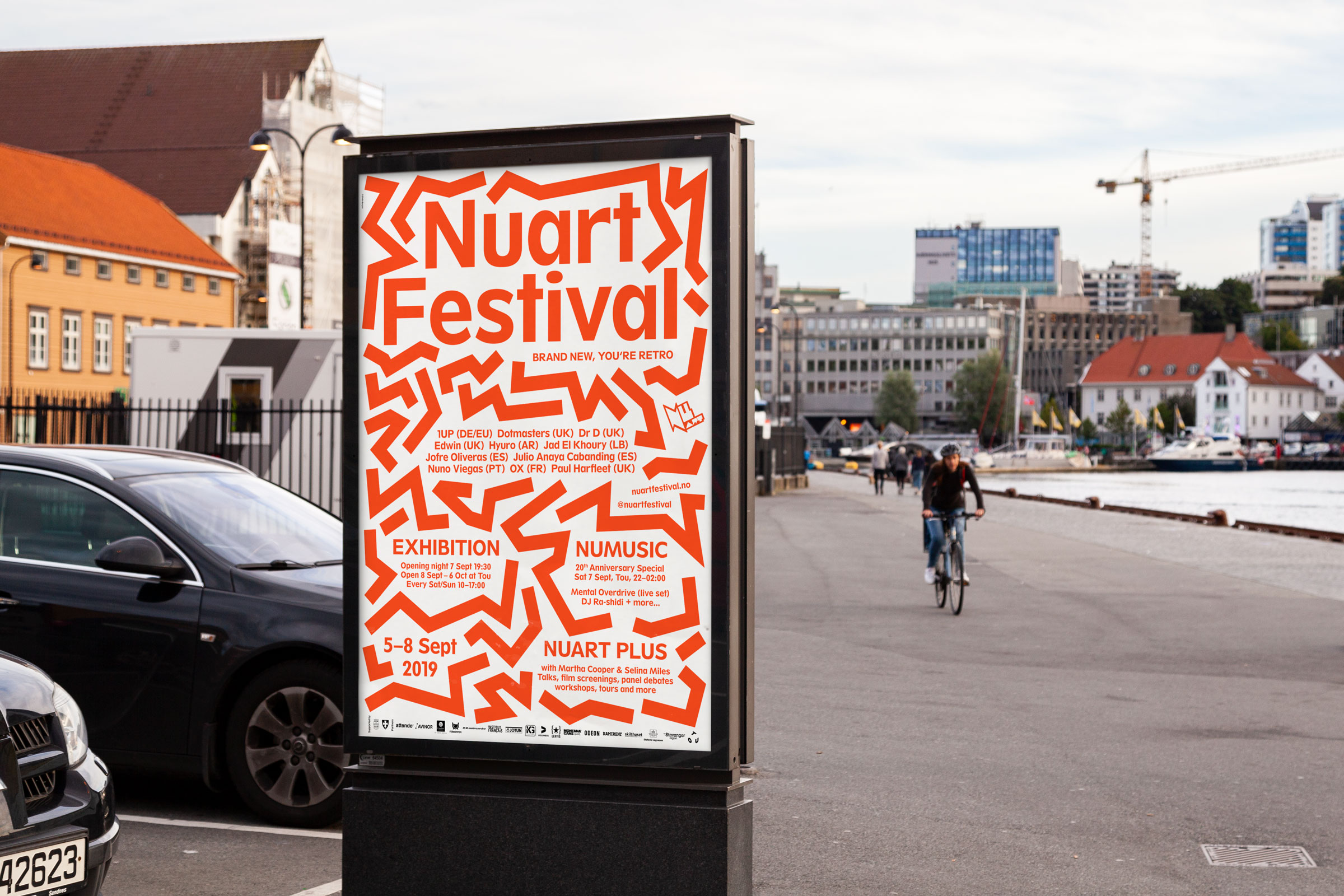
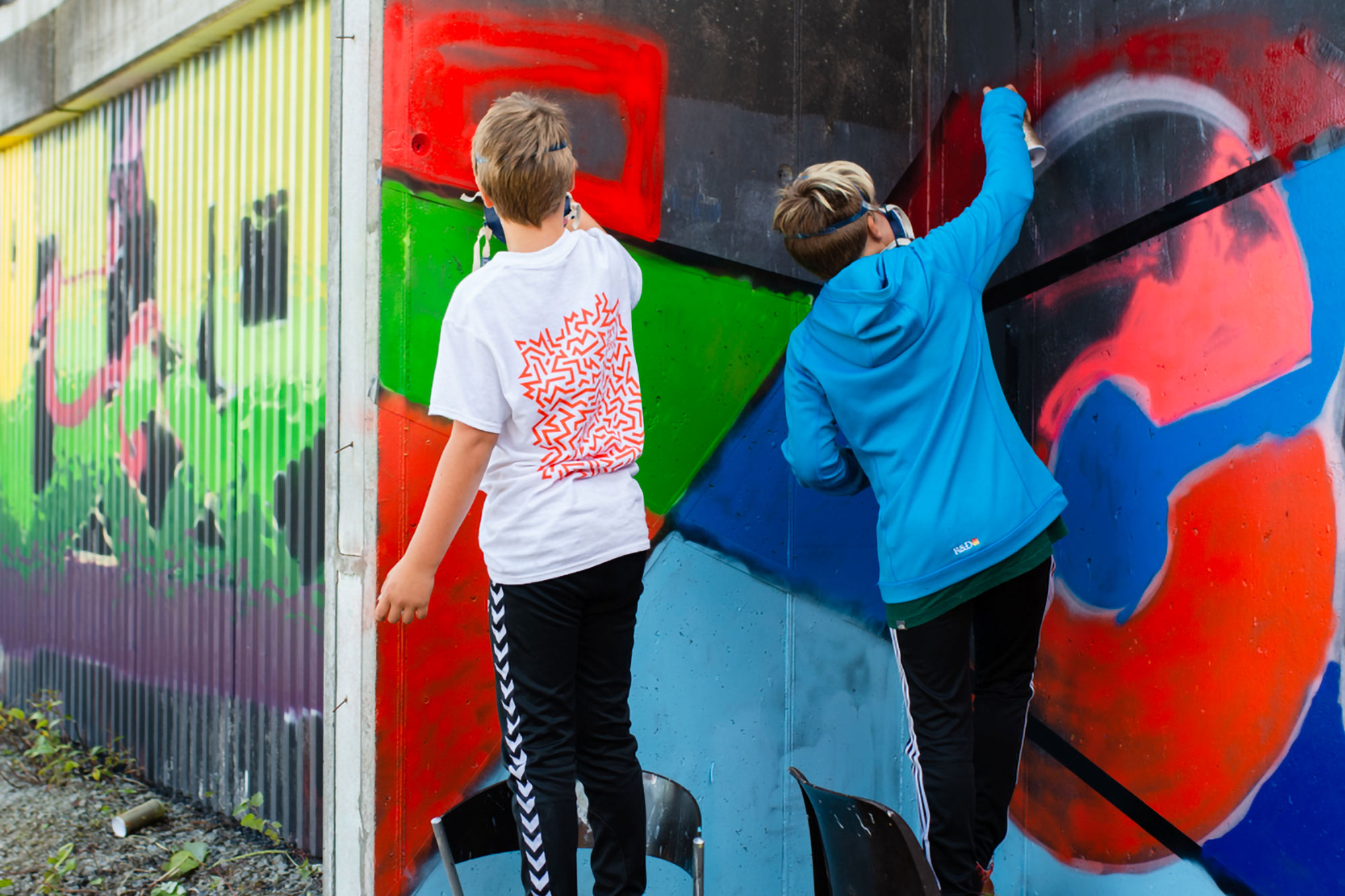
Set against the backdrop of Stavanger – a small town on the west coast of Norway – Nuart Festival is considered one of the world’s leading Street Art festival, and the world’s first of its kind too, comprising indoor and outdoor exhibitions, debates, and a critical symposium. Since 2013, Studio Bergini has been responsible for Nuart’s visual identity, designing all the related collateral, and evolving it each year to reflect the festival’s changing focus.
—
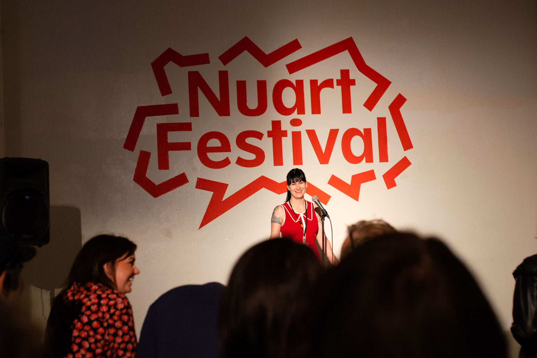
While the visual identity for Nuart Festival builds on and references the visual output of the Situationists, Punks, and other 20th century radical artist and protest movements, the 2019 rendition departed partly from the cut-outs and speech bubbles of the previous three years, favouring a system of dynamic red lines reminiscent of the work of Keith Haring (whose major retrospective was taking place at Tate Liverpool at the time). The lines, sometimes accidentally similar to letterforms, form mesmerising, map-like constellations that leave the viewer questioning if there might be some form of message hidden in the visuals.
As a bonus, a new temporary Bergini emblem was created in the process by or intern Sapir Ziv.
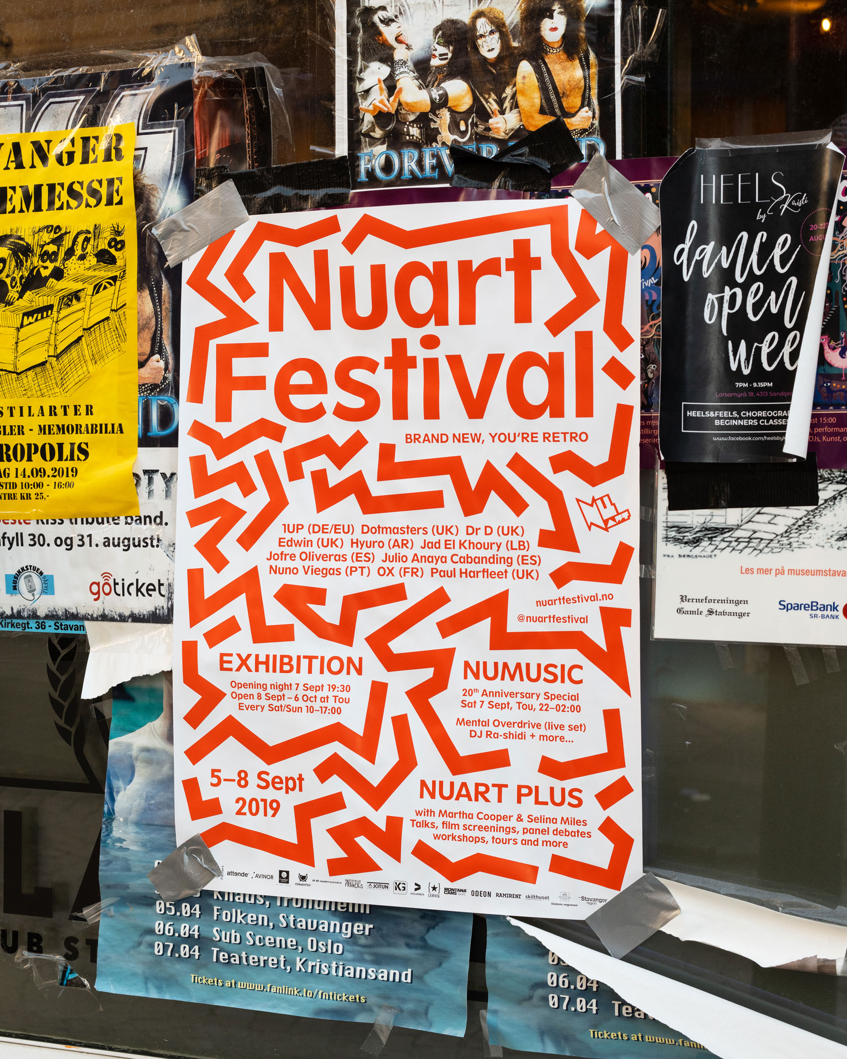

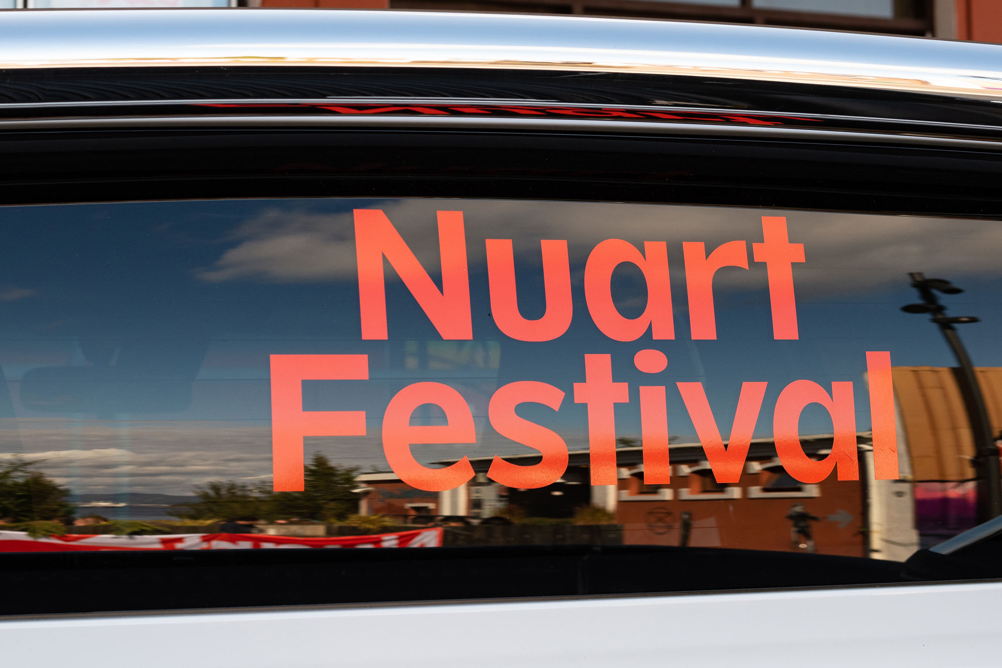
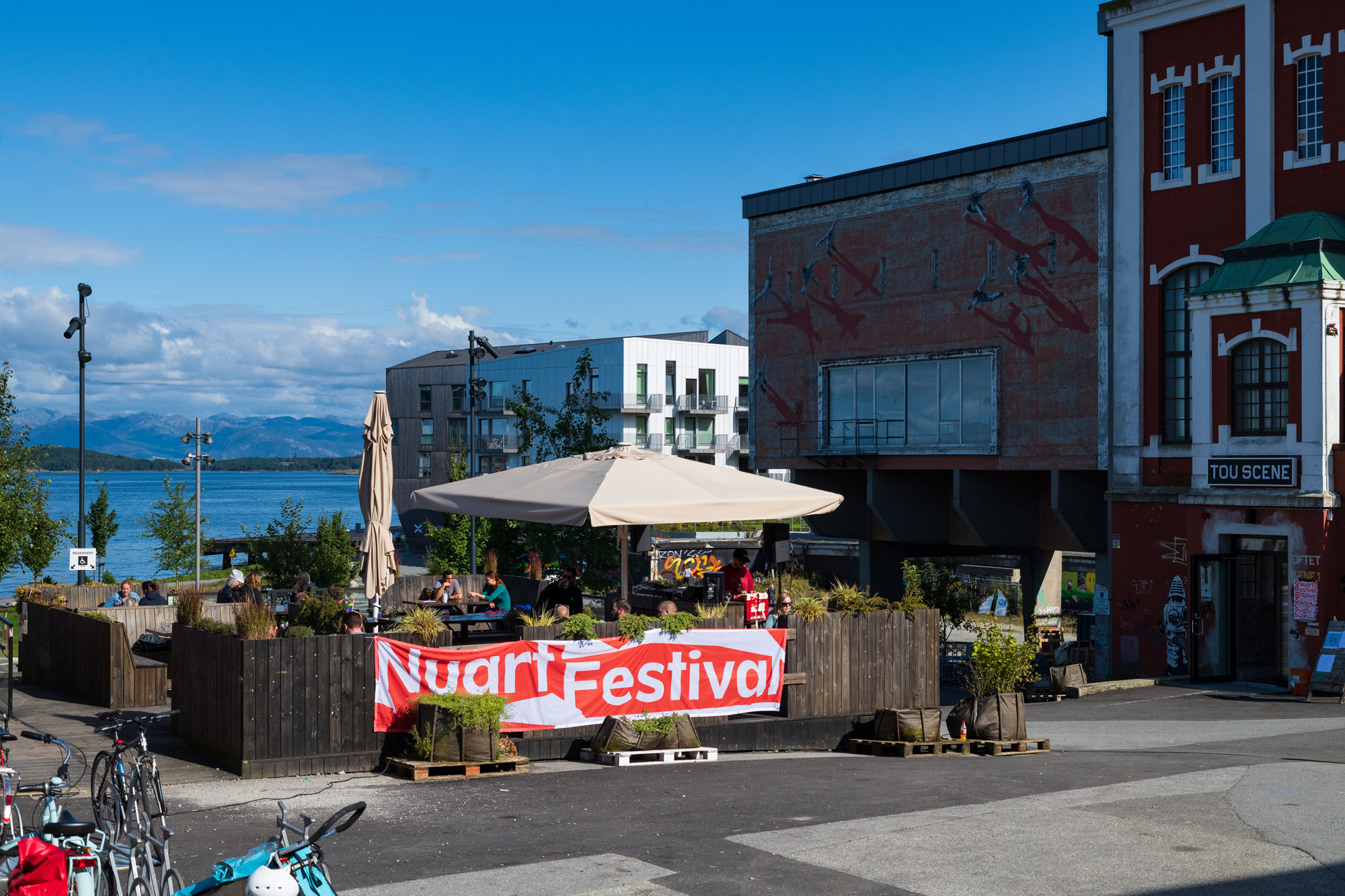
Set against the backdrop of Stavanger – a small town on the west coast of Norway – Nuart Festival is considered one of the world’s leading Street Art festival, and the world’s first of its kind too, comprising indoor and outdoor exhibitions, debates, and a critical symposium. Since 2013, Studio Bergini has been responsible for Nuart’s visual identity, designing all the related collateral, and evolving it each year to reflect the festival’s changing focus.
—
While the visual identity for Nuart Festival builds on and references the visual output of the Situationists, Punks, and other 20th century radical artist and protest movements, the 2019 rendition departed partly from the cut-outs and speech bubbles of the previous three years, favouring a system of dynamic red lines reminiscent of the work of Keith Haring (whose major retrospective was taking place at Tate Liverpool at the time). The lines, sometimes accidentally similar to letterforms, form mesmerising, map-like constellations that leave the viewer questioning if there might be some form of message hidden in the visuals.
As a bonus, a new temporary Bergini emblem was created in the process by or intern Sapir Ziv.