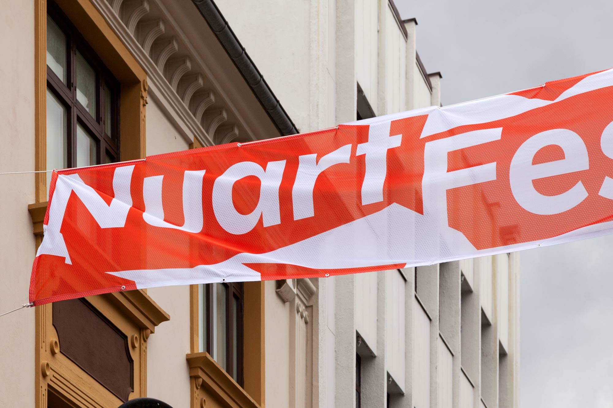
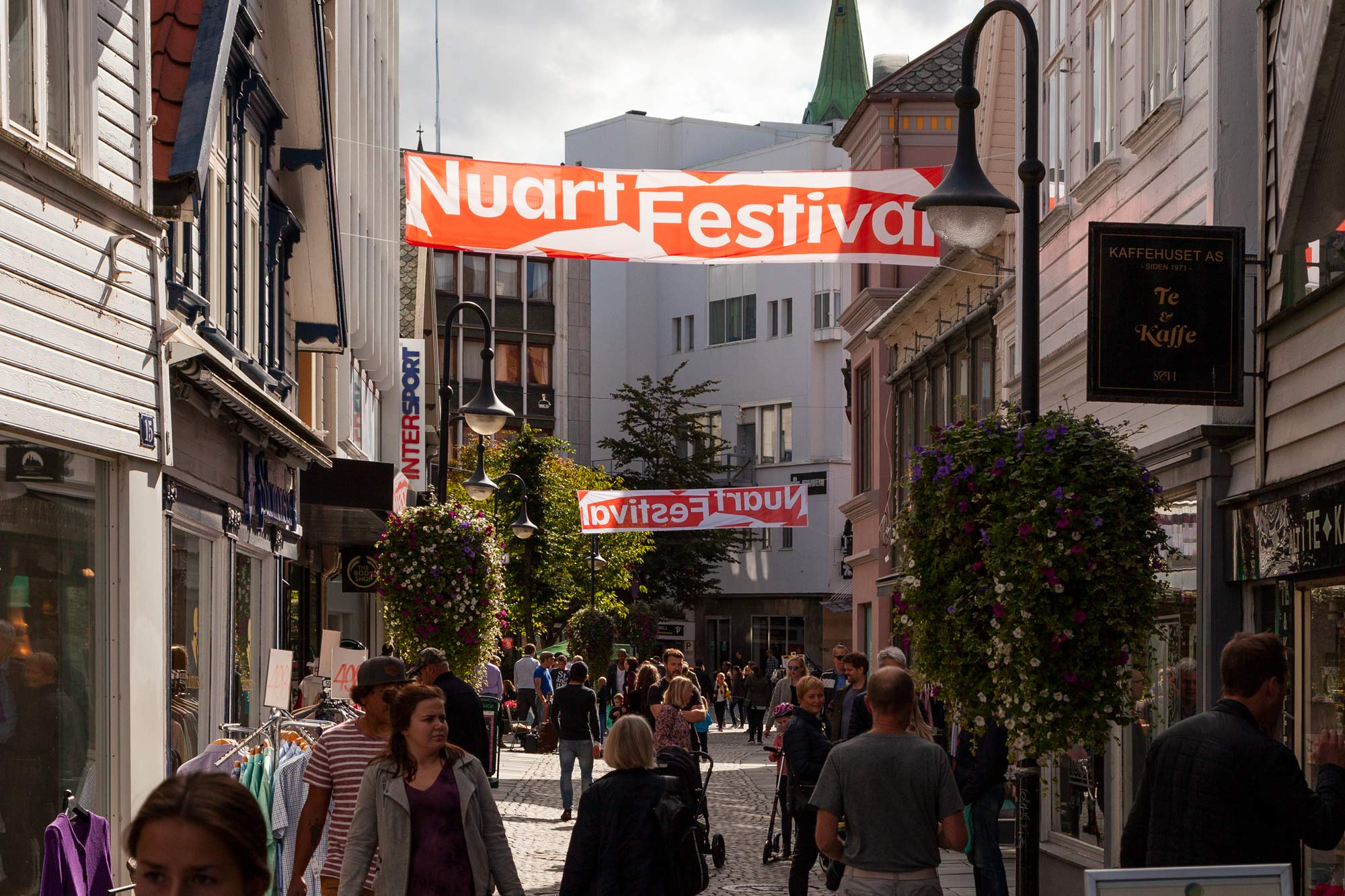
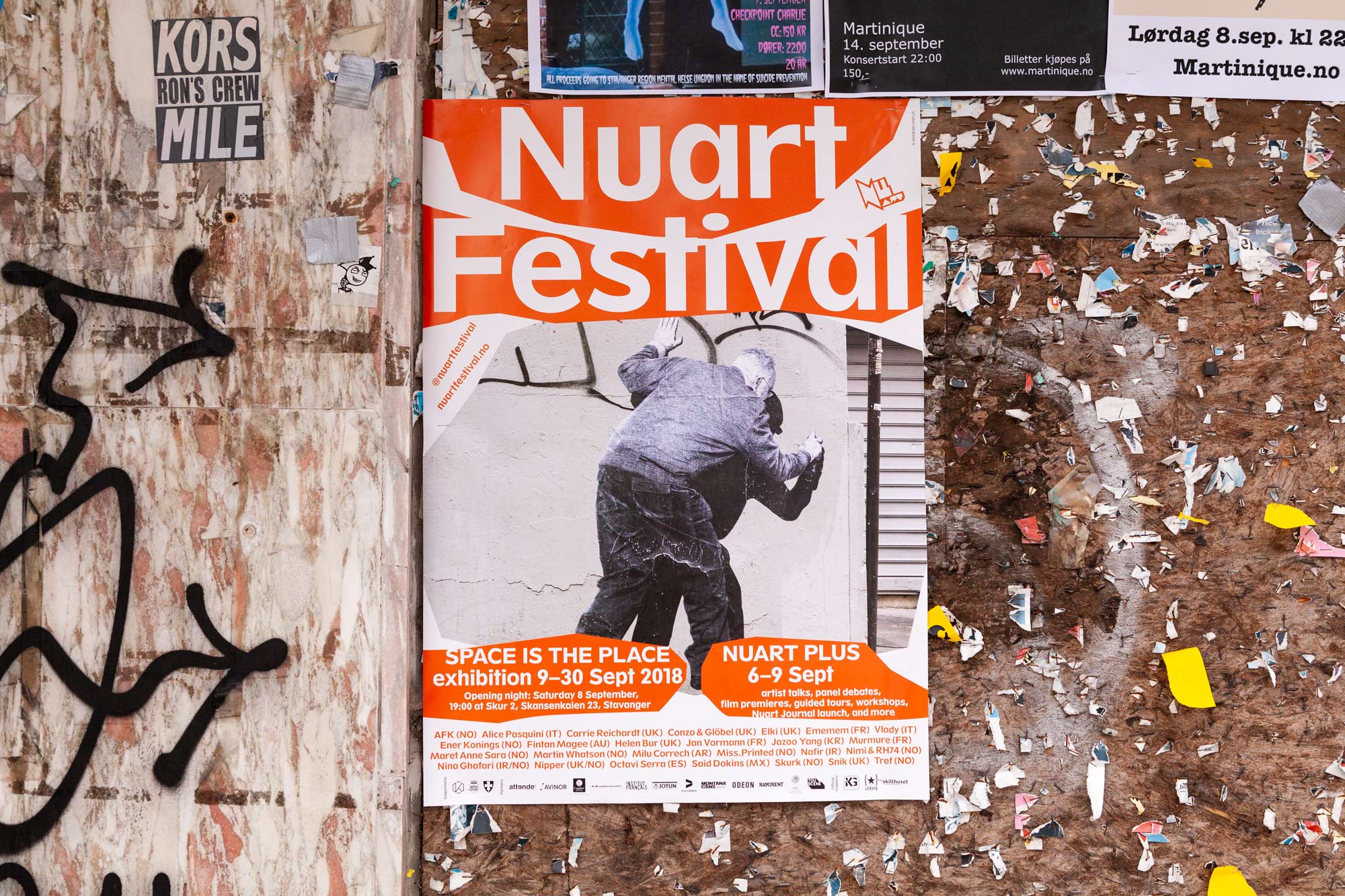
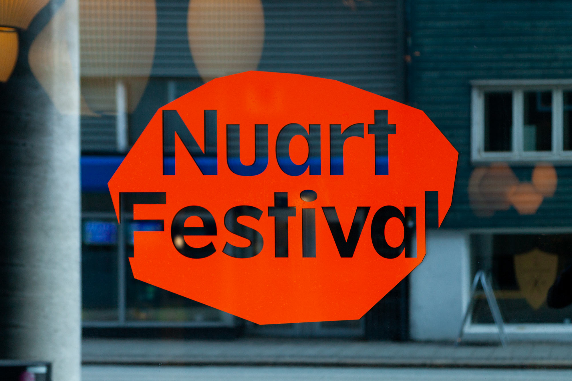
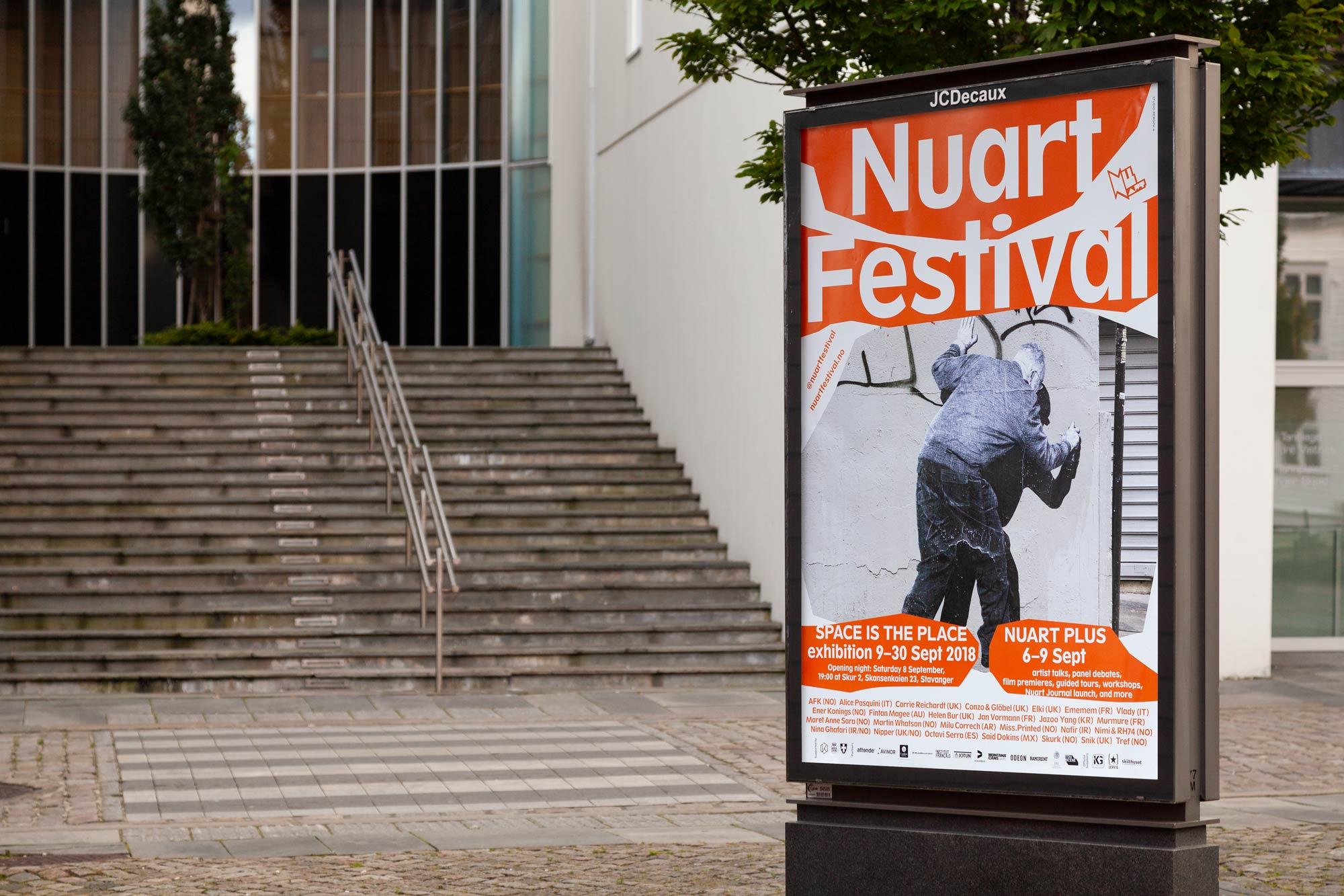
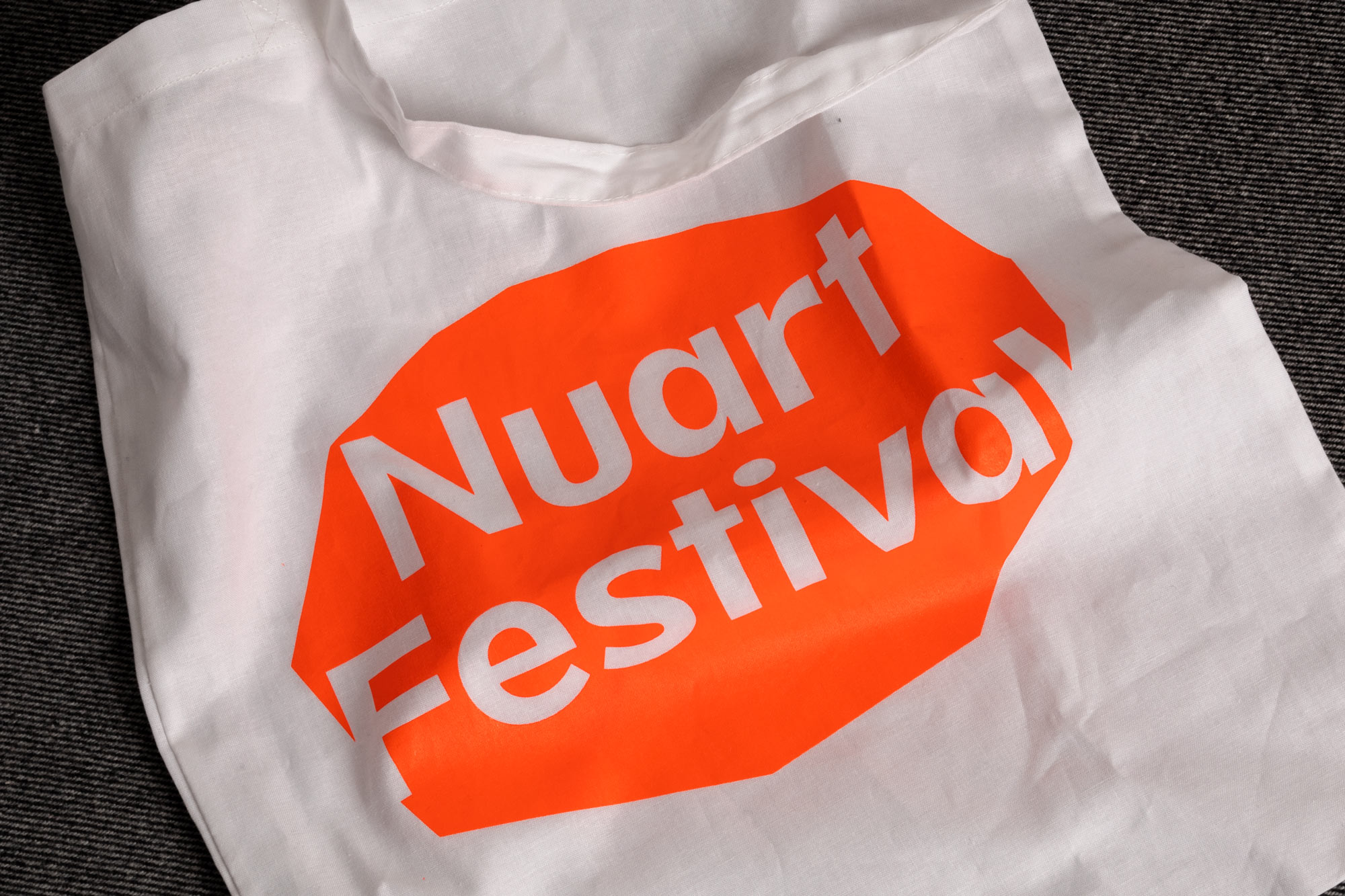
Set against the backdrop of Stavanger – a small town on the west coast of Norway – Nuart Festival is considered one of the world’s leading Street Art festival, and the world’s first of its kind too, comprising indoor and outdoor exhibitions, debates, and a critical symposium. Since 2013, Studio Bergini has been responsible for Nuart’s visual identity, designing all the related collateral, and evolving it each year to reflect the festival’s changing focus.
—
2018 marked the sixth year of our collaboration with Nuart Festival, and our third iteration of the current visual identity. Having previously been re-shaped each year, this time we laid the groundwork for a more permanent visual identity for the festival.
The visual concept builds on our work from previous years, where we create our own interpretation of the cut-outs, speech bubbles, and collage/décollage techniques found in the visual output of the Punks and Situationists by using standard computer software (our own default tool for designing), allowing the means to dictate the aesthetic.
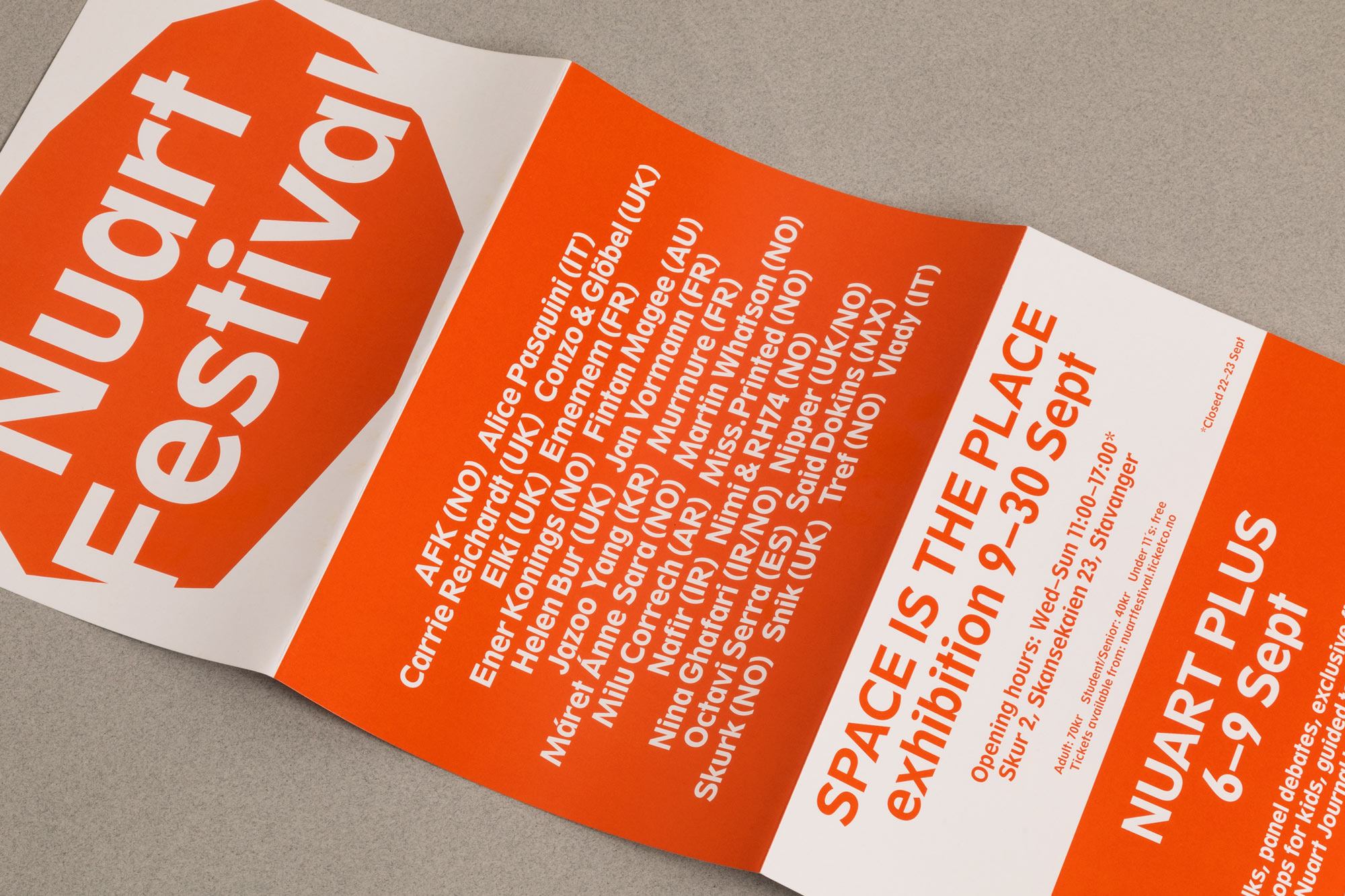
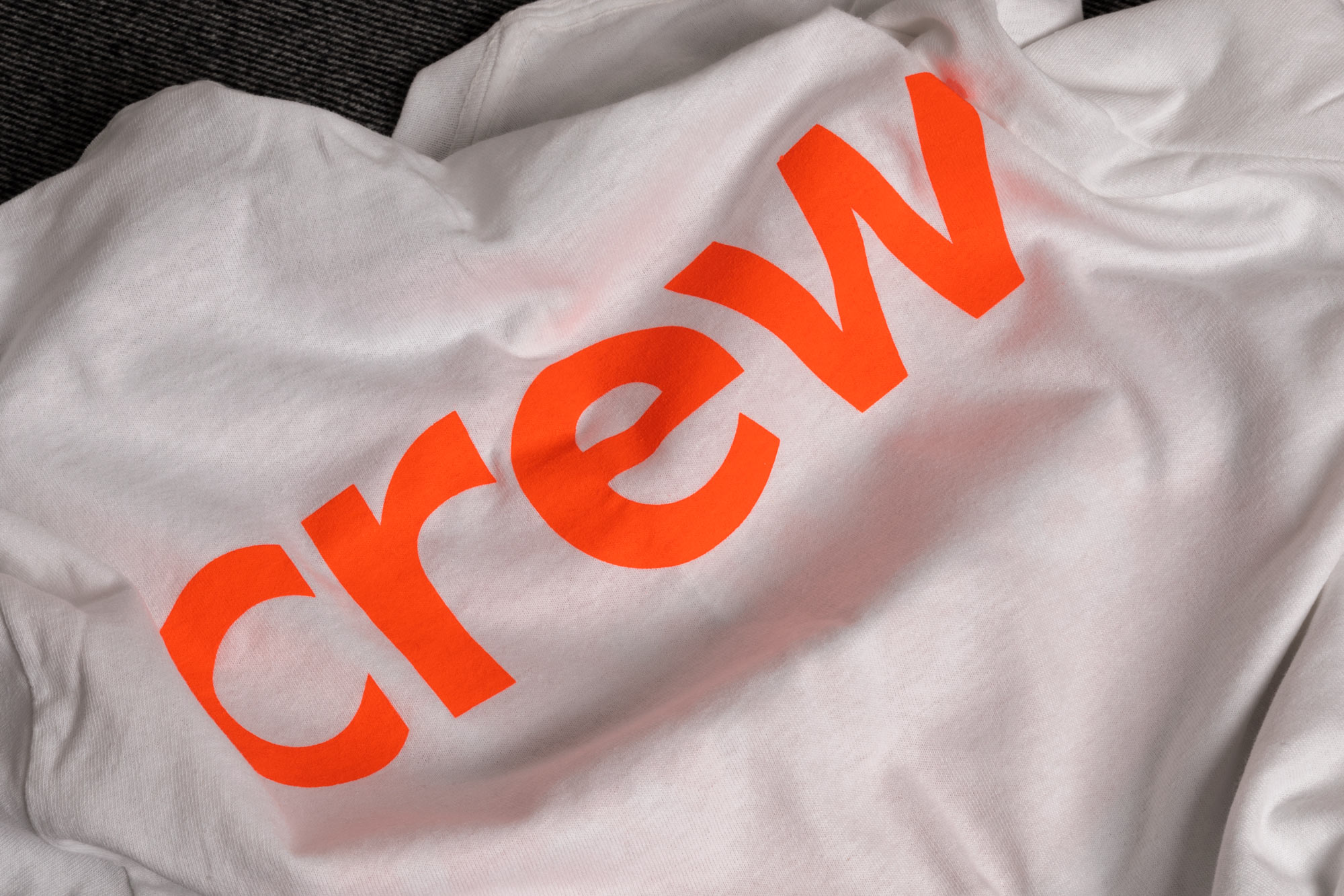
As well as having defined a logo and colour palette, we introduced our new, custom typeface – SB Spartan – to be the defining element of the identity. The typeface (drawn by us) builds on Spartan Classified (previously used in 2017), taking some core visual cues from the original and remaking it into a more usable and complete font family. Currently consisting of a Regular and Bold extended latin with italics, it’s still a work in progress, with aim at expanding into more weights and characters with time as the identity develops further.
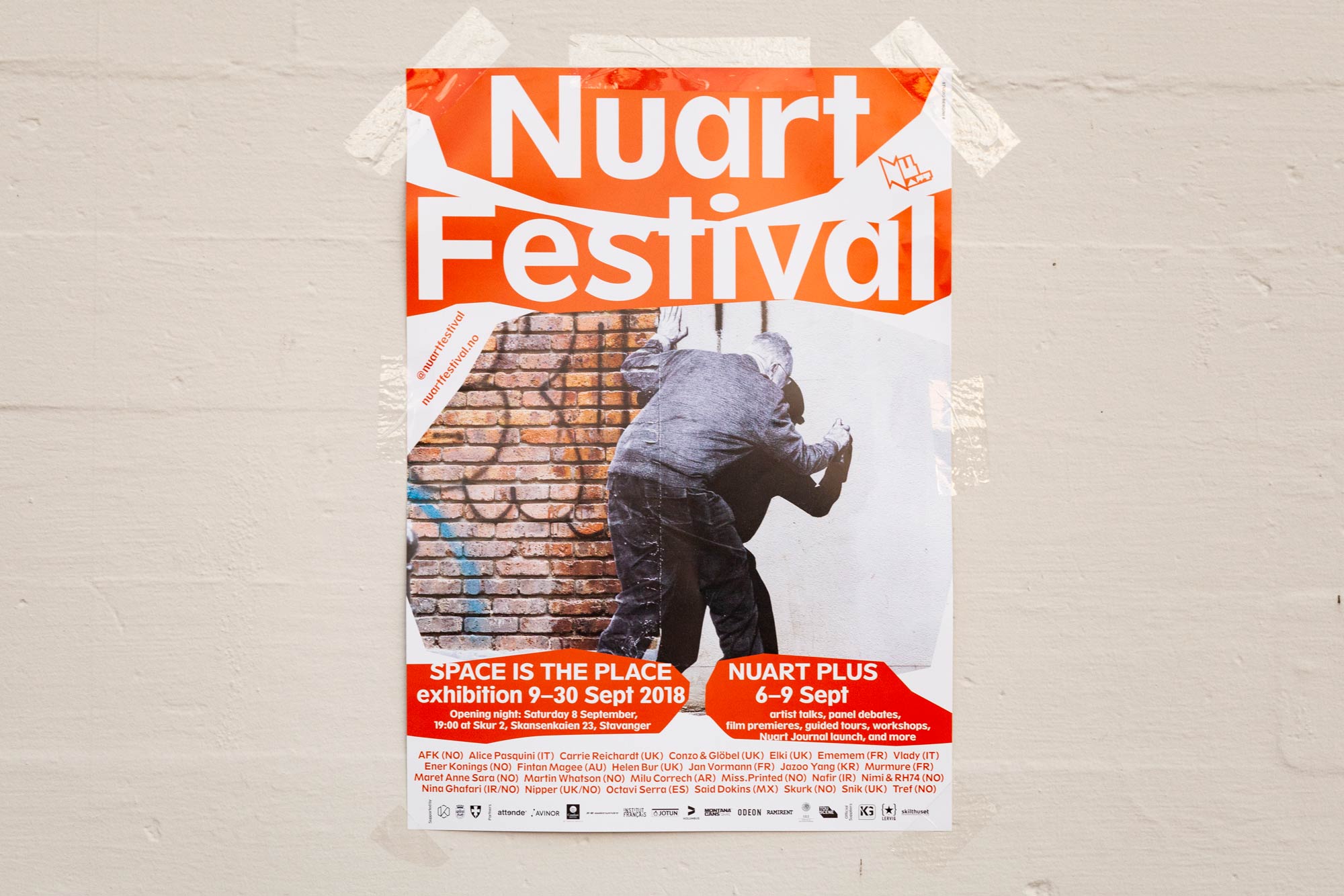
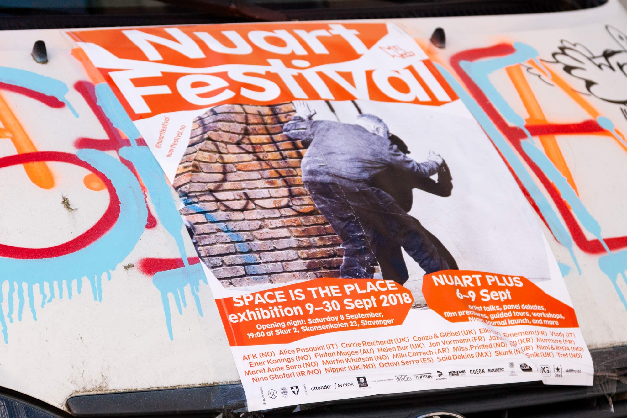
Set against the backdrop of Stavanger – a small town on the west coast of Norway – Nuart Festival is considered one of the world’s leading Street Art festival, and the world’s first of its kind too, comprising indoor and outdoor exhibitions, debates, and a critical symposium. Since 2013, Studio Bergini has been responsible for Nuart’s visual identity, designing all the related collateral, and evolving it each year to reflect the festival’s changing focus.
—
2018 marked the sixth year of our collaboration with Nuart Festival, and our third iteration of the current visual identity. Having previously been re-shaped each year, this time we laid the groundwork for a more permanent visual identity for the festival.
The visual concept builds on our work from previous years, where we create our own interpretation of the cut-outs, speech bubbles, and collage/décollage techniques found in the visual output of the Punks and Situationists by using standard computer software (our own default tool for designing), allowing the means to dictate the aesthetic.
As well as having defined a logo and colour palette, we introduced our new, custom typeface – SB Spartan – to be the defining element of the identity. The typeface (drawn by us) builds on Spartan Classified (previously used in 2017), taking some core visual cues from the original and remaking it into a more usable and complete font family. Currently consisting of a Regular and Bold extended latin with italics, it’s still a work in progress, with aim at expanding into more weights and characters with time as the identity develops further.