UNTO, visual identity & packaging, 2021
Unto (meaning greasy or oily in Tuscan slang) is a small Italian organic olive oil brand and producer with a local, ecological focus, on a mission to revitalise ancient abandoned fields in rural Tuscany. Aimed at a young, mid- to high-end food conscious crowd, Unto aims to establish a reputation through specialised shops, delis, and restaurants in London, while selling direct-to-consumer internationally through a webshop and social media.
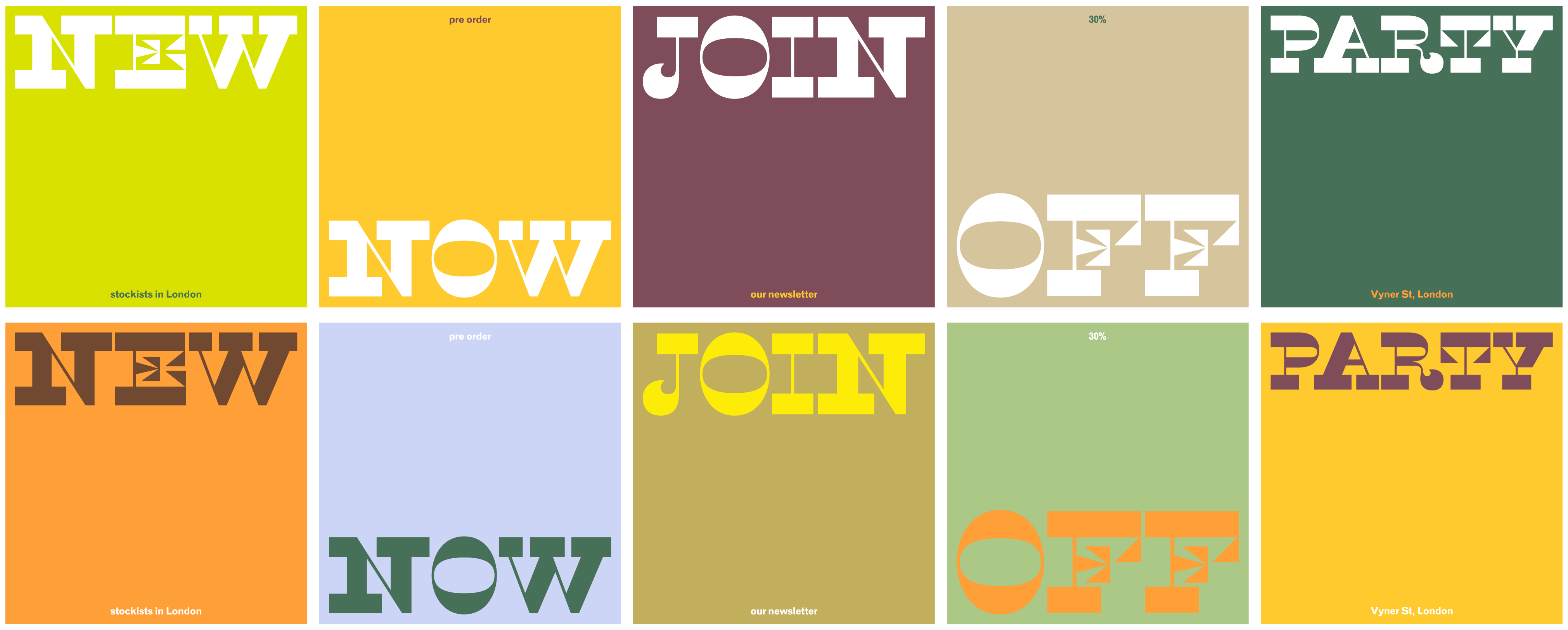
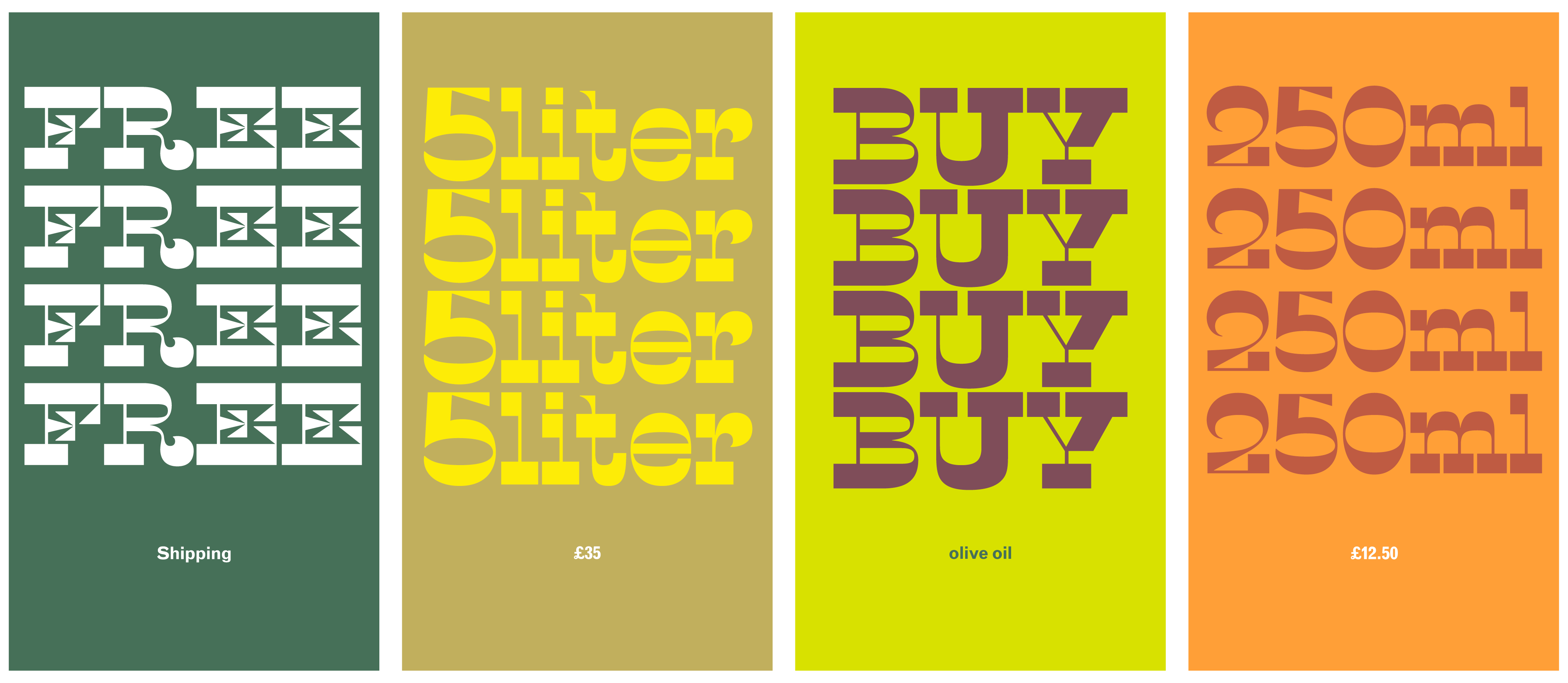
To launch their brand and gain traction, Unto were looking for a bold identity that would be equally eye-catching and recognisable on the shop shelf as on the Instagram feed, and which would reflect their unique, hands-on approach.
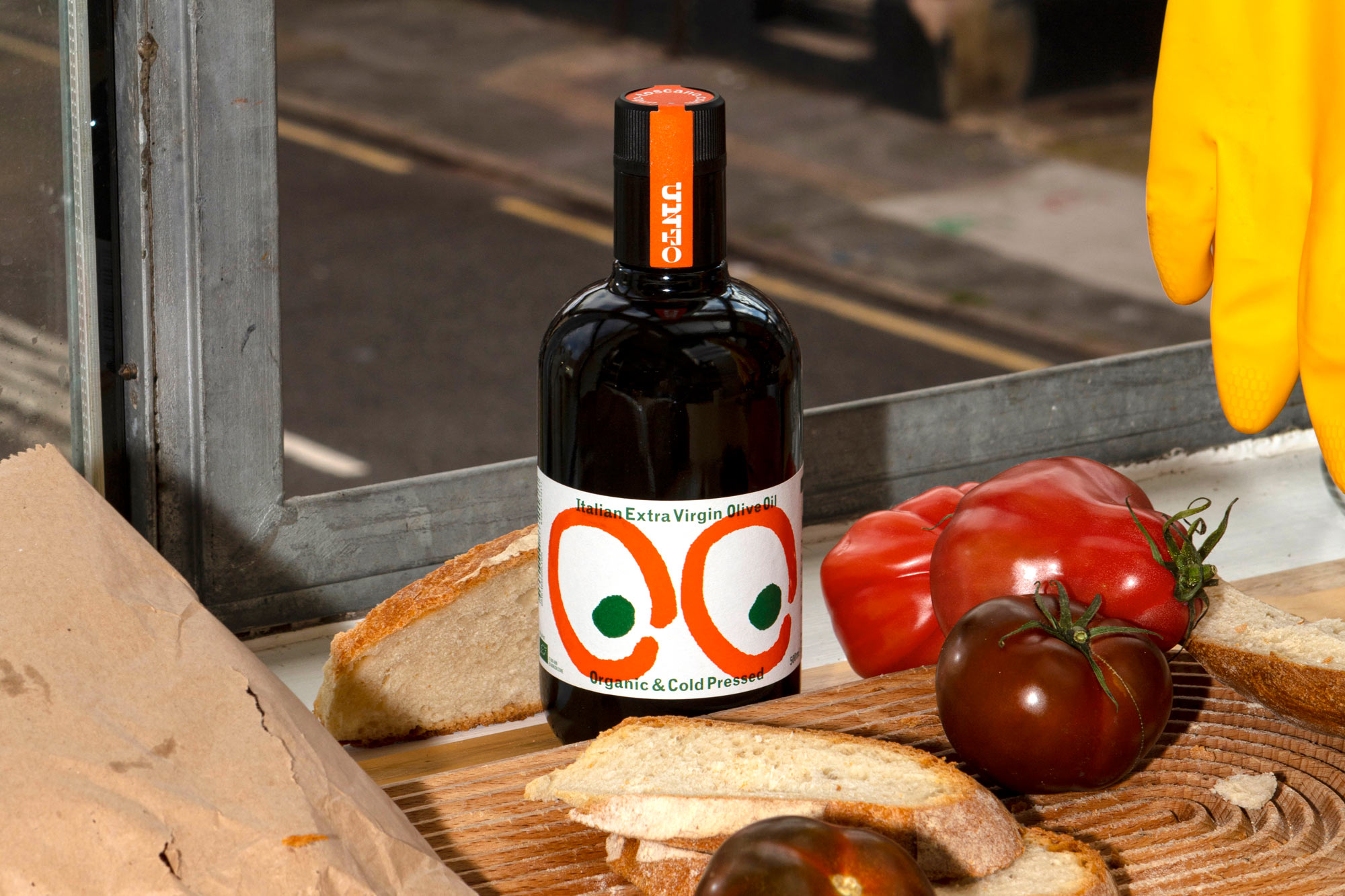
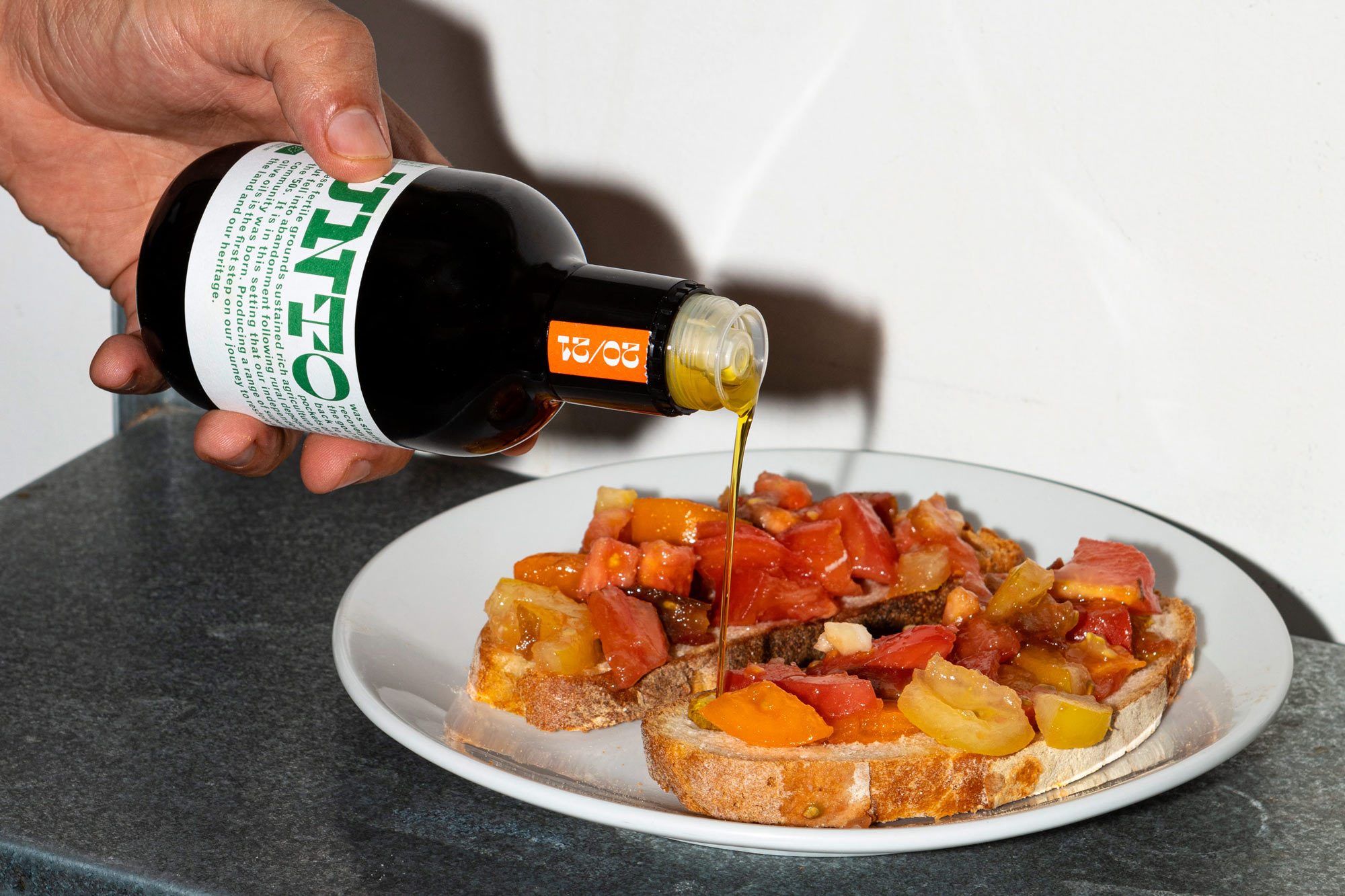
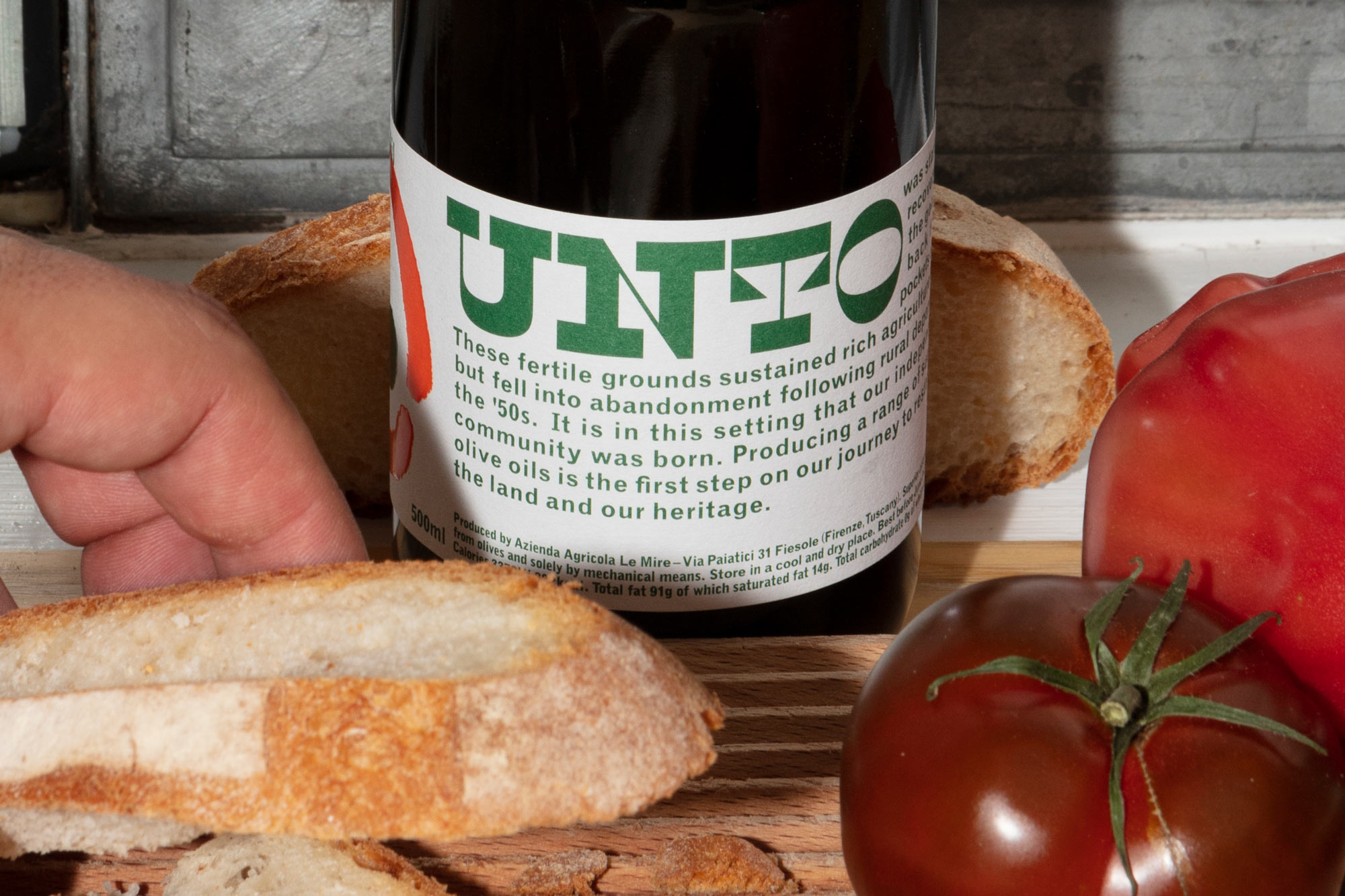
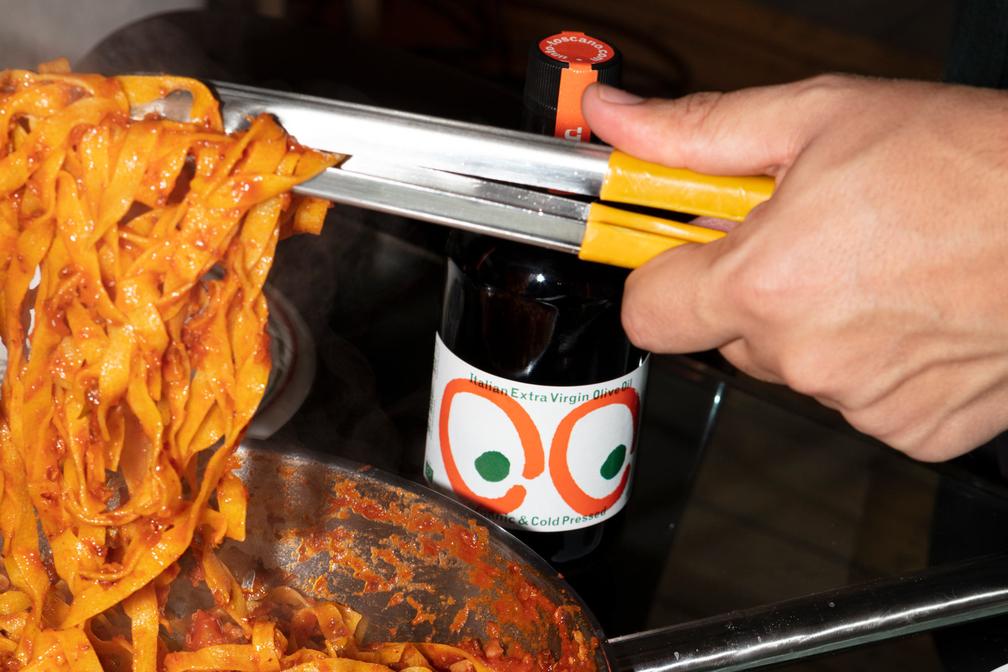
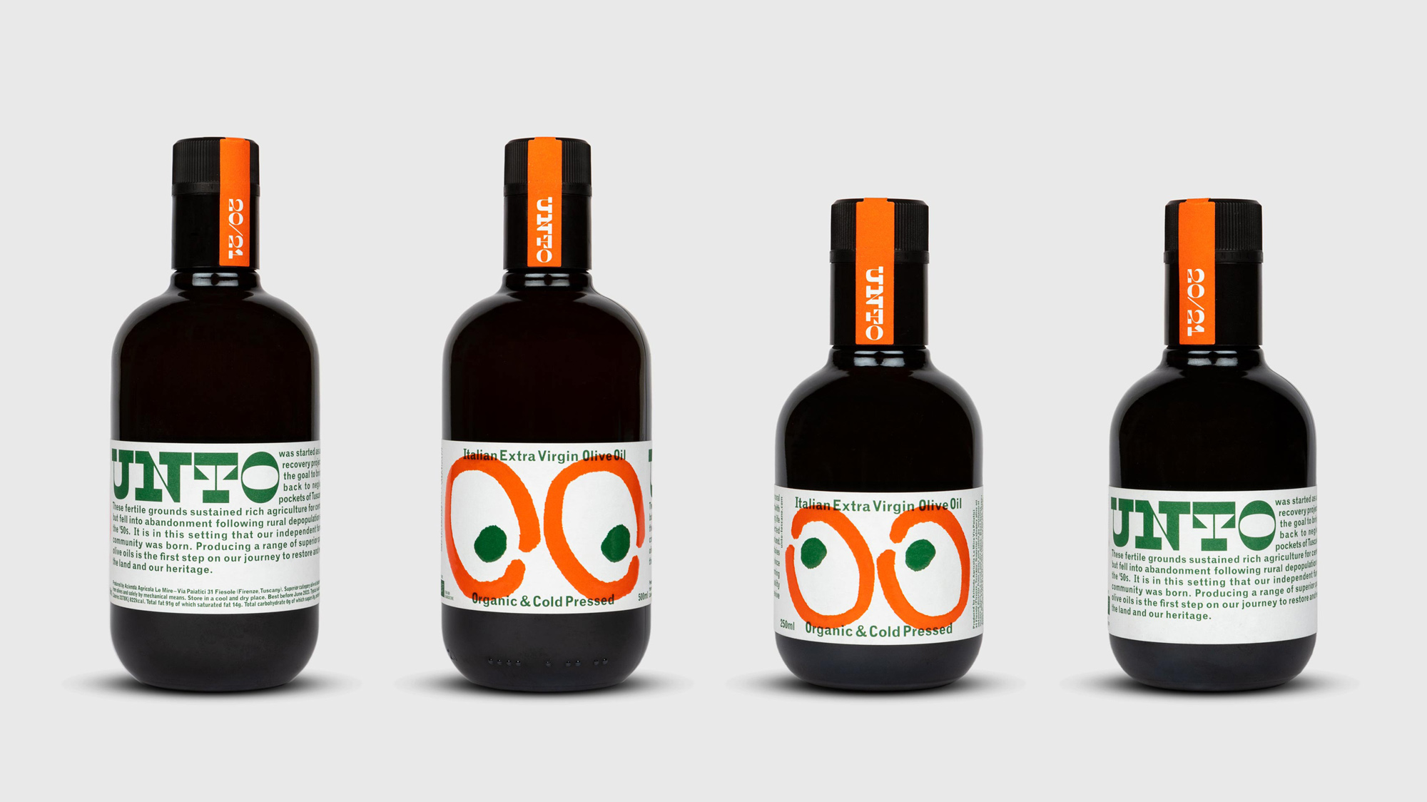
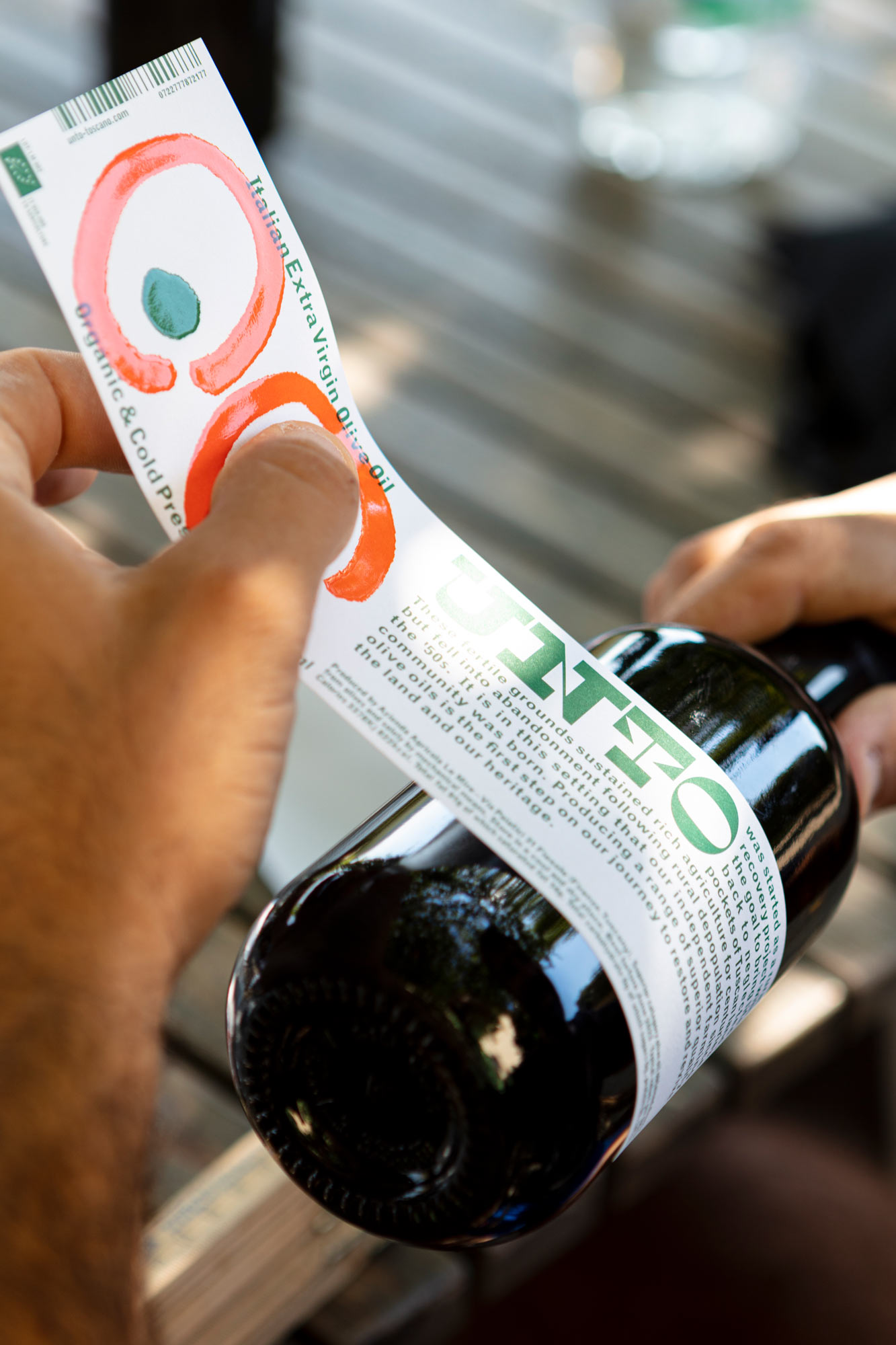
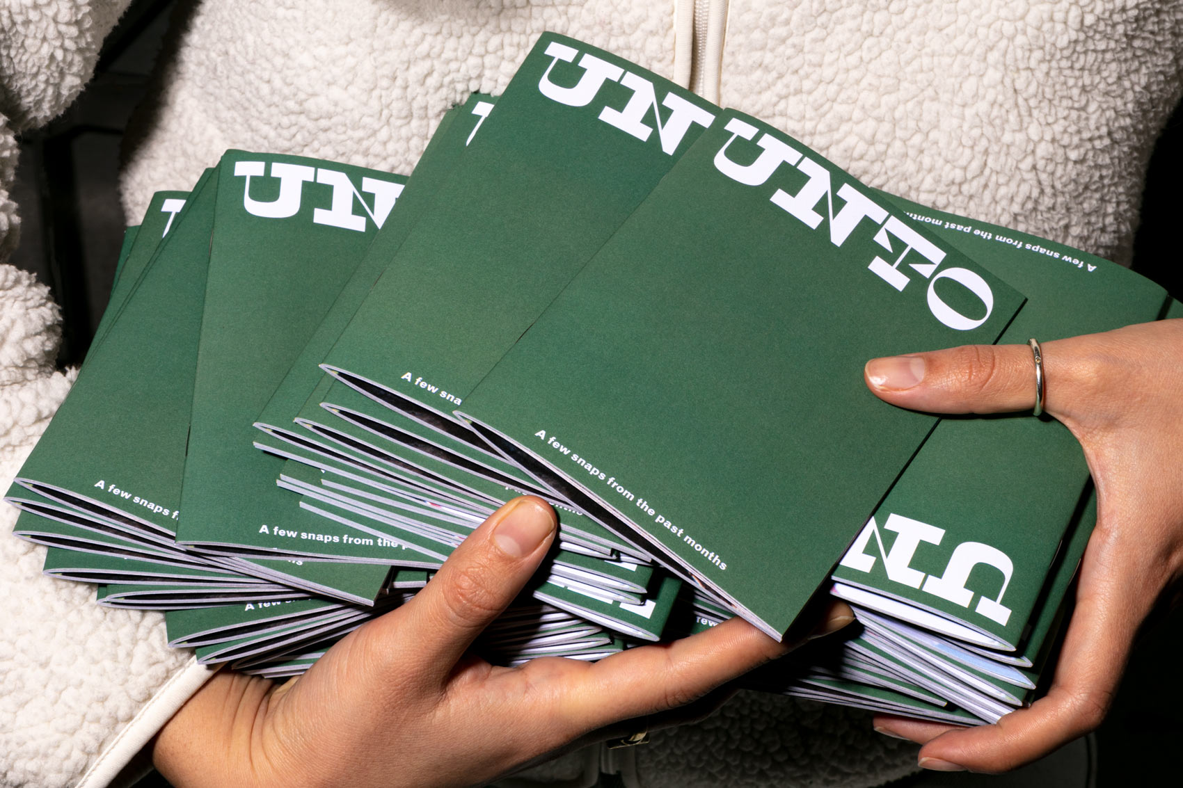
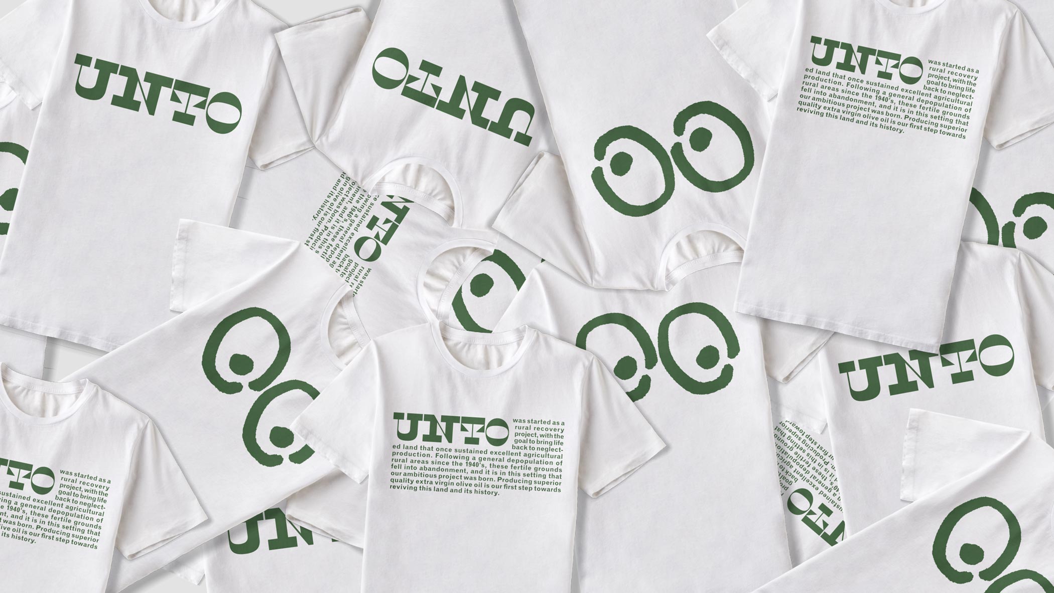
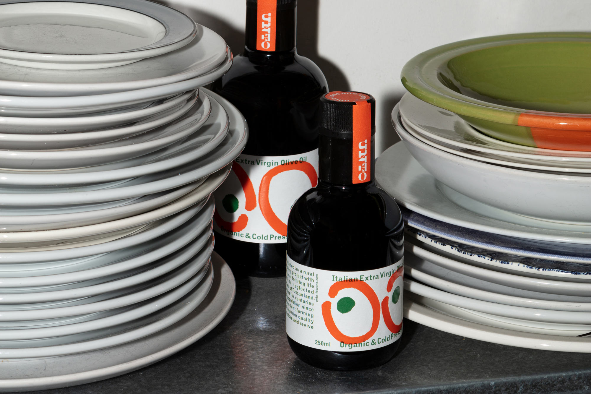
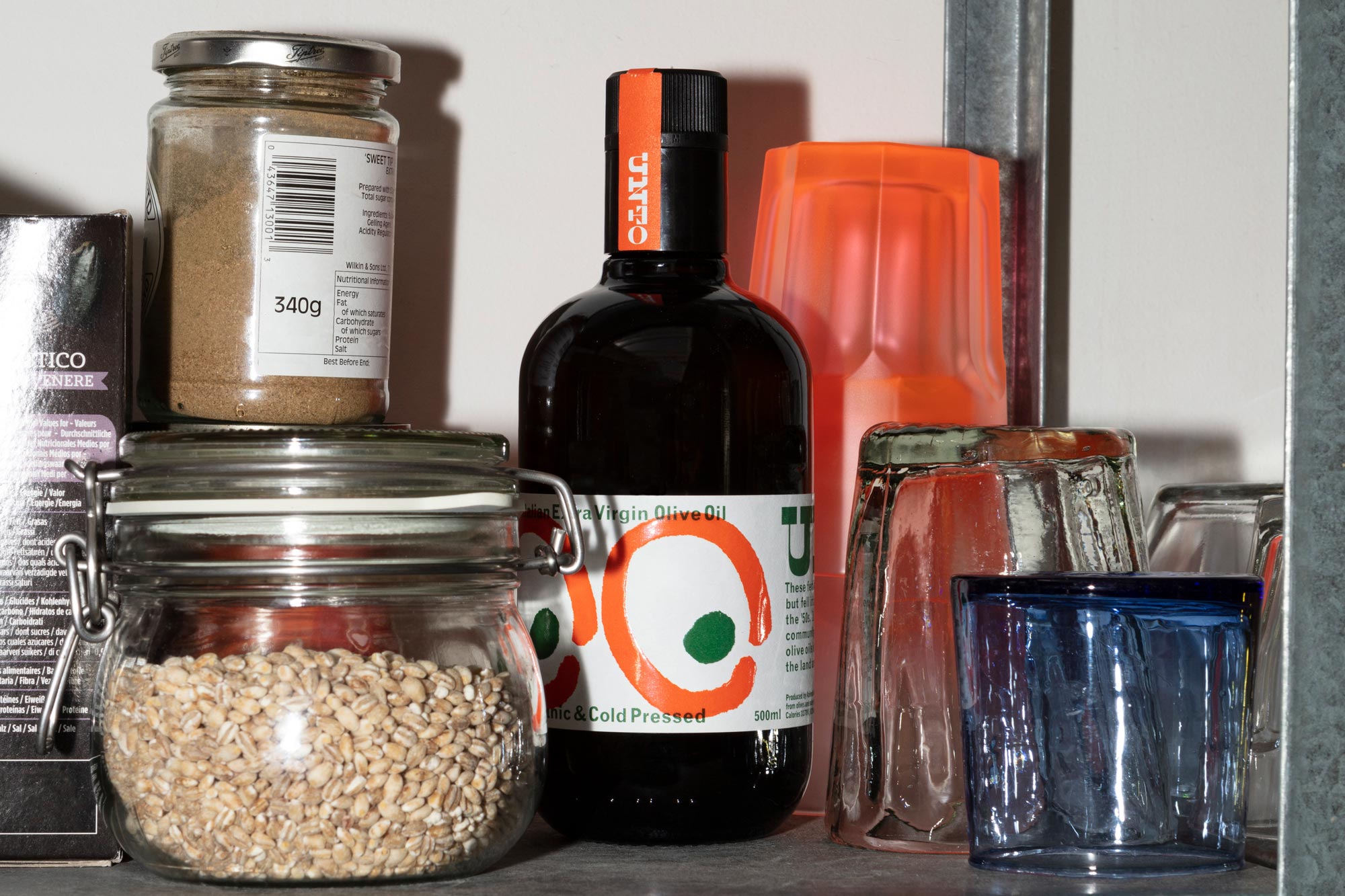
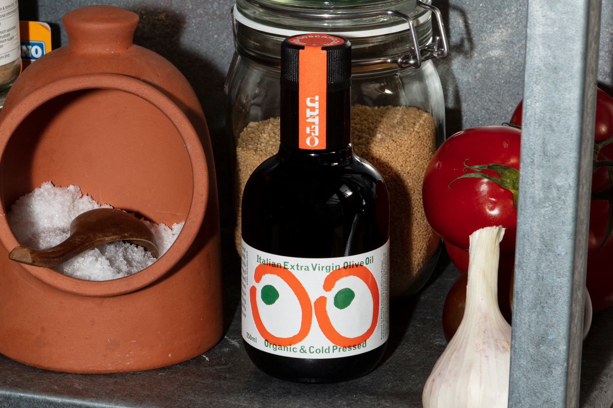
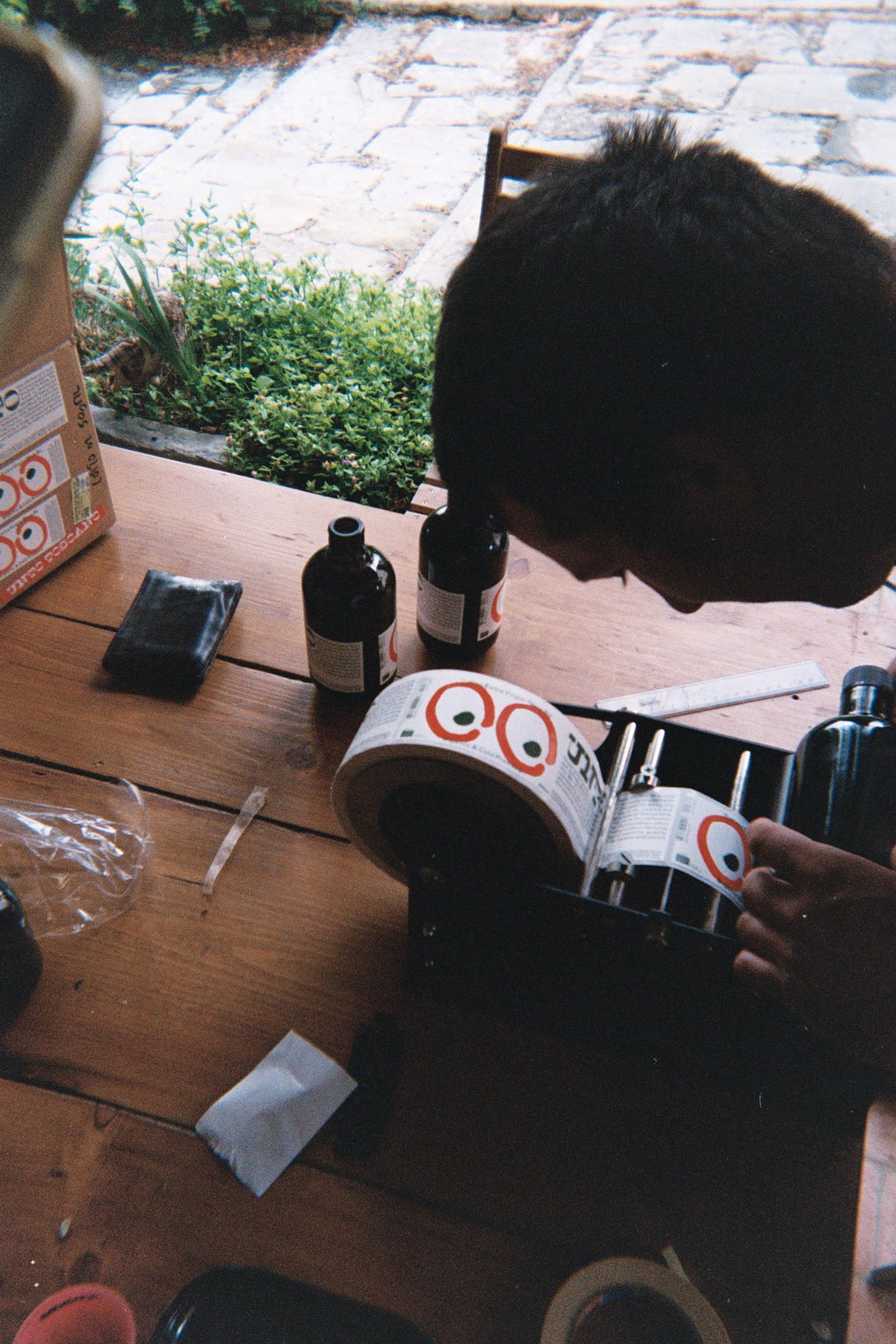
As the brand and product launched simultaneously on a small budget, we devised a set of graphic elements applicable to all platforms and surfaces – a kit of bold, impactful parts: wordmark, story graphic, and an illustration of two olives doubling as eyes. Crude typography based on metal type is used together with overprinting spot colours to create the right atmosphere.
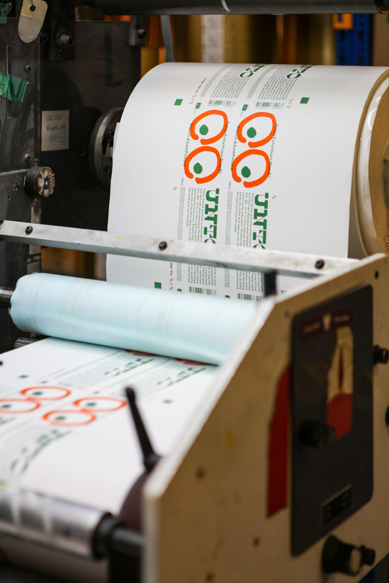
The kit-of-parts approach helped establish brand recognition from the start, with the bottle as main identity application, as well as website and Instagram. The spaghetti western-inspired aesthetic playfully reflects the brand's rural focus, and the honest, thoughtful use of materials and print (two-colour offset and screen print) create an honest, tactile, standout product in the category, with its oversized olive-eyes peeking out from the shelves.
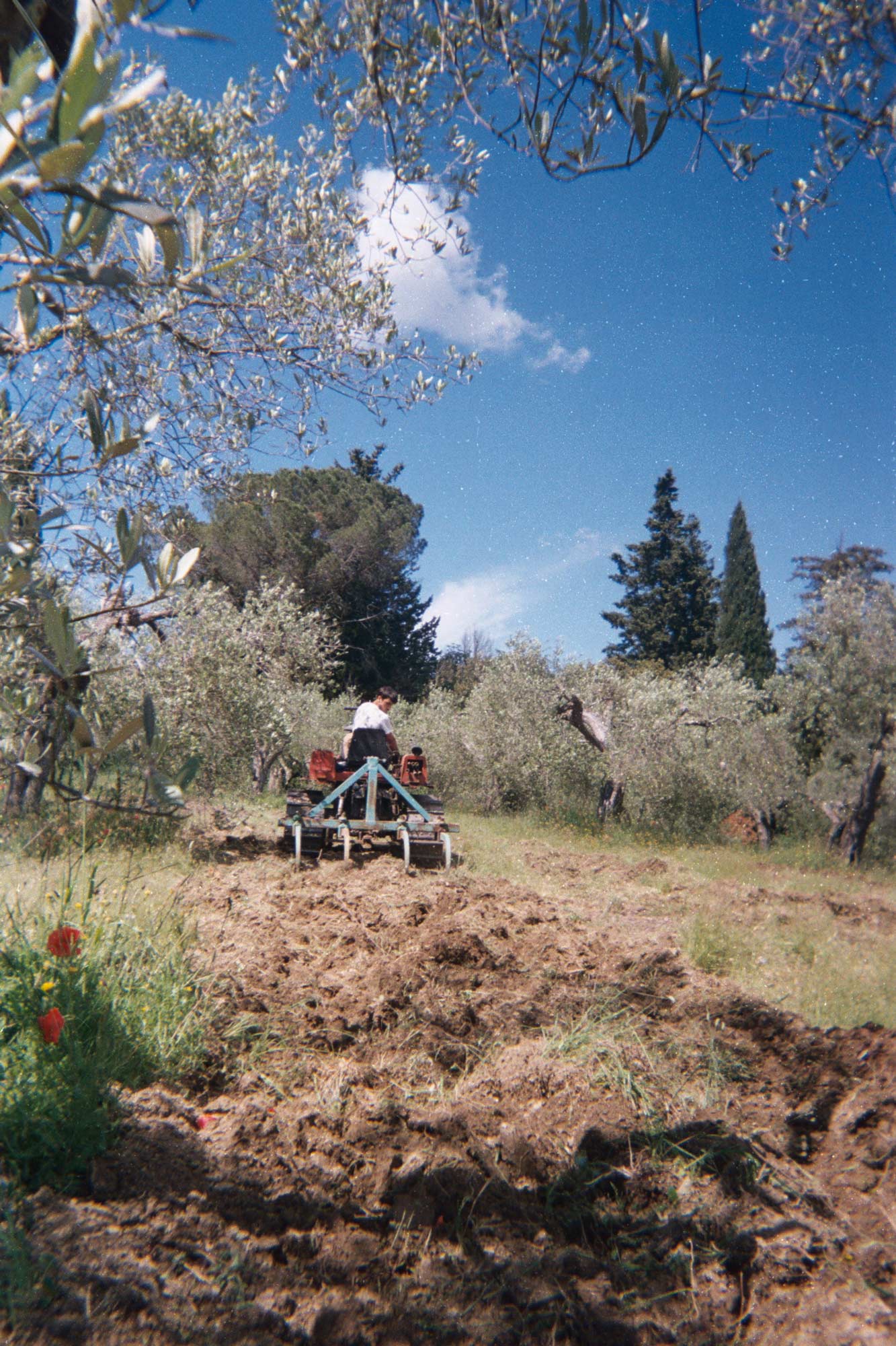
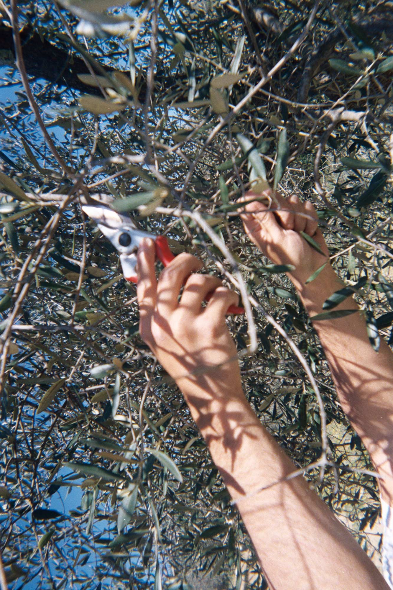
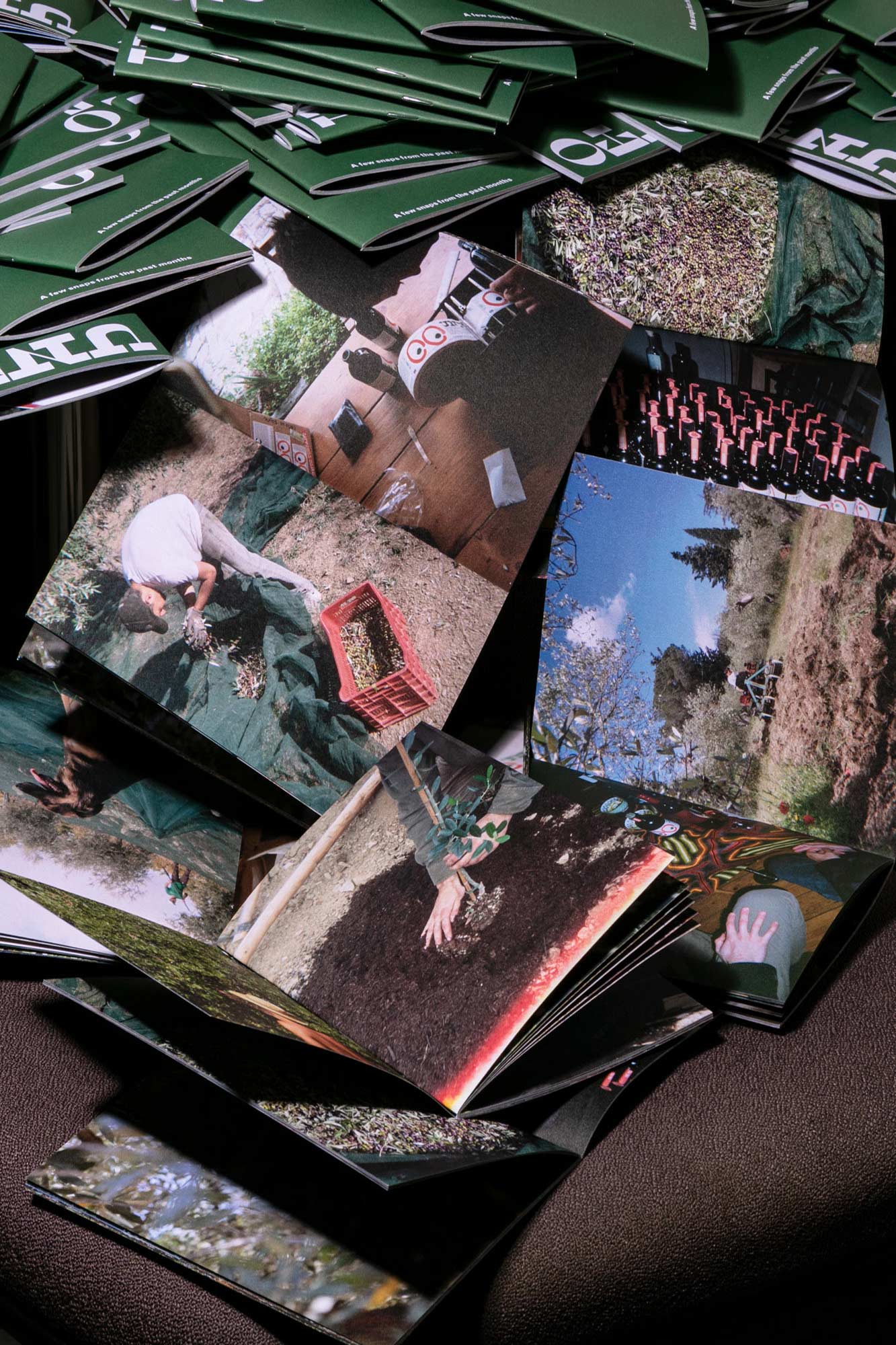
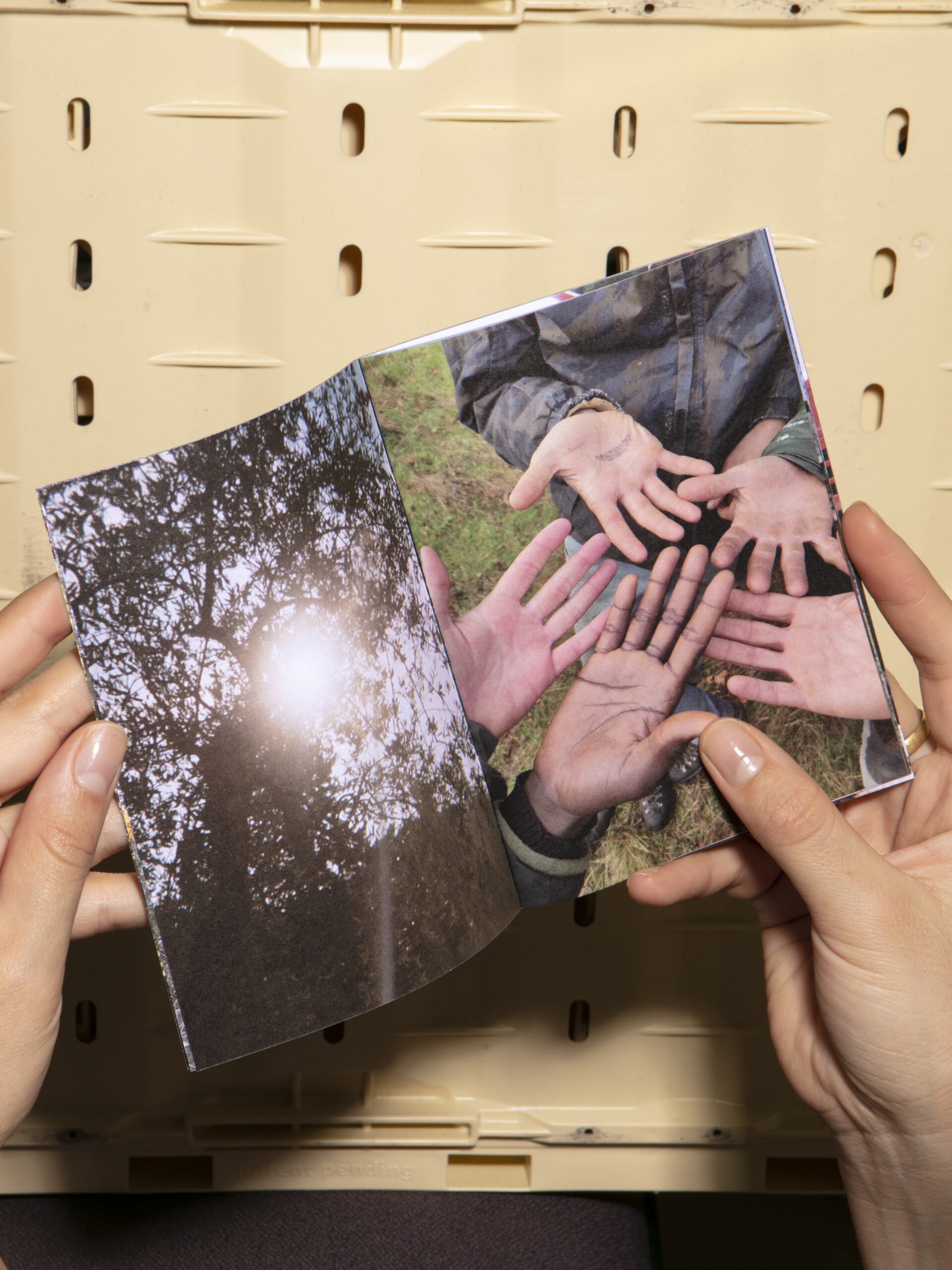
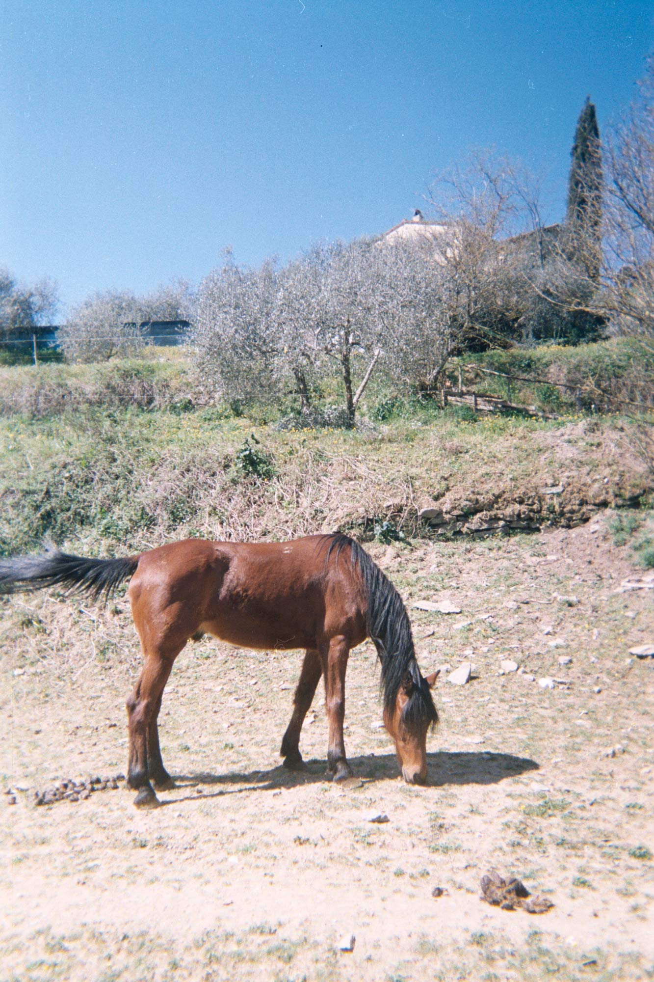
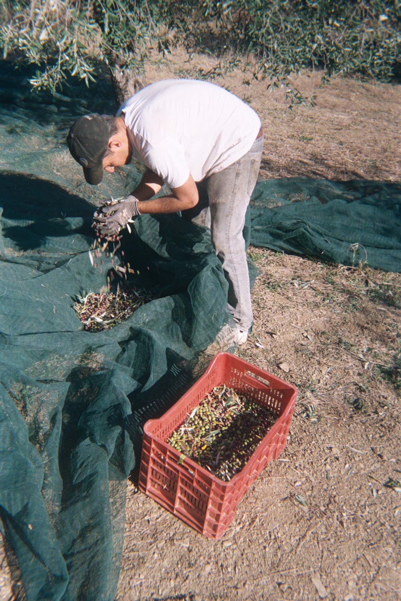
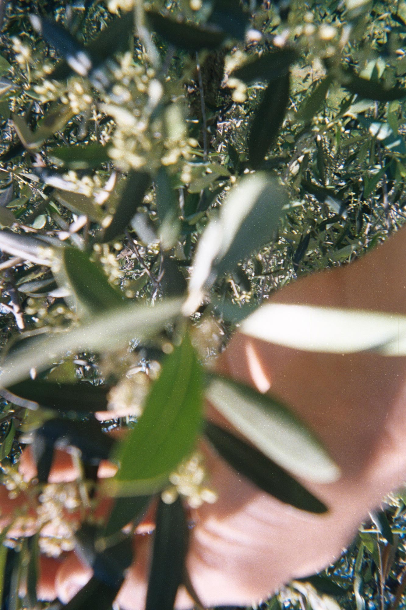
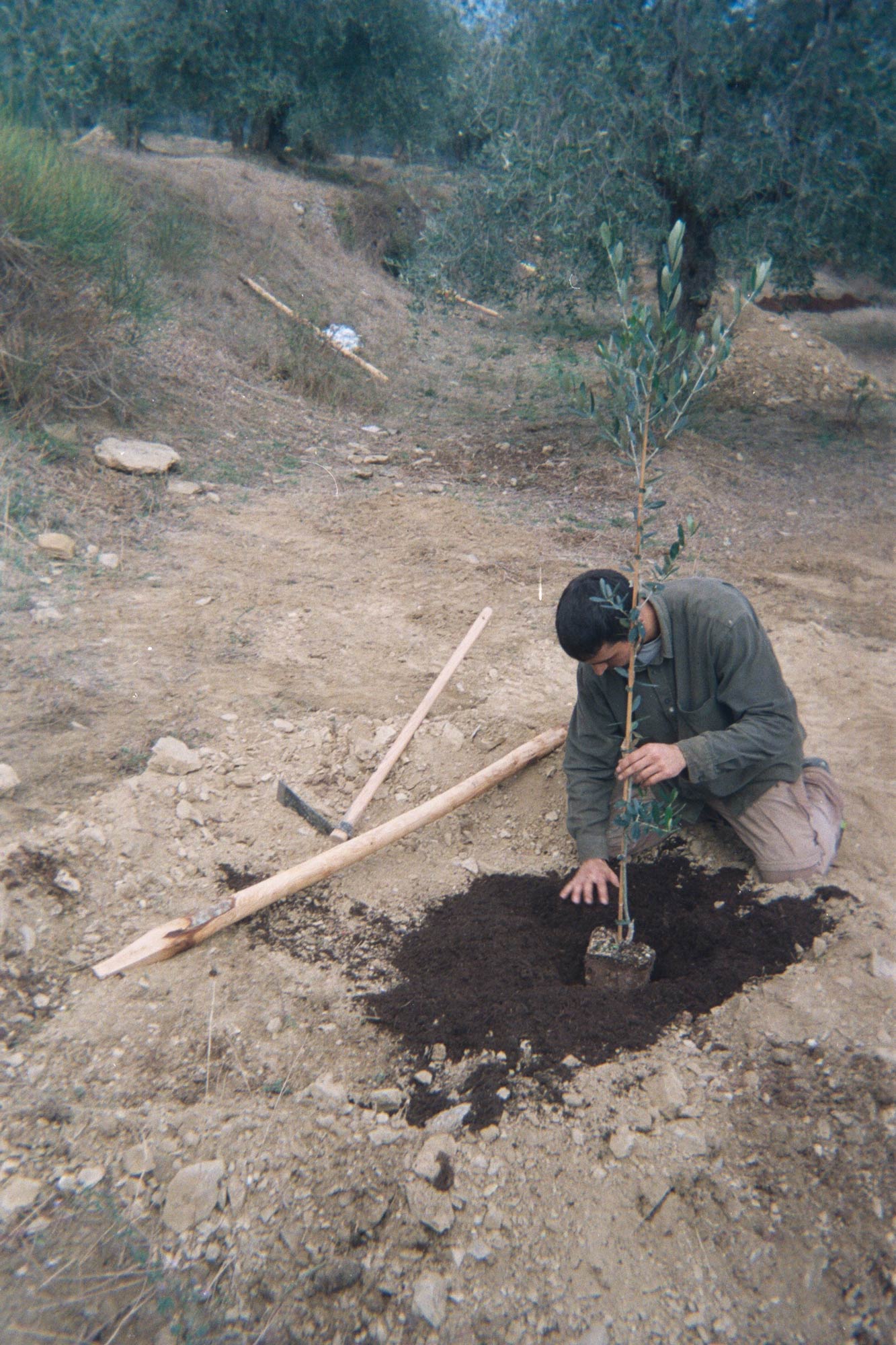
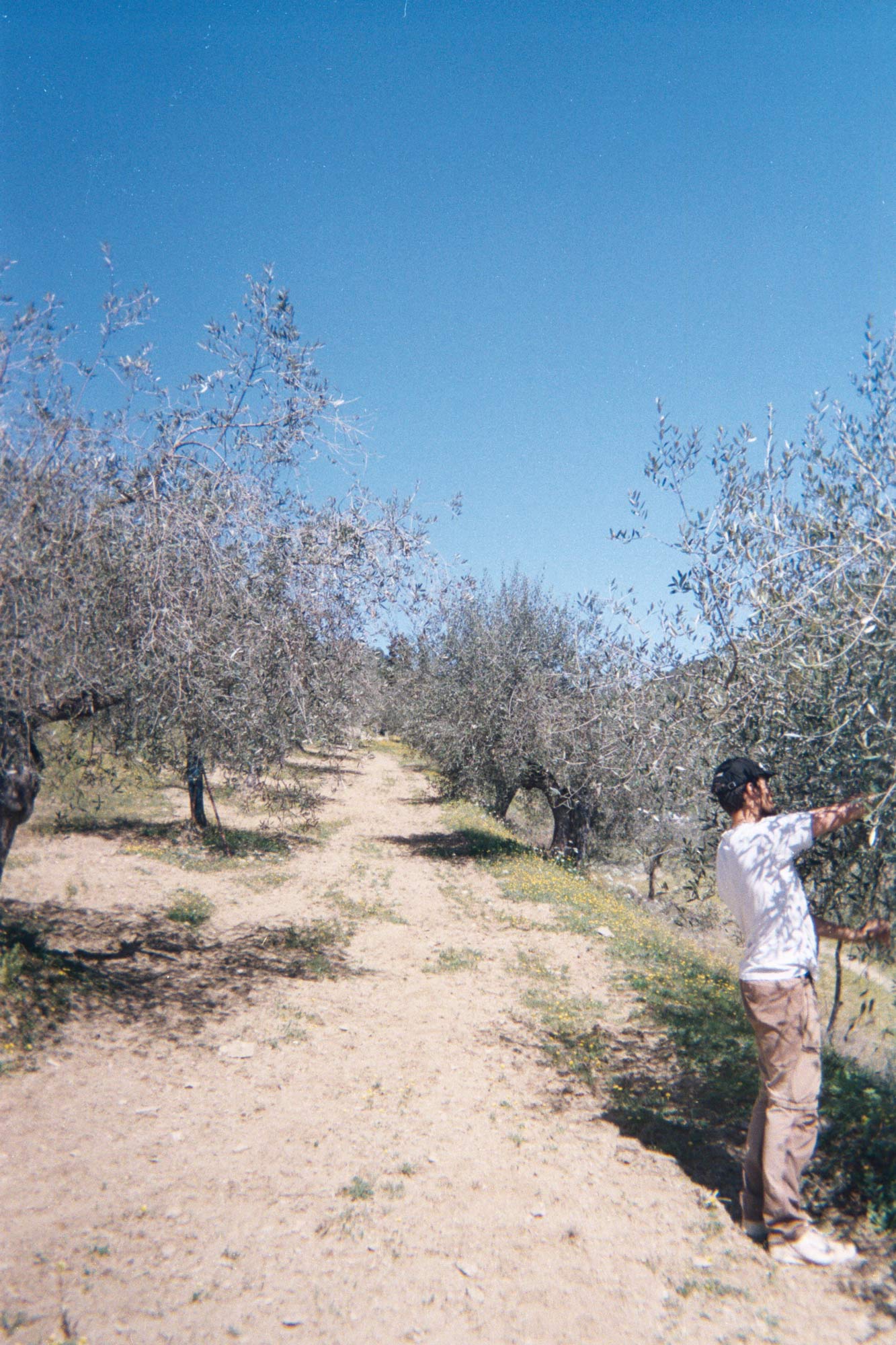
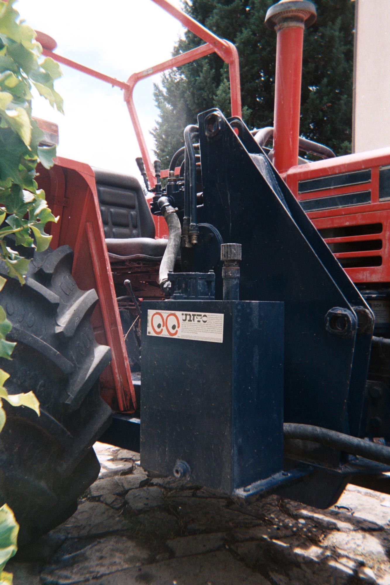
To generate campaign and advertising imagery, we supplied the Unto harvesting team with a bag of disposable cameras – which they continue to enthusiastically use, giving the audience a unique look into the workings of the business, through images with the perfect, low-fidelity film quality.
