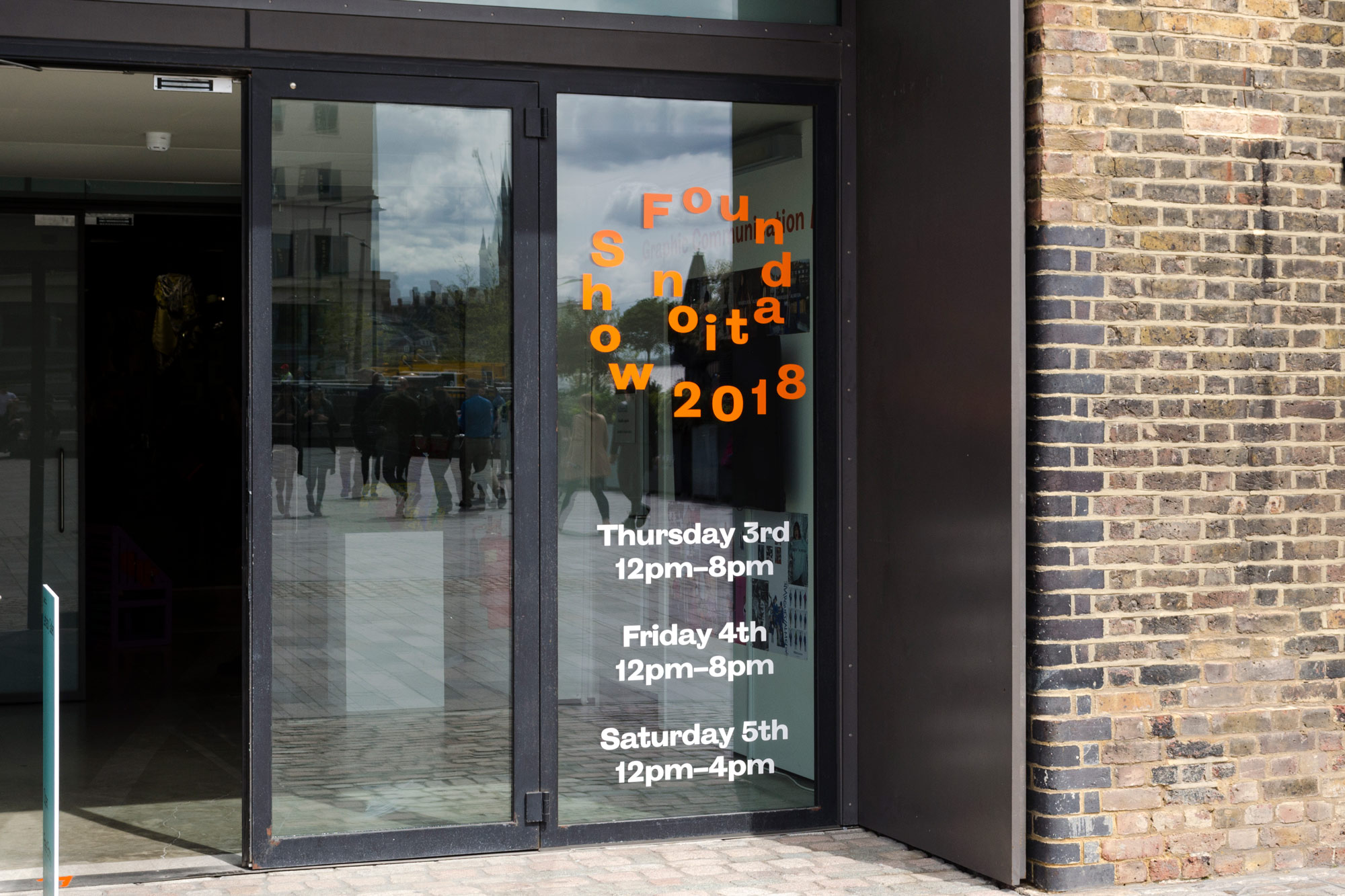

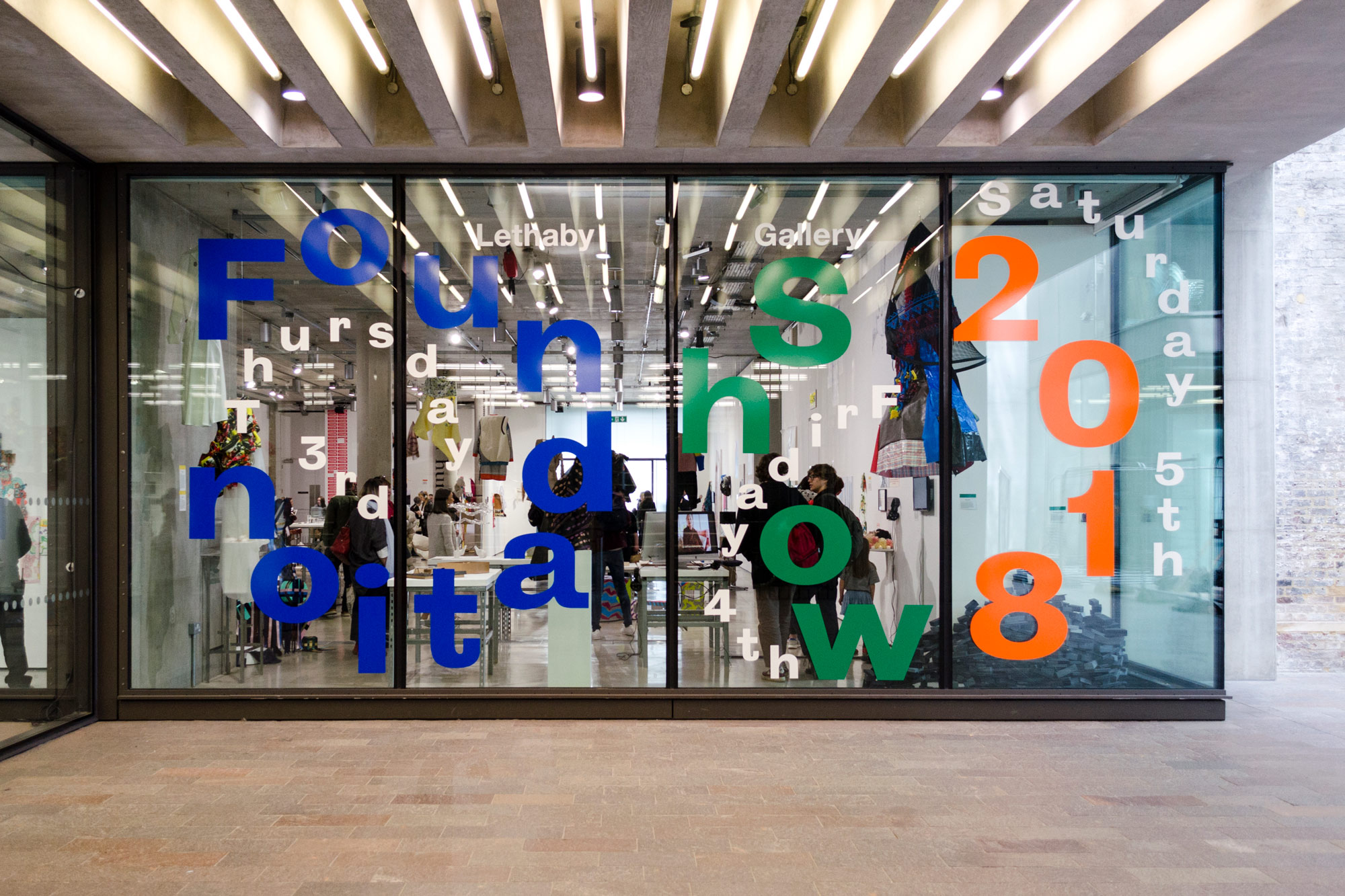
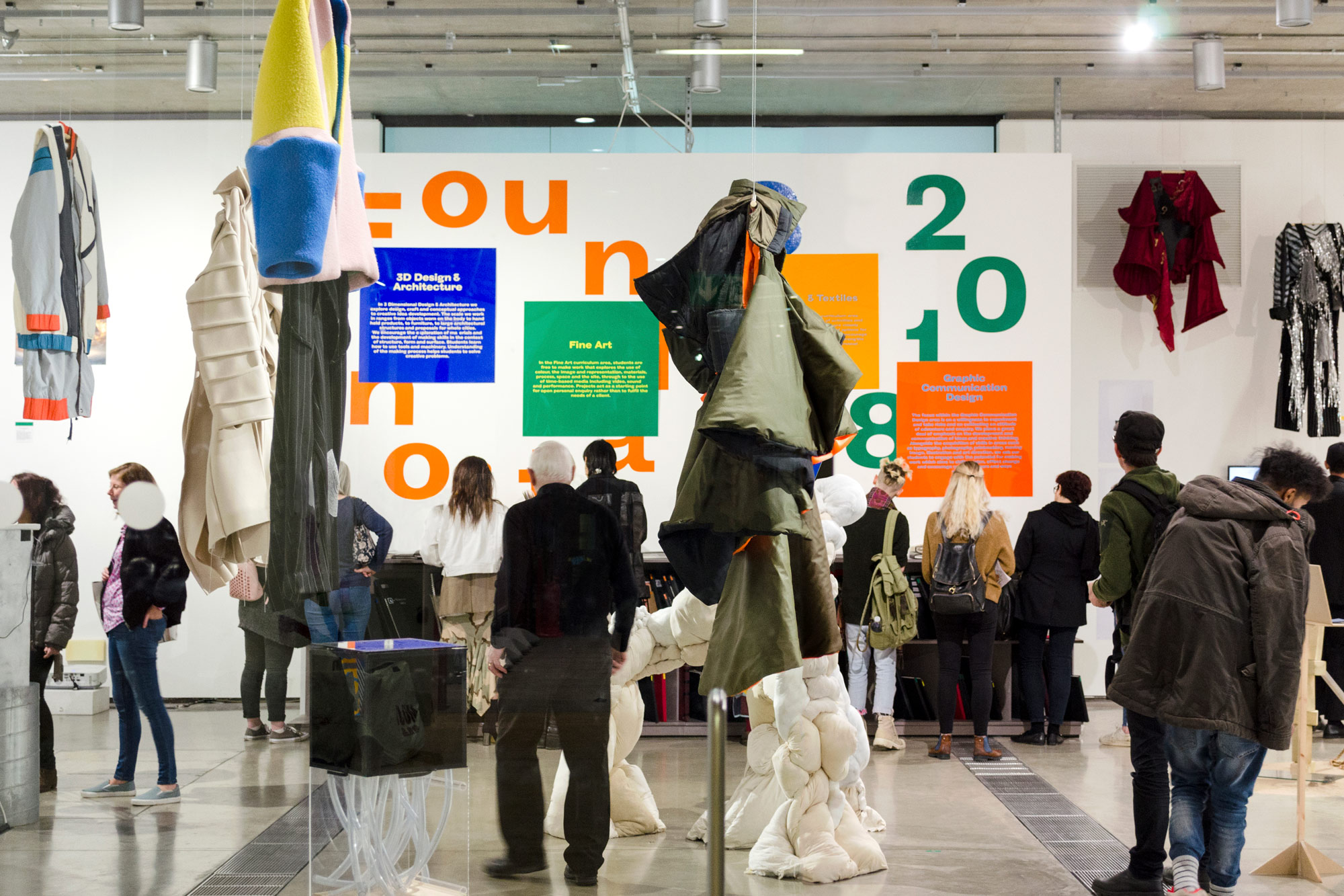
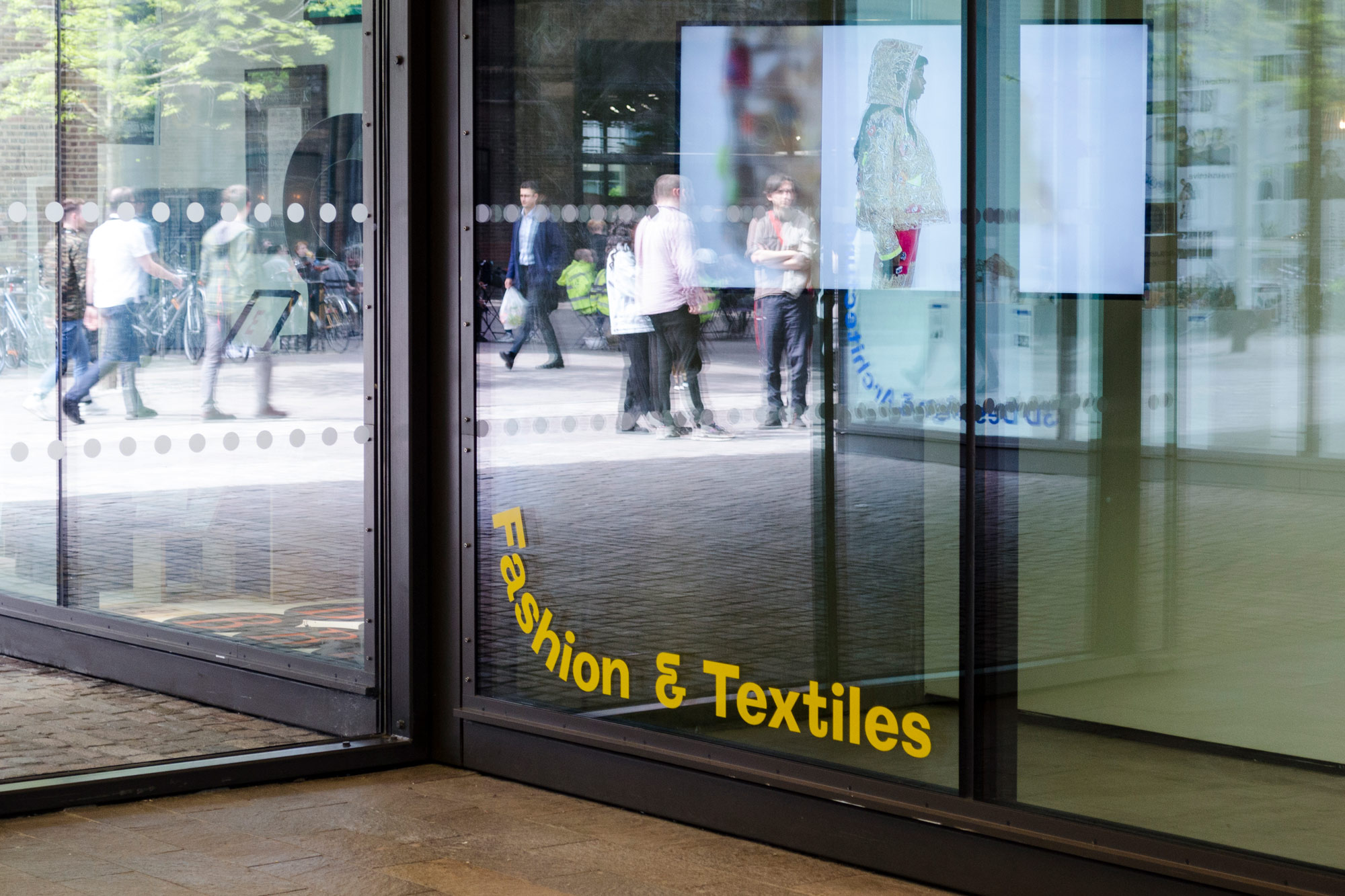
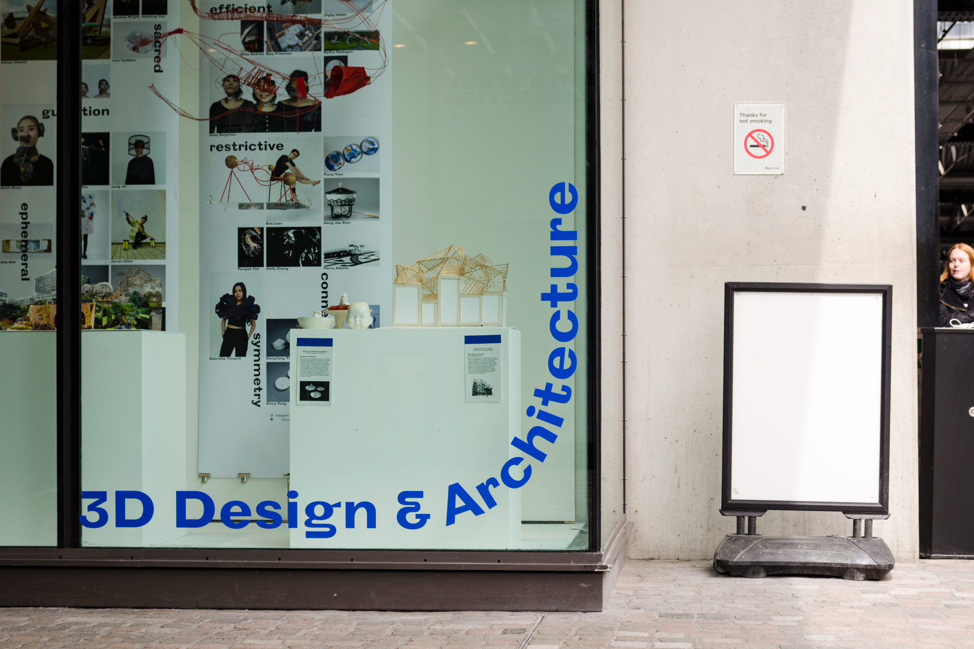
Foundation Show Identity, Central Saint Martins, 2018
For the CSM FAD Show of 2018, the course wanted to present an exhibition that gibe an overview of the course, rather than focusing on each student’s individual work as in a typical degree show. It was curated by Emma Tod and Gary Colclough, and the exhibition graphics done by Studio Bergini.
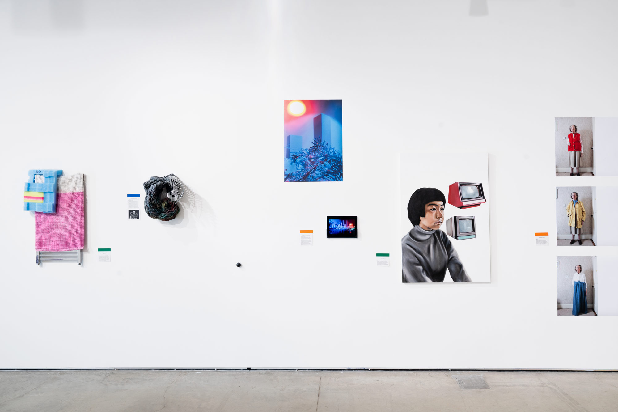
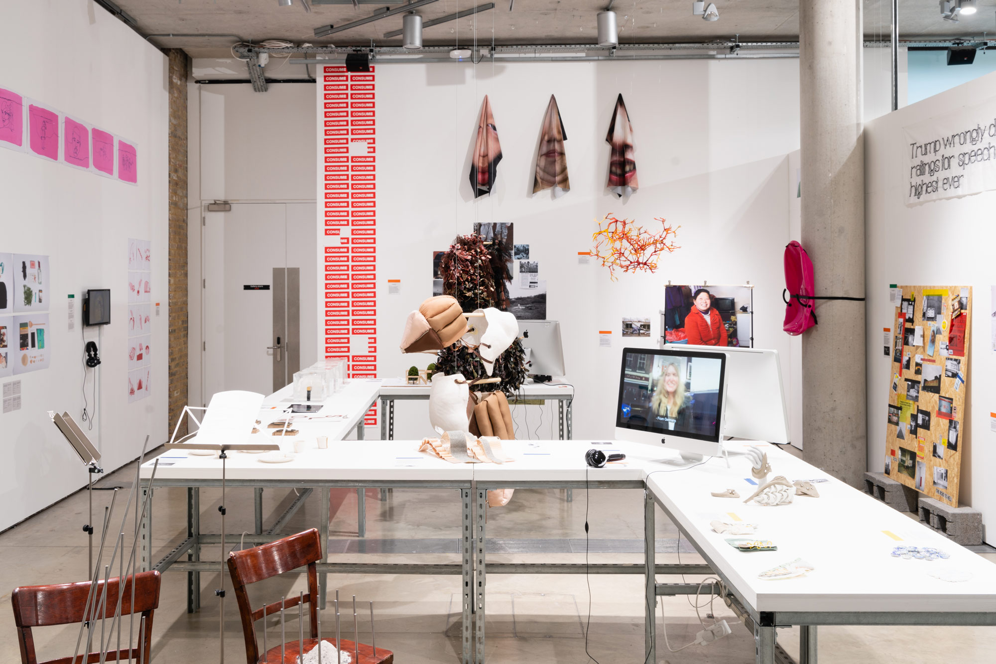
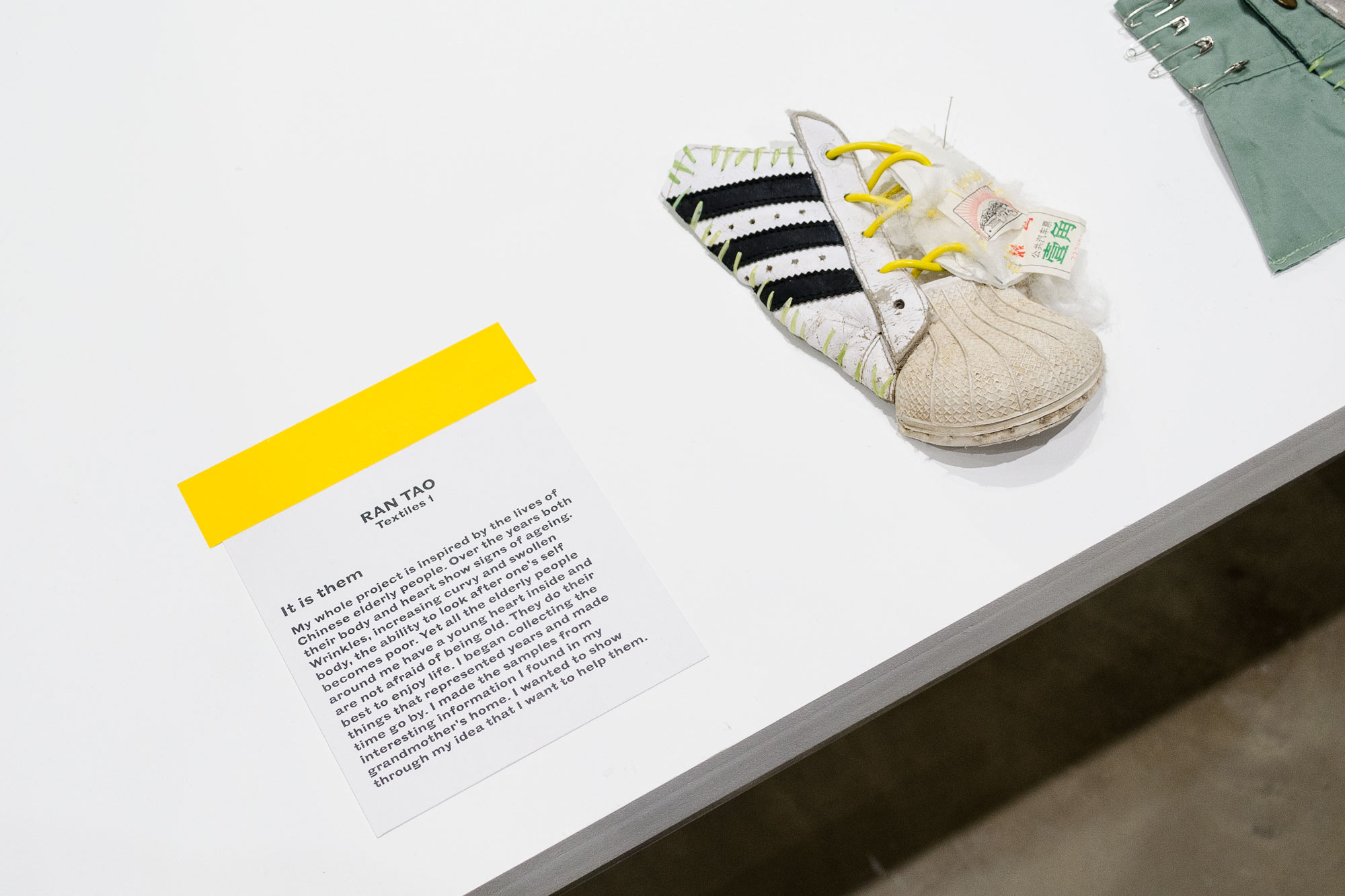
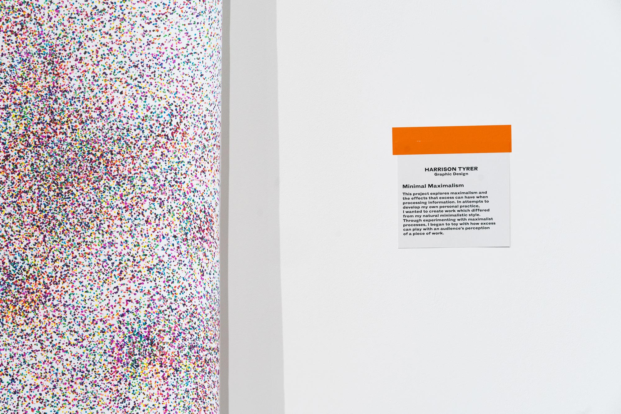
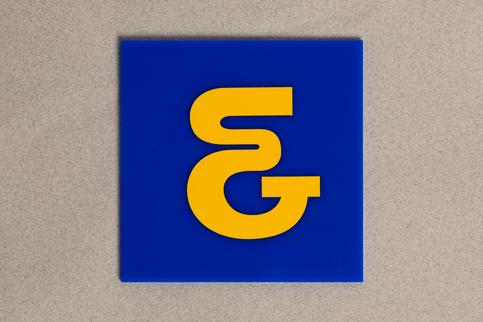
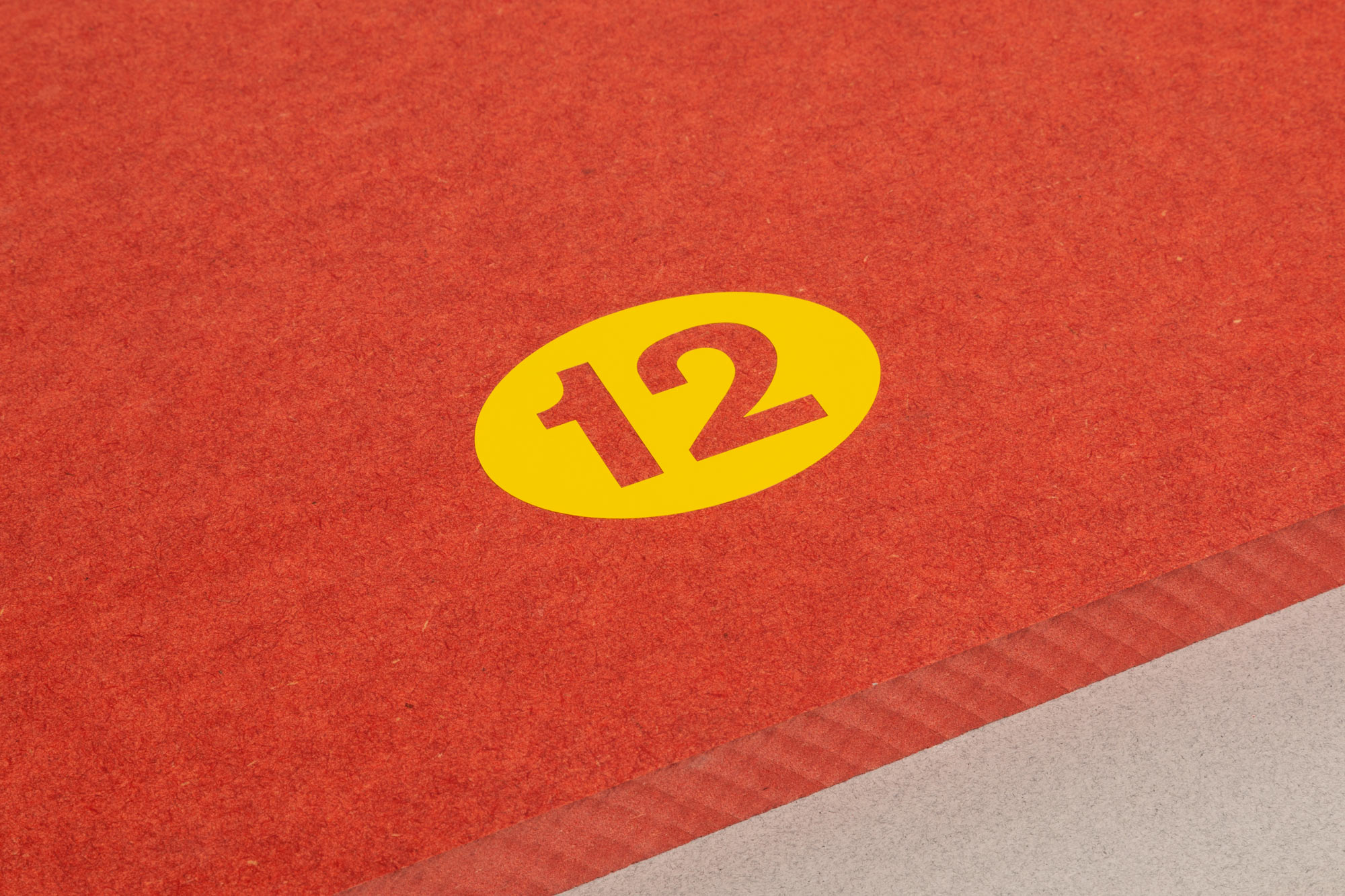
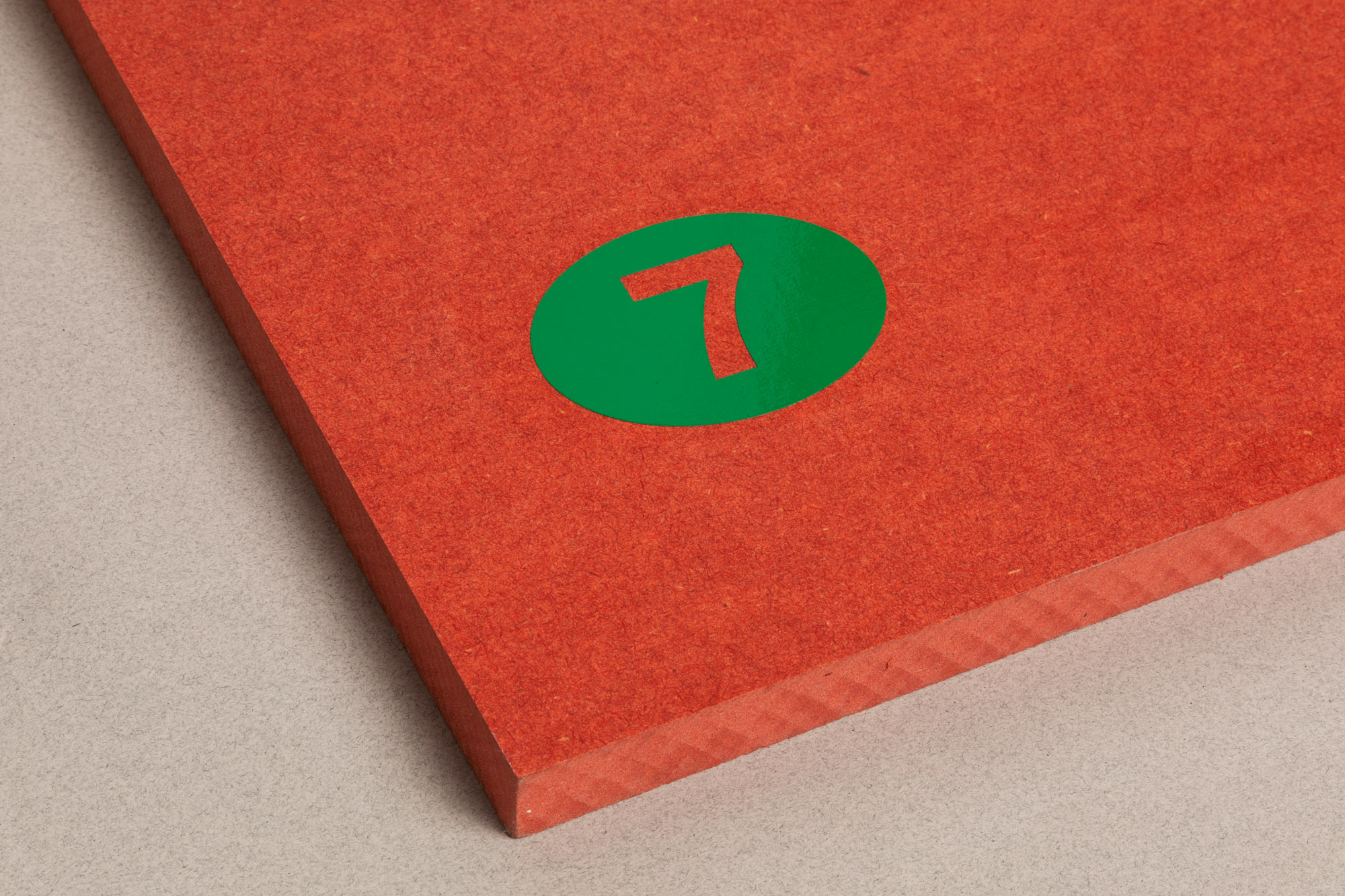
The exhibition was colour coded to indicate the four subject areas of the course; Fine Art, Fashion & Textiles, 3D Design & Architecture, and Graphic Communication Design. The colours were used for the course descriptions at the centre of the space, and were reflected in the coloured vinyl stickers used for the labelling system around the gallery.
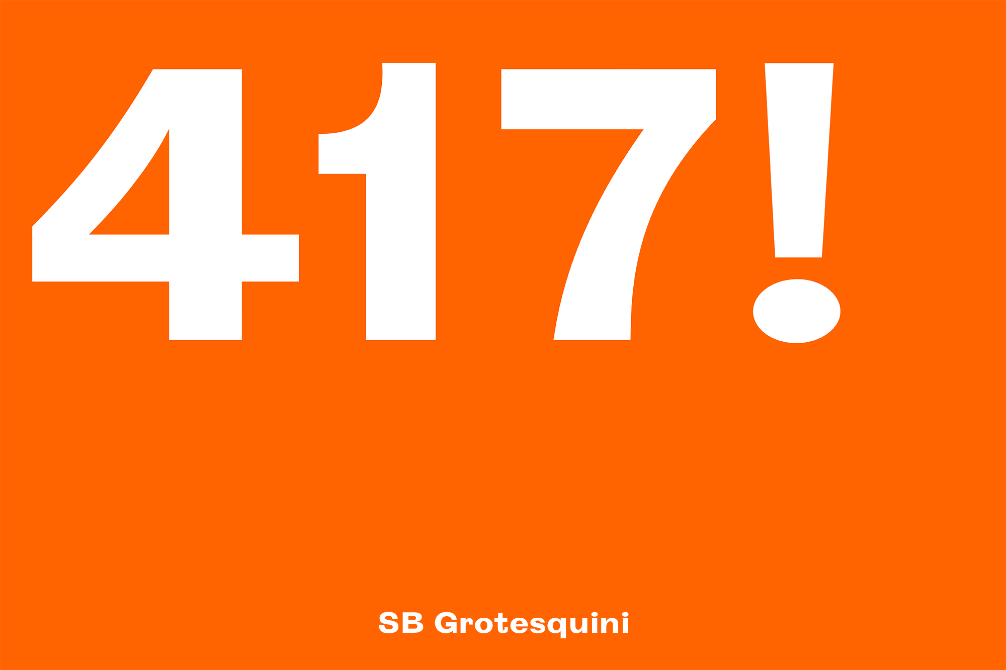
To communicate the playful, experimental, bold, and “in progress” spirit of the Foundation course, we developed a display typeface for use around the exhibition. Grotesqini was created by combining features of various old grotesque typefaces, which then were combined and redrawn to create a single font with a lot of playful character and a feeling of being a bit rough around the edges and unfinished.
Foundation Show Identity, Central Saint Martins, 2018
For the CSM FAD Show of 2018, the course wanted to present an exhibition that gibe an overview of the course, rather than focusing on each student’s individual work as in a typical degree show. It was curated by Emma Tod and Gary Colclough, and the exhibition graphics done by Studio Bergini.
The exhibition was colour coded to indicate the four subject areas of the course; Fine Art, Fashion & Textiles, 3D Design & Architecture, and Graphic Communication Design. The colours were used for the course descriptions at the centre of the space, and were reflected in the coloured vinyl stickers used for the labelling system around the gallery.
To communicate the playful, experimental, bold, and “in progress” spirit of the Foundation course, we developed a display typeface for use around the exhibition. Grotesqini was created by combining features of various old grotesque typefaces, which then were combined and redrawn to create a single font with a lot of playful character and a feeling of being a bit rough around the edges and unfinished.