Exhibition catalogue, CSM BA Fine Art, 2015
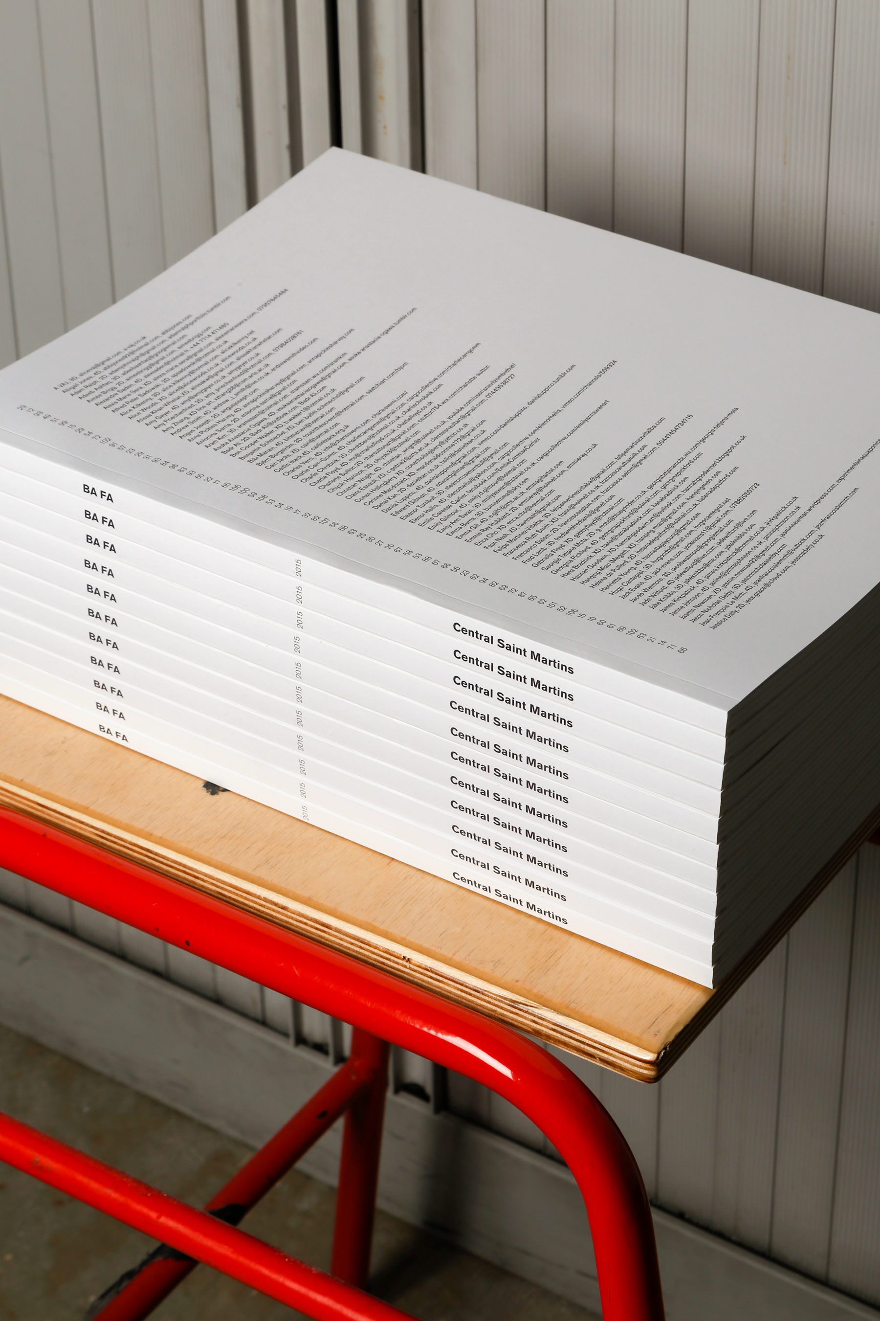
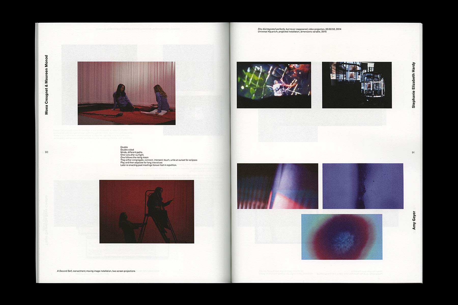
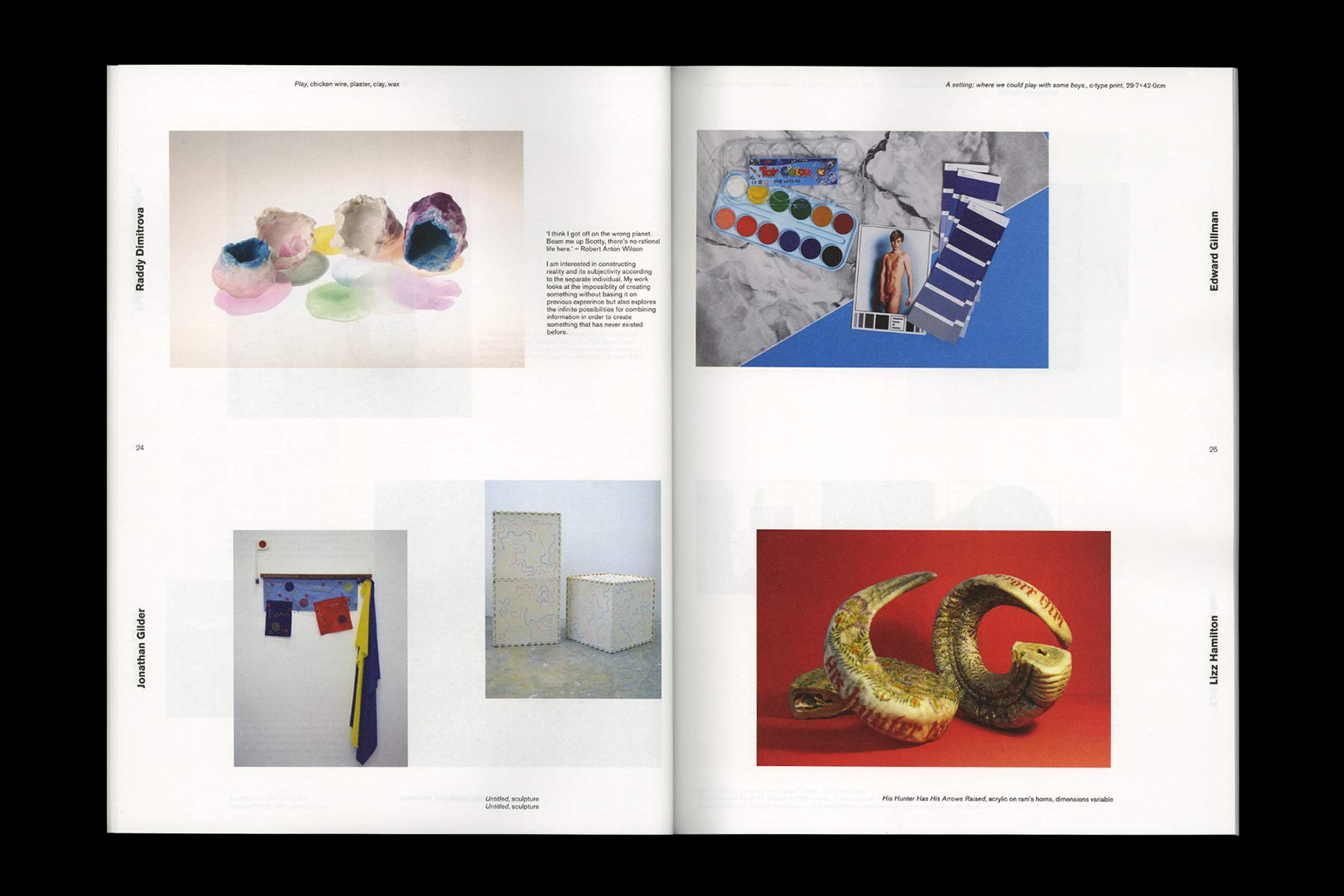
The Central Saint Martins BA Fine Art class of 2015 asked us to design their graduation show catalog. The initial brief was to make the catalog soft-covered and magazine-sized, with a minimal design that would let the artworks speak for themselves, while at the same time avoiding a rigid and repetitive layout.
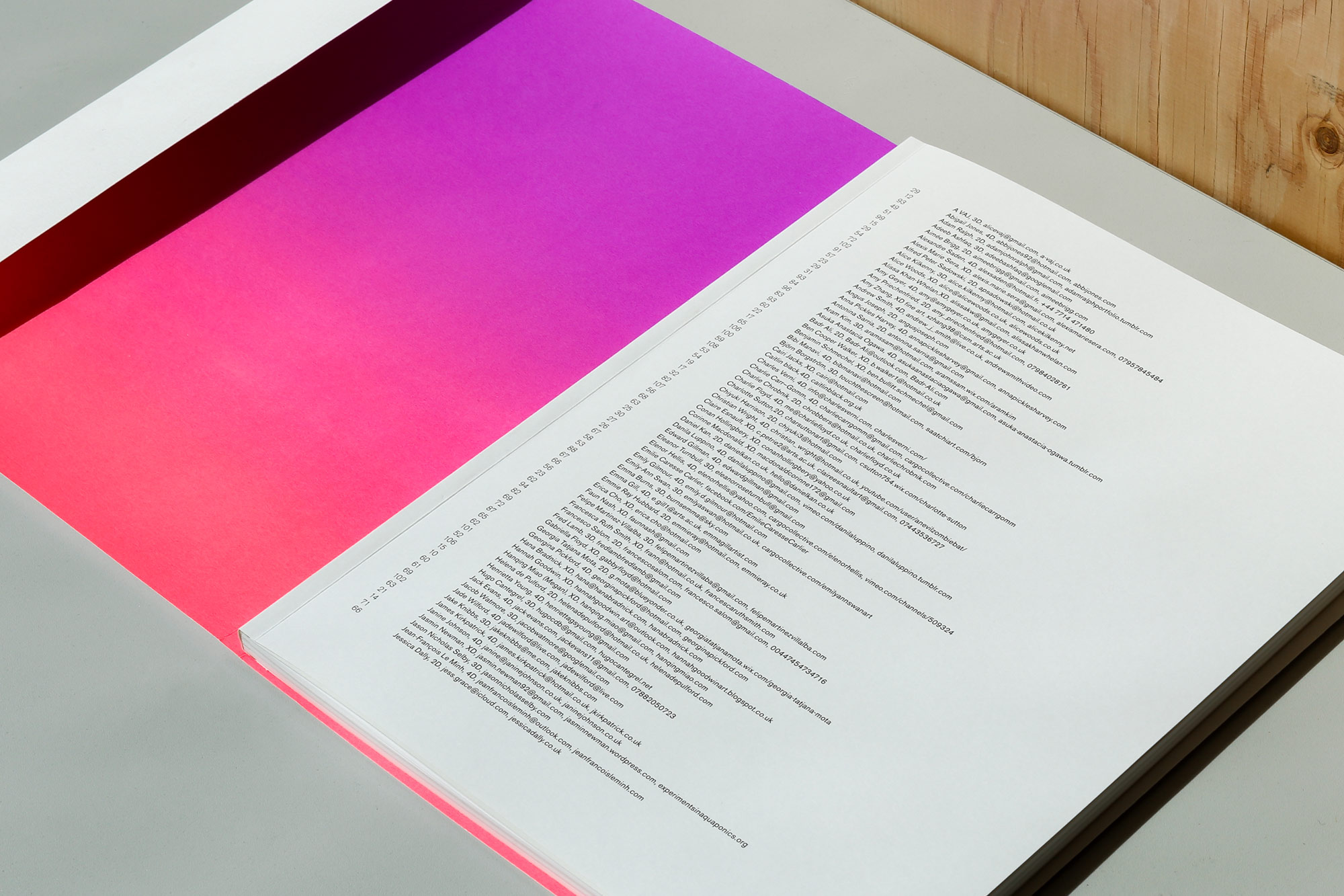
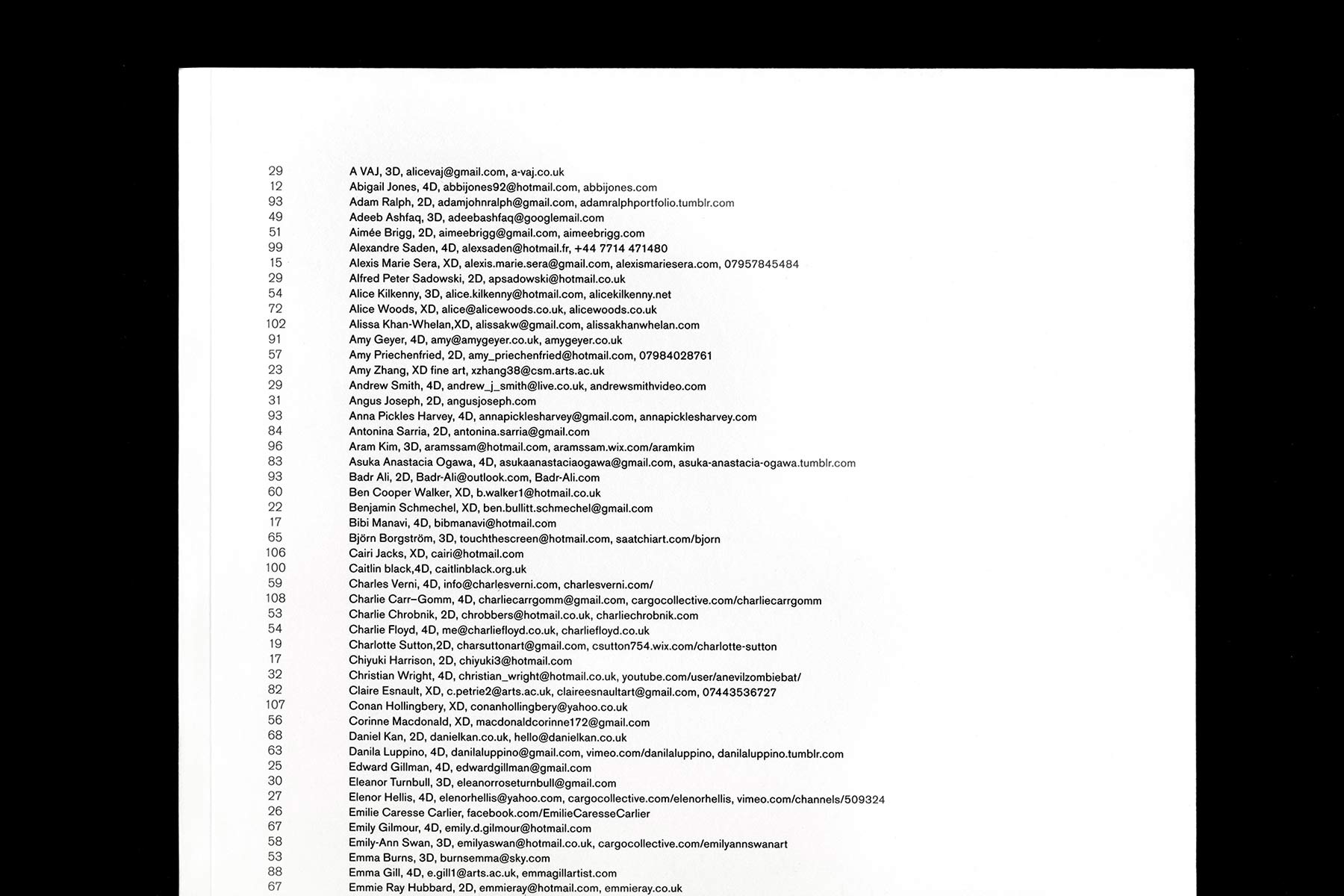
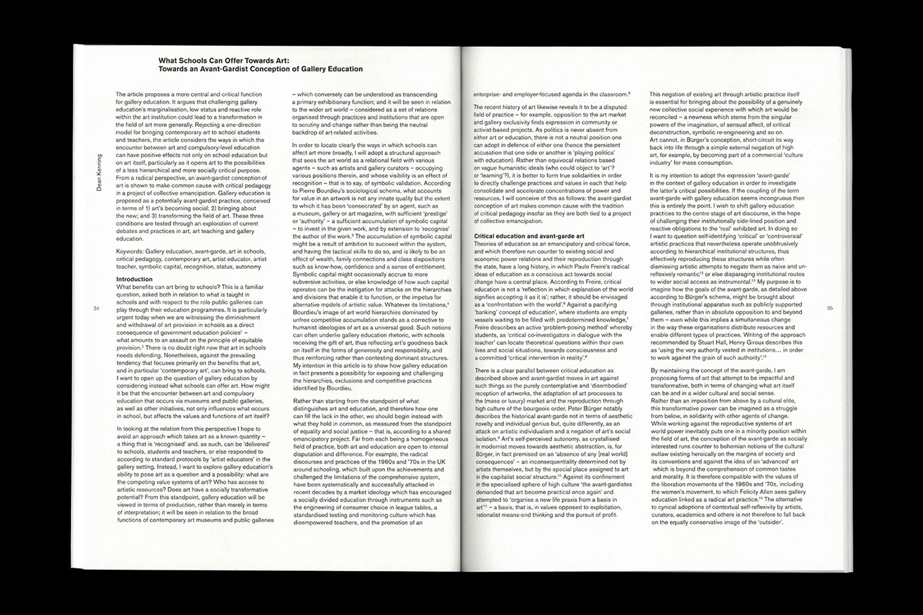
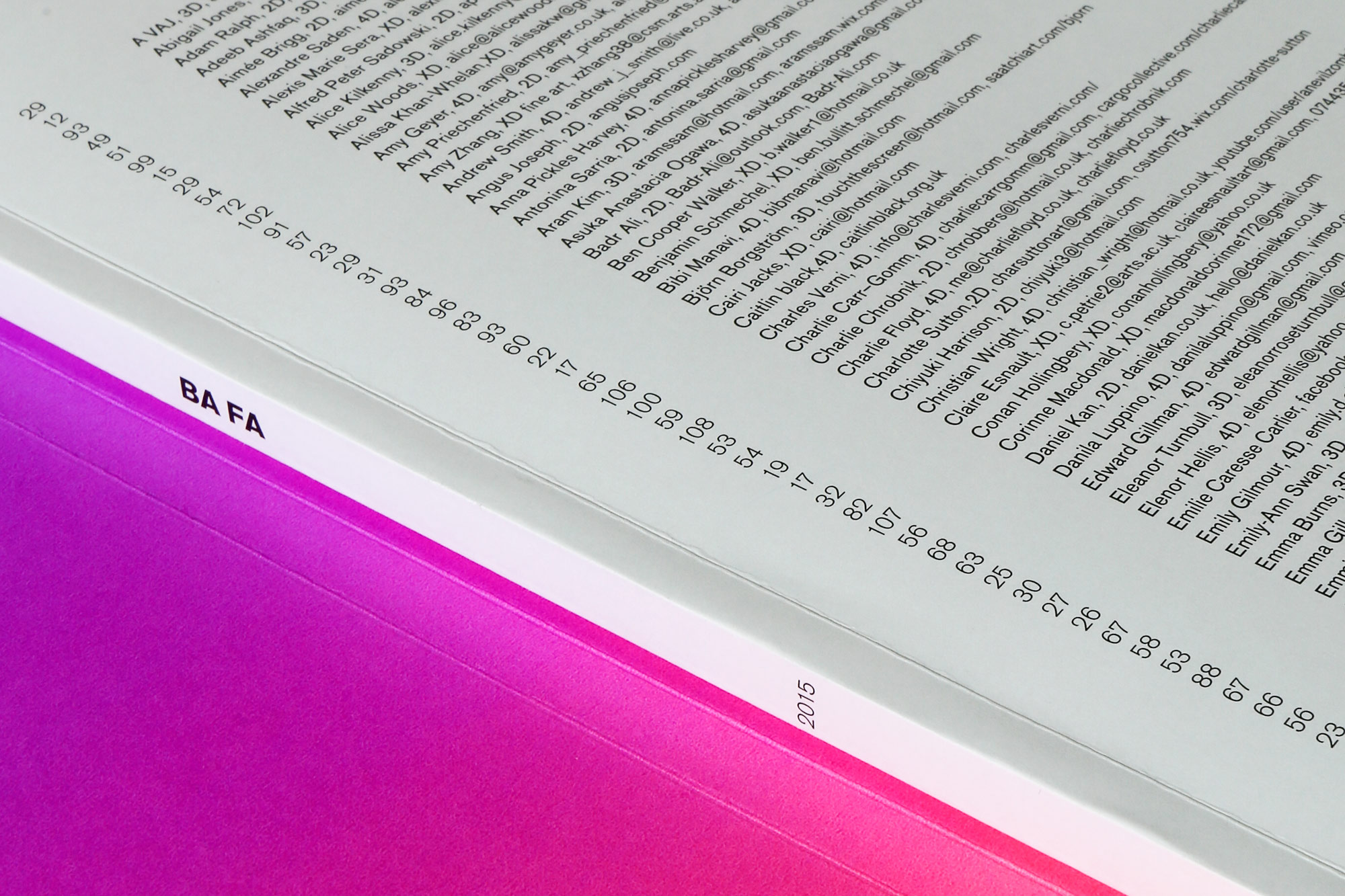
For each of the almost 150 students we had to accompany images of artworks, descriptions, and a blurb. There were also seven commissioned essays and one interview to include. Our solution was to develop a grid system with the ability to accommodate all of those different elements, but that would also look good if it were in places to contain only one of the elements, as we anticipated the contributors would likely not all be supplying the same kind of content. And due to the sheer volume of content, our system had to be very rational and leave very few variables for us to adjust, so that we wouldn’t have to obsess over details too much. At the same time the system had to have a certain flexibility to it, in order to give an impression of continuous movement. The front and back covers have a full alphabetical index of all the contributing students with their contact details.
We also designed and screen printed 50 neon pink dust jackets for the sponsors of the production of the publication.
