The Written Language of Reality, book + exhibition design, Marta Cacciavillani, 2017
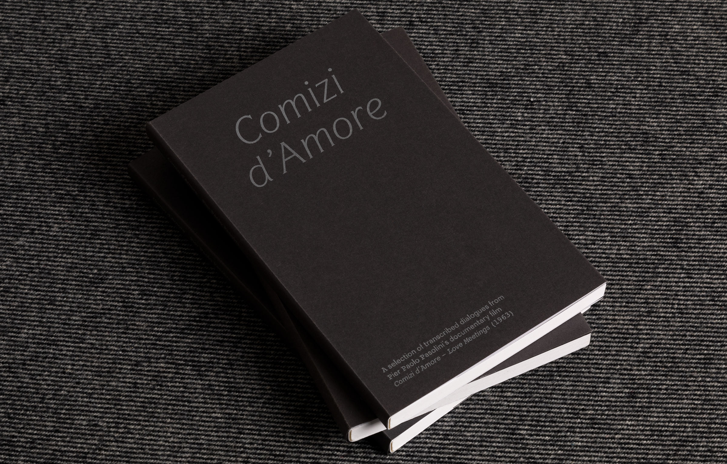
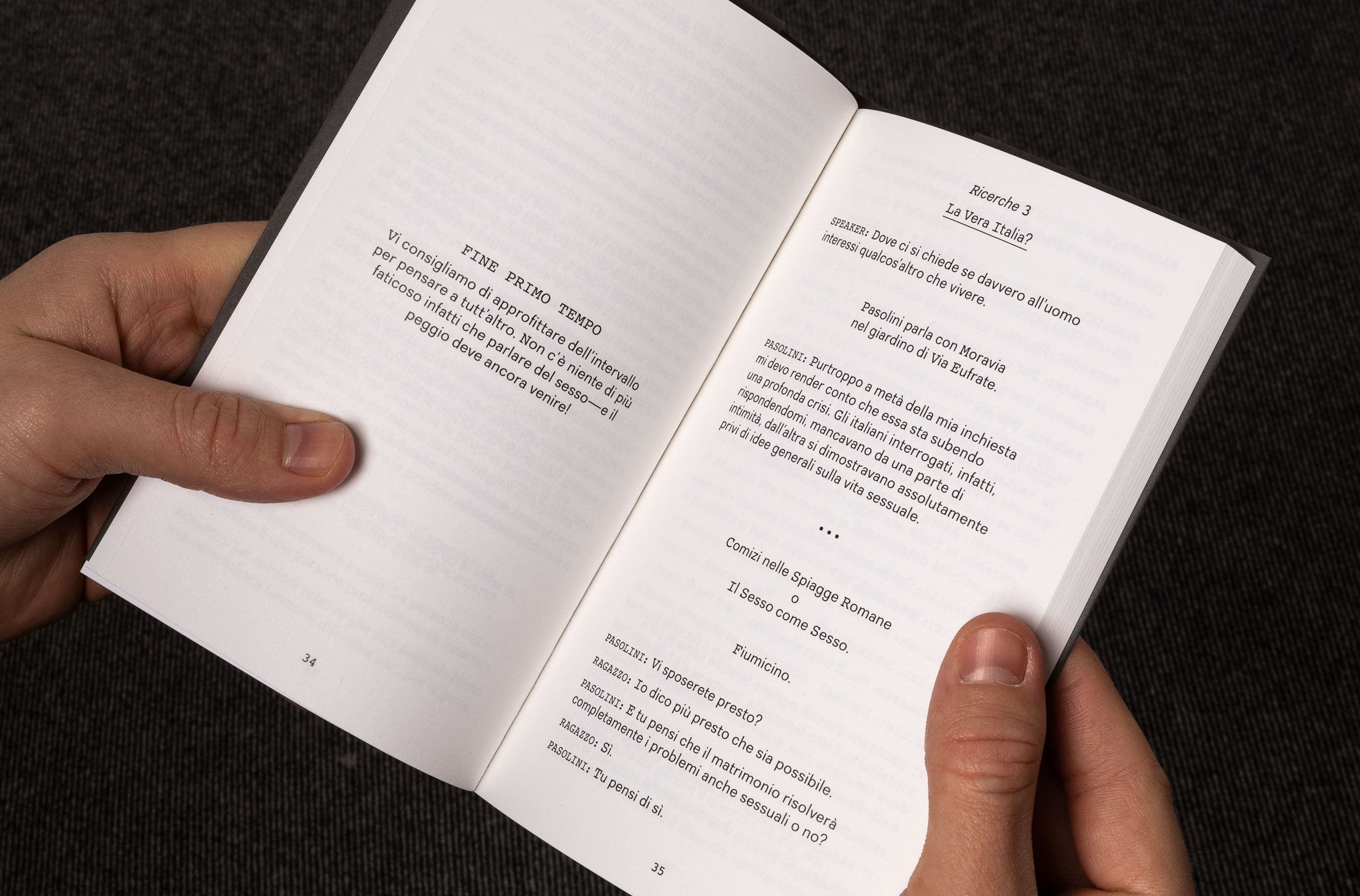
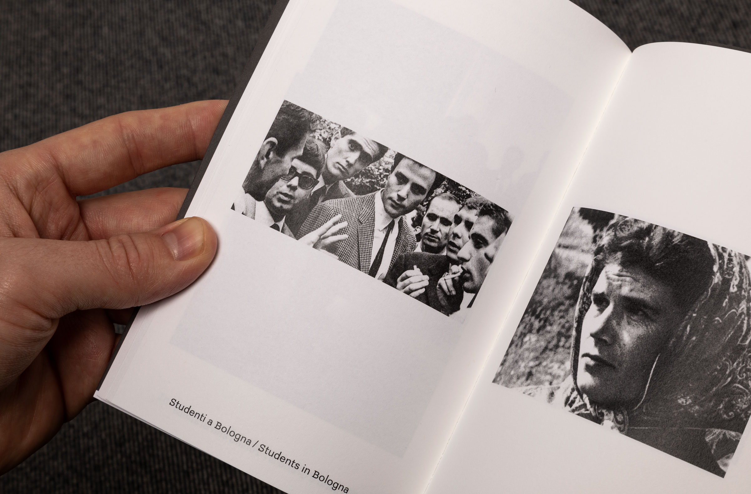
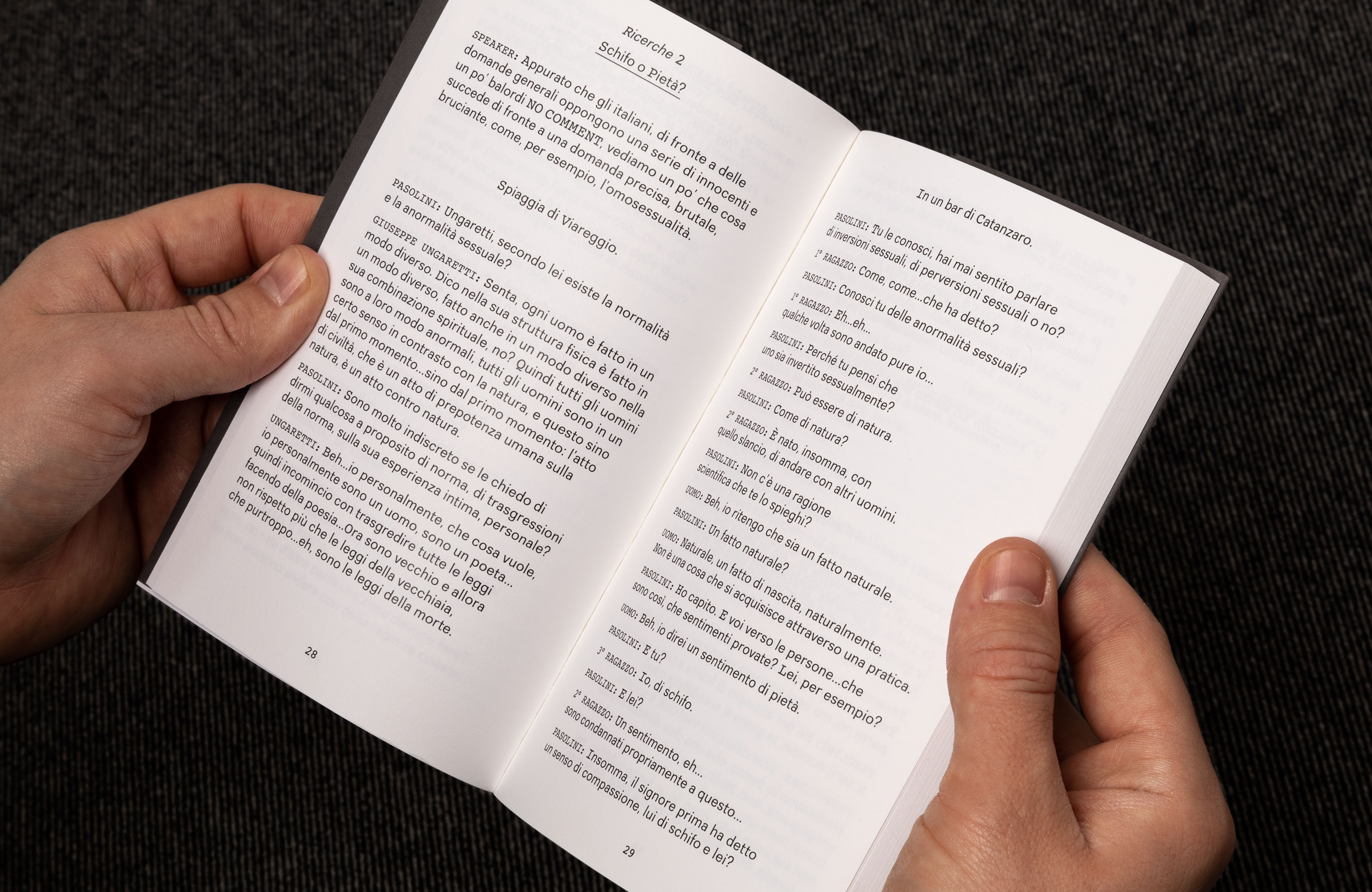
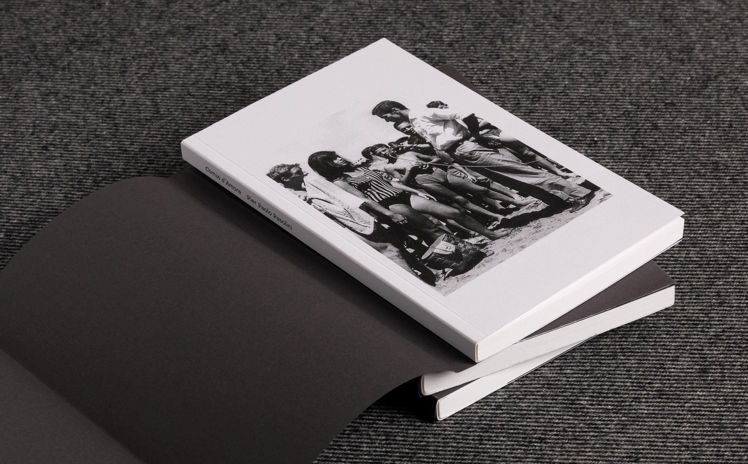
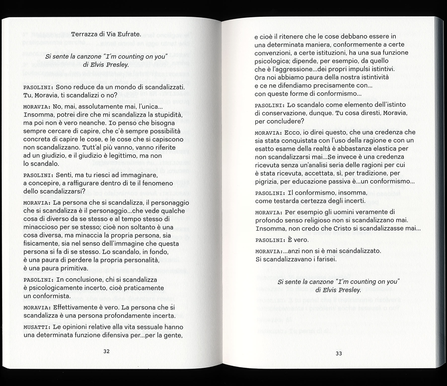
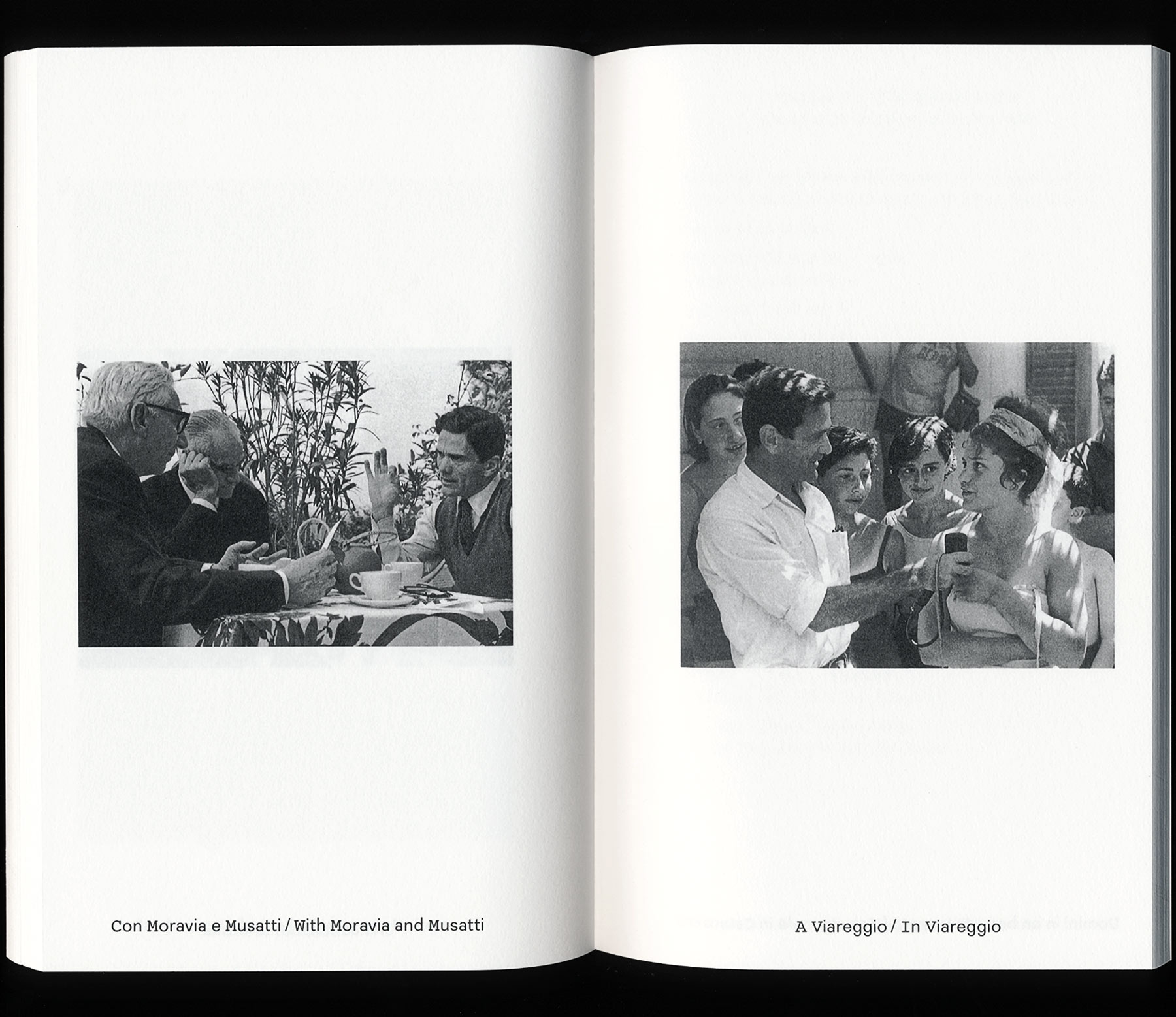
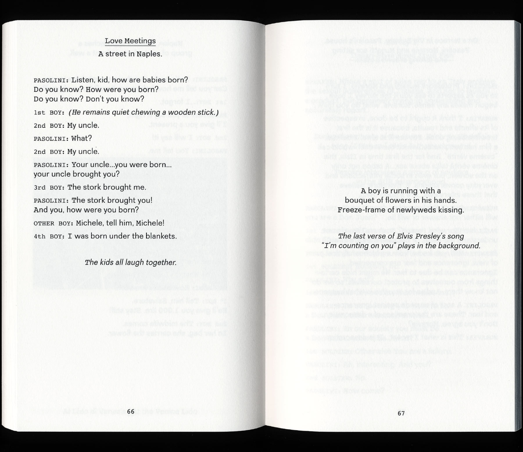
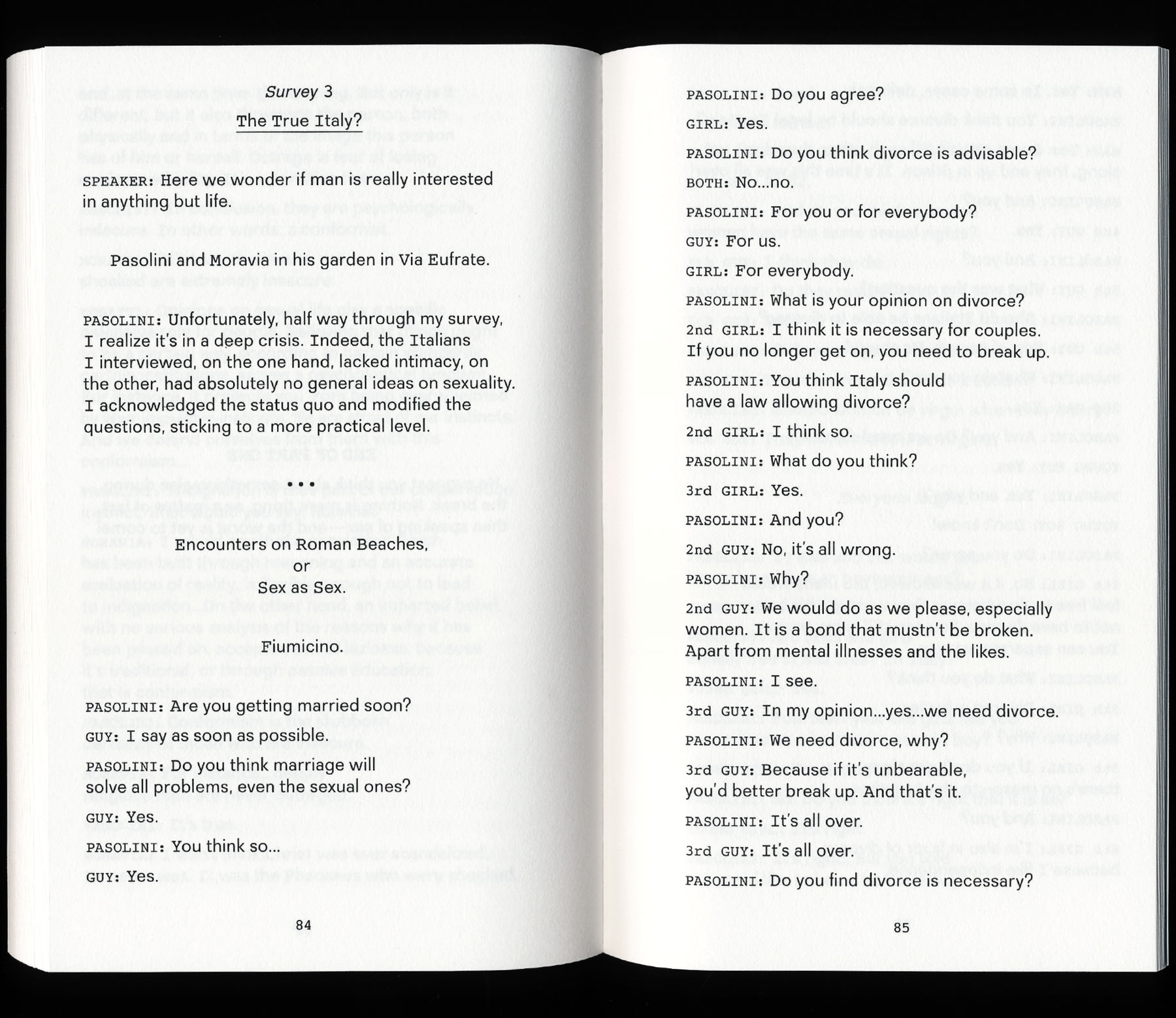
For her graduate exhibition at CCS Bard (9 April – 28 May 2017, Hessel Museum of Art and CCS Bard Galleries, New York), Marta Cacciavillani approached us for the exhibition design, as well as book design for Comizi d'Amore (Love Meetings) – a transcript and first ever English translation of selected dialogues from the film with the same title by Italian director, poet, and intellectual Pier Paolo Pasolini.
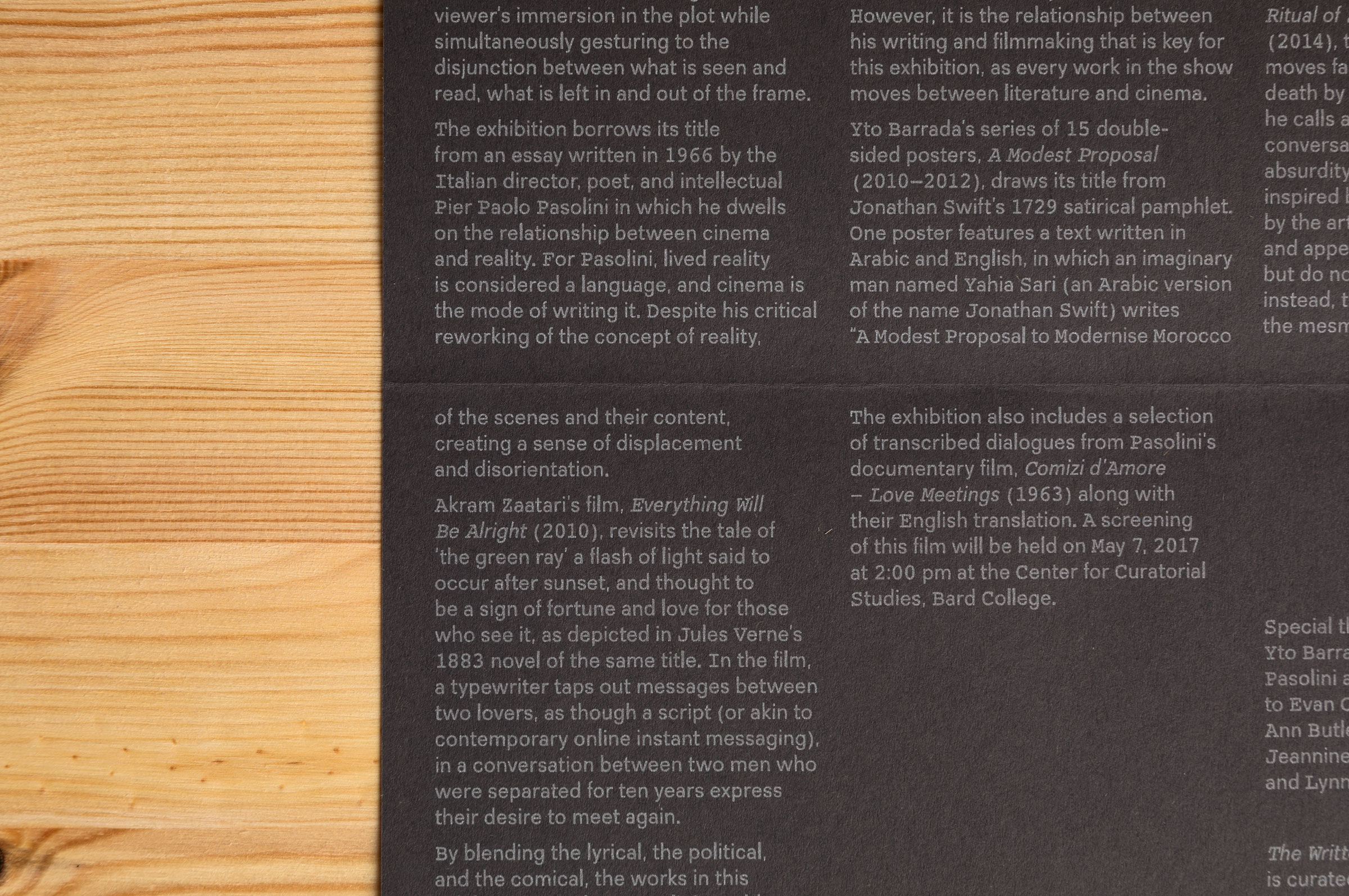
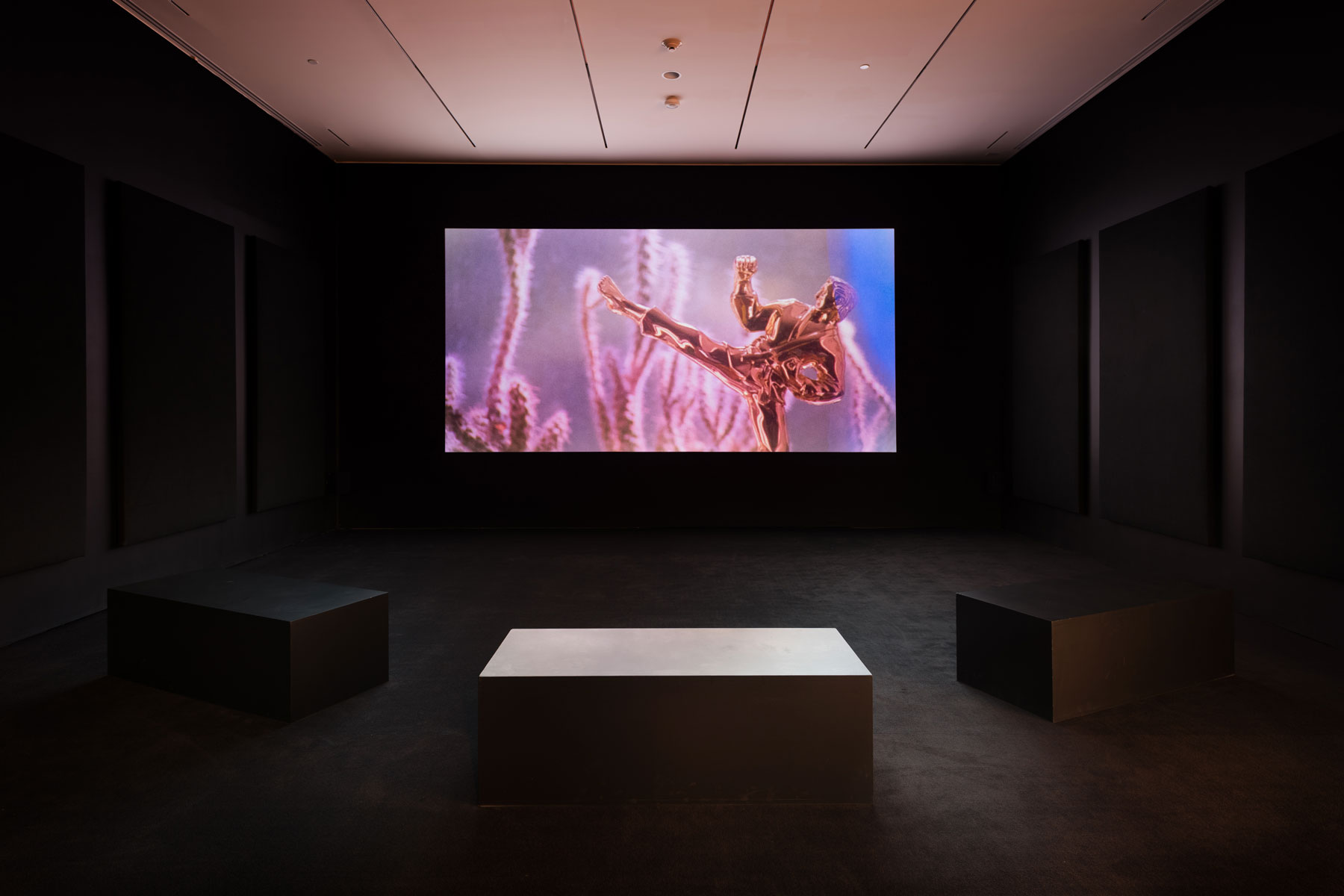
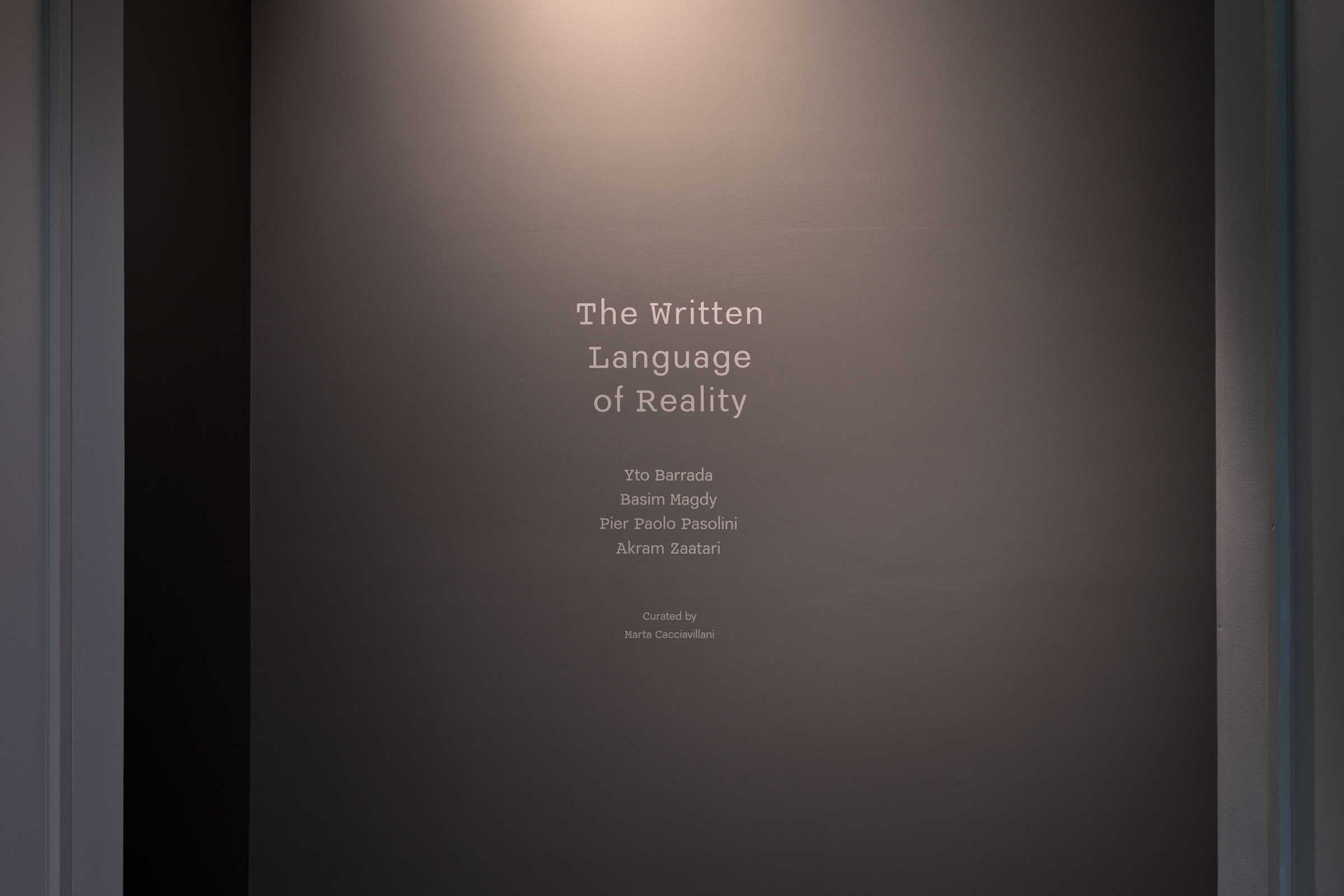
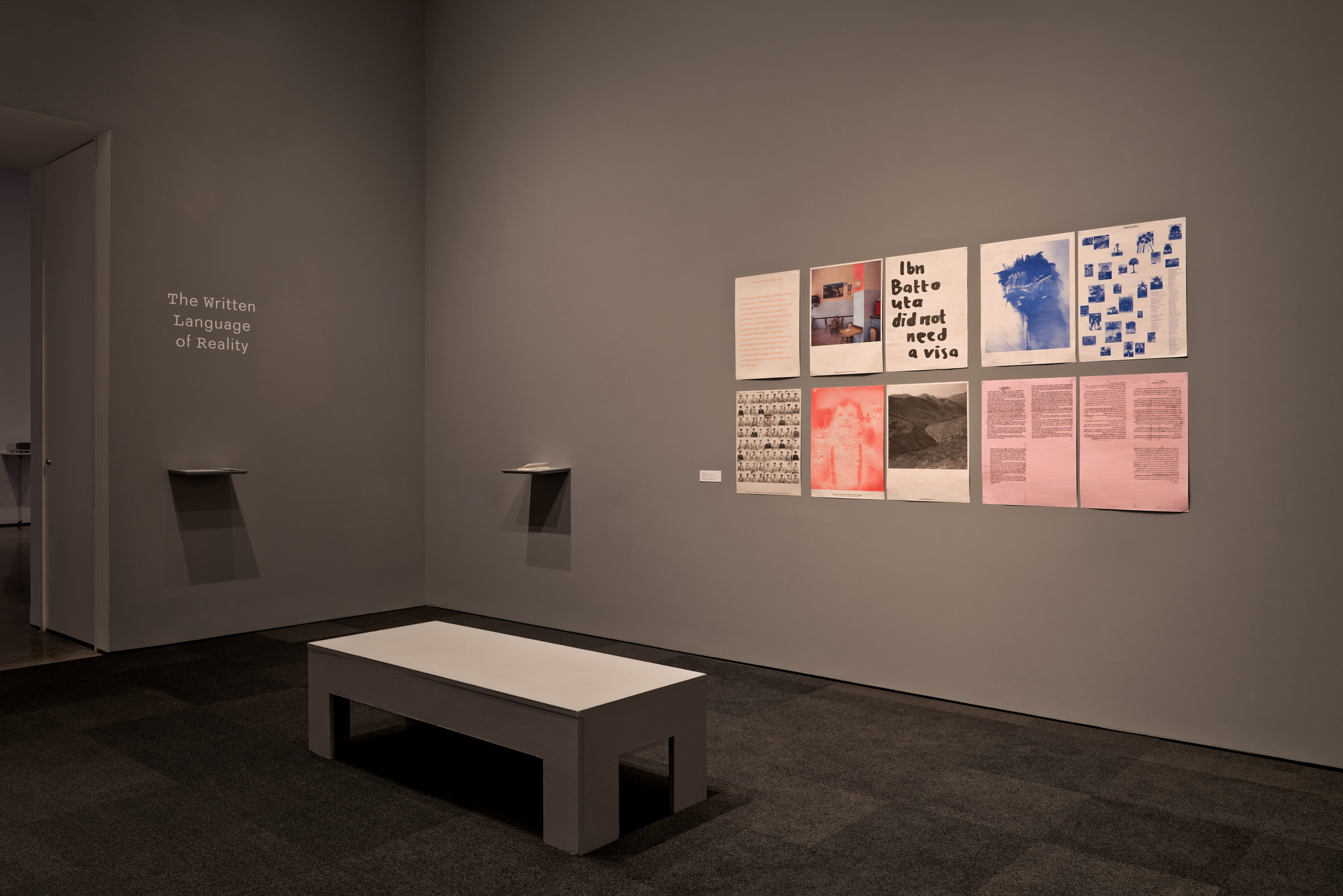
The exhibition, titled The Written Language of Reality, brought together a group of works by Yto Barrada, Basim Magdy, and Akram Zaatari that staged a complicated, broken relation between image, text, and script. The visual identity – which was applied to the book, exhibition design, and online promotion – focused on Pasolini’s use of the typewriter (an Olivetti Lettera 22) in his work, and on the standardized style guidelines in which he would have written his movie scripts. We created a hybrid font for the project, using Courier (the international standard font for script writing) for capitals, numerals, and some punctuation, and mixing it with Recta, a typical typeface from 1960s Italy.
Comizi d'Amore is available through Printed Matter
Installation shots by Chris Kendall
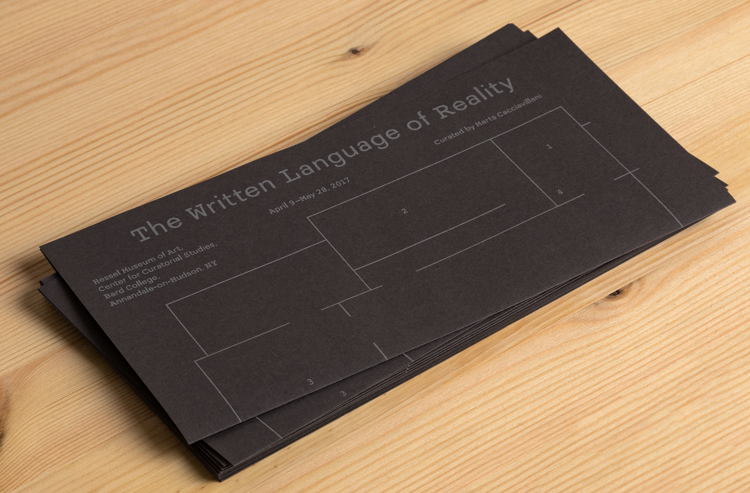
The Written Language of Reality, book + exhibition design, Marta Cacciavillani, 2017
For her graduate exhibition at CCS Bard (9 April – 28 May 2017, Hessel Museum of Art and CCS Bard Galleries, New York), Marta Cacciavillani approached us for the exhibition design, as well as book design for Comizi d'Amore (Love Meetings) – a transcript and first ever English translation of selected dialogues from the film with the same title by Italian director, poet, and intellectual Pier Paolo Pasolini.
The exhibition, titled The Written Language of Reality, brought together a group of works by Yto Barrada, Basim Magdy, and Akram Zaatari that staged a complicated, broken relation between image, text, and script. The visual identity – which was applied to the book, exhibition design, and online promotion – focused on Pasolini’s use of the typewriter (an Olivetti Lettera 22) in his work, and on the standardized style guidelines in which he would have written his movie scripts. We created a hybrid font for the project, using Courier (the international standard font for script writing) for capitals, numerals, and some punctuation, and mixing it with Recta, a typical typeface from 1960s Italy.
Comizi d'Amore is available through Printed Matter
Installation shots by Chris Kendall