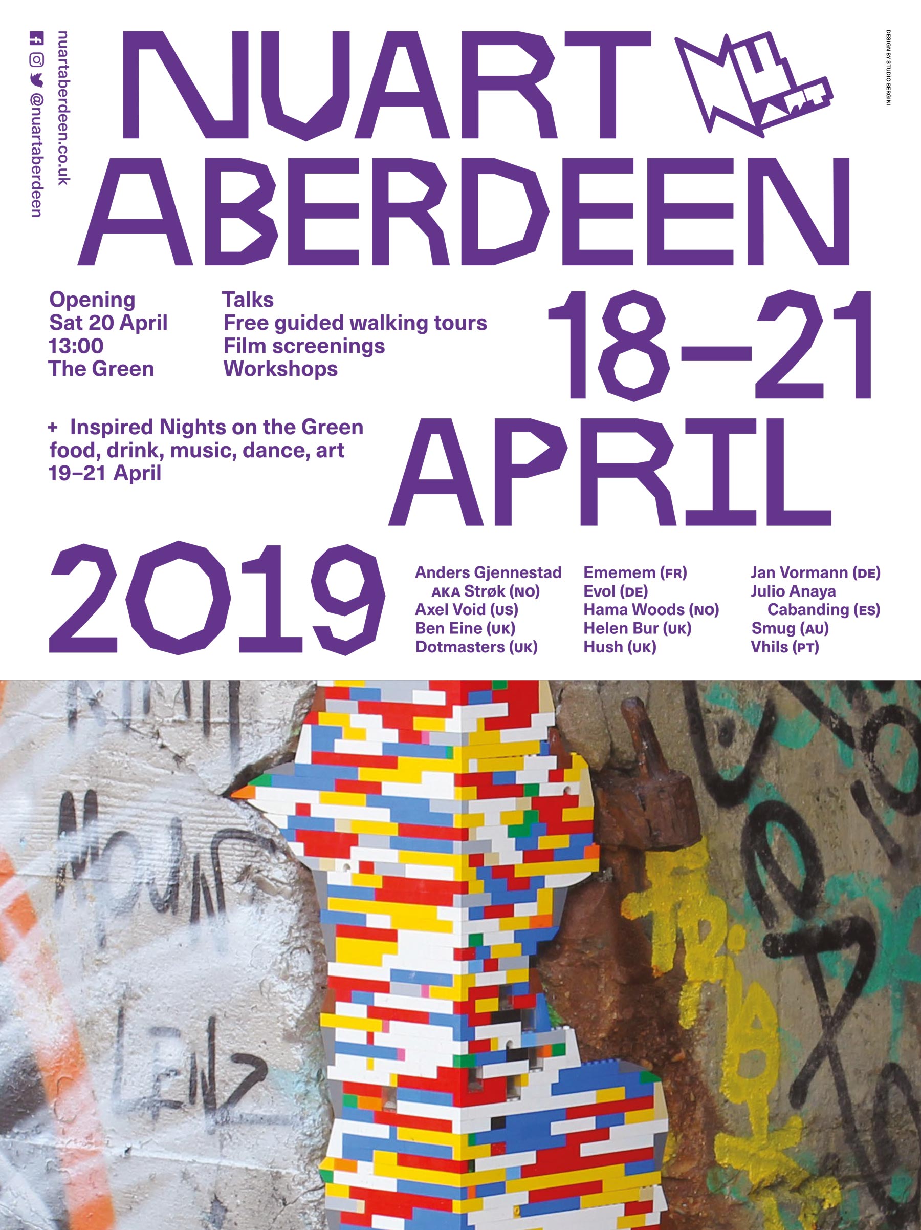
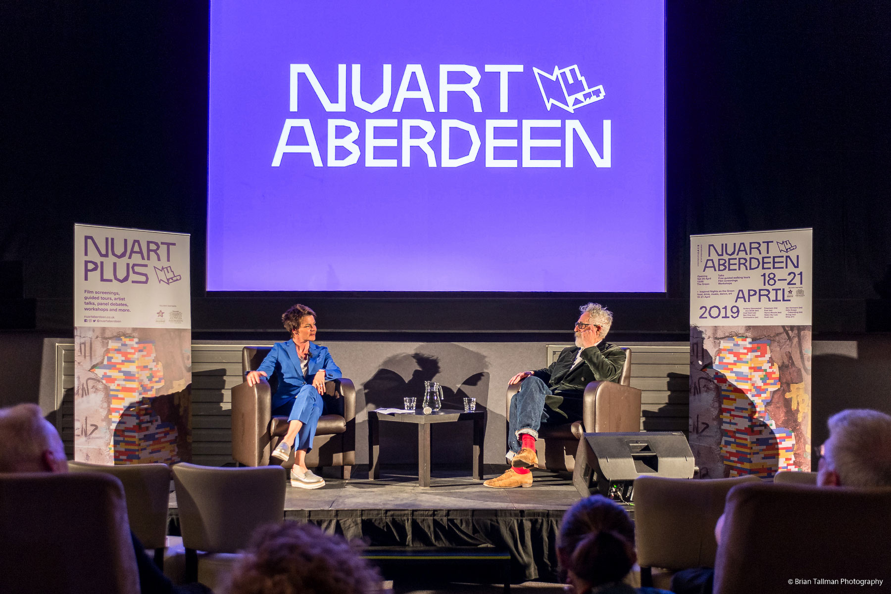
Nuart Aberdeen, visual identity, 2017–2020
In May 2017, Nuart – the Street Art festival we’ve been working with since 2012 – organized its first edition outside the city of Stavanger, staging a festival in Aberdeen, Scotland, in collaboration with Aberdeen Inspired. A huge public and civic success, it was scheduled to return to the city each spring for the next four years.
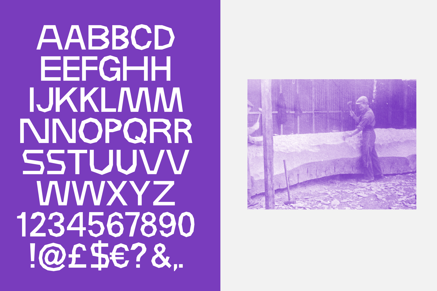
Known as the Granite City for its predominant use of granite as building material, Nuart Aberdeen was a fresh breath of colour to the city that saw its population interacting with their public spaces in entirely new ways. As the city is only just starting to loosen its zero-tolerance policies towards Graffiti, Street Art etc., the new public artworks had a significant impact on the otherwise pristine city centre.
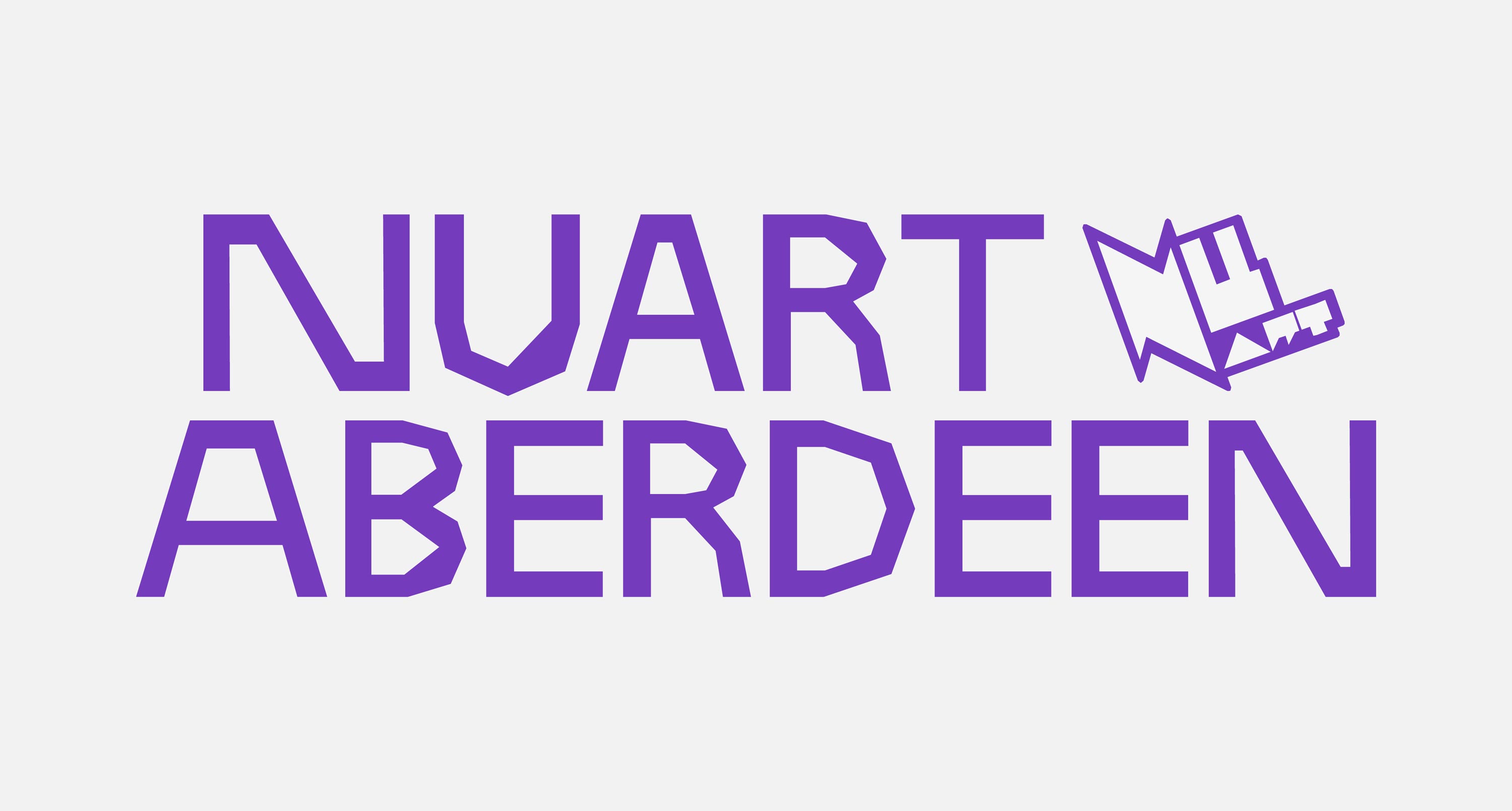
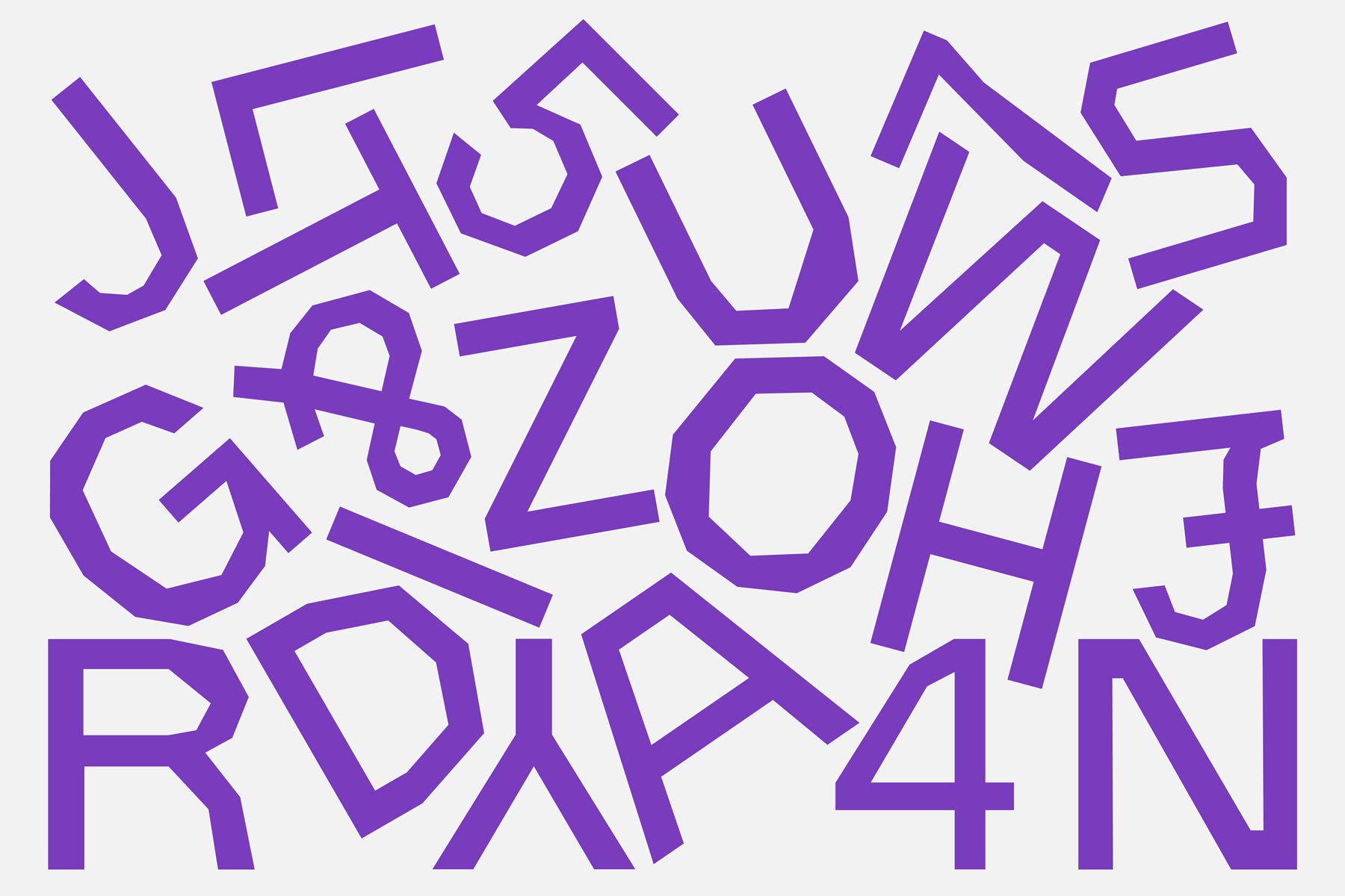
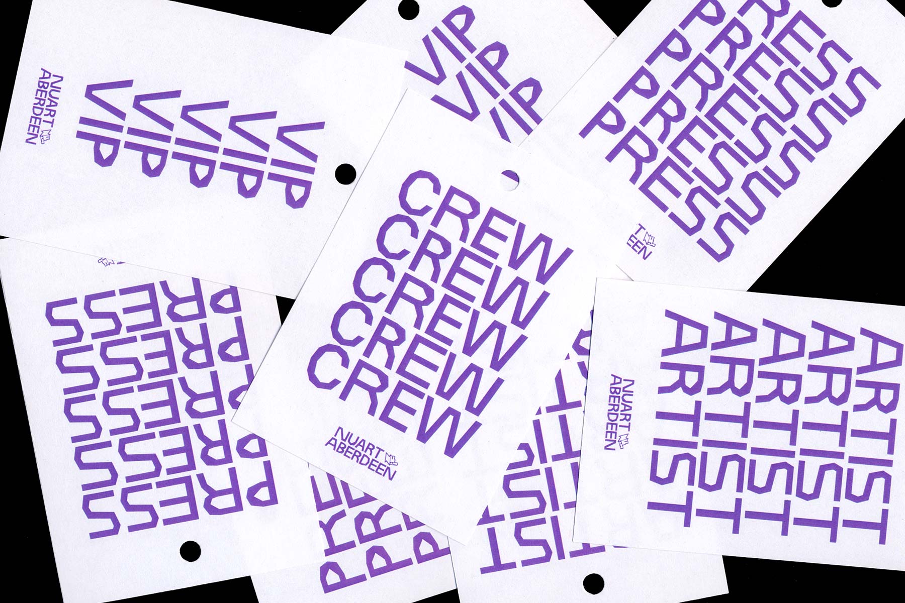
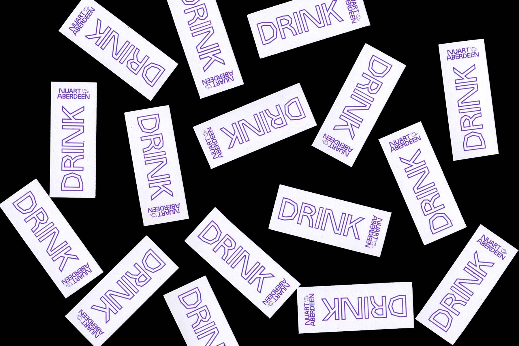
Taking our cue from Aberdeen’s nickname, we constructed a display typeface inspired by the granite stones used as building material in a large portion of the city’s traditional architecture – rough chiselled cuts leaving a surface texture of uneven facets. The font is in one weight and caps only, with a few alternate characters for variation. The font, Granite Headline, became the backbone of the visual identity, combined with a strong purple colour and a very minimal layout system.
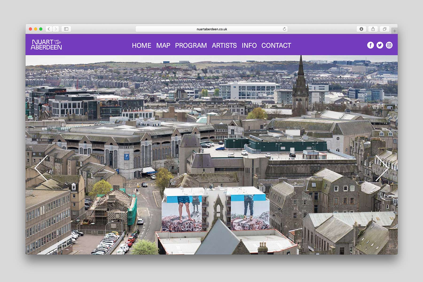
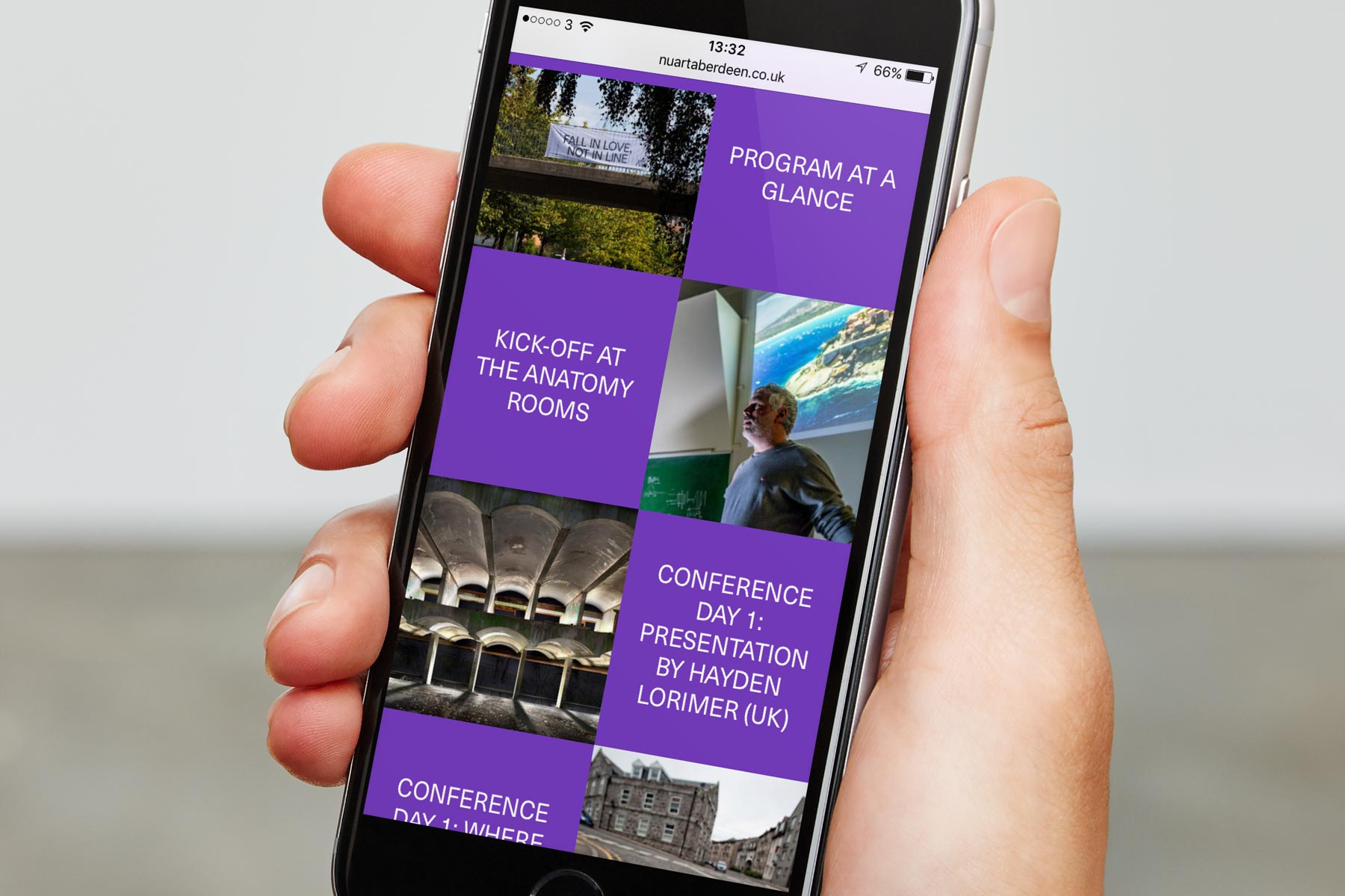
nuartaberdeen.co.uk
Nuart Aberdeen, visual identity, 2017–2020
In May 2017, Nuart – the Street Art festival we’ve been working with since 2012 – organized its first edition outside the city of Stavanger, staging a festival in Aberdeen, Scotland, in collaboration with Aberdeen Inspired. A huge public and civic success, it was scheduled to return to the city each spring for the next four years.
Known as the Granite City for its predominant use of granite as building material, Nuart Aberdeen was a fresh breath of colour to the city that saw its population interacting with their public spaces in entirely new ways. As the city is only just starting to loosen its zero-tolerance policies towards Graffiti, Street Art etc., the new public artworks had a significant impact on the otherwise pristine city centre.
Taking our cue from Aberdeen’s nickname, we constructed a display typeface inspired by the granite stones used as building material in a large portion of the city’s traditional architecture – rough chiselled cuts leaving a surface texture of uneven facets. The font is in one weight and caps only, with a few alternate characters for variation. The font, Granite Headline, became the backbone of the visual identity, combined with a strong purple colour and a very minimal layout system.
nuartaberdeen.co.uk